Colour Collab: Ermanno Cattaneo
Originally trained as an architect, Italian designer Ermanno Cattaneo works for Suzanne Turley Landscapes, where he creates bespoke residential landscapes and the occasional small-scale architecture project for clients throughout New Zealand. In this Colour Collab with Resene, he draws colour inspiration from his home village in Italy.
How did you make the move from architecture to landscape design?
Ermanno Cattaneo (EC): I studied architecture in Milan and Barcelona and then, towards the end of my university career, I worked for an architecture practice specialising in landscape architecture and urban design. That’s where I learned firsthand how the design of the surrounding spaces, the ‘interstitial’, the ‘empty’, is important to the creation of good architecture. Technology nowadays could allow buildings to become site agnostic. Landscape design, to me, has the role of grounding the building to the specifics of the site and being true to the land, the orientation, the microclimate.
In your line of work, you must draw great inspiration from the colours of nature.
EC: When using colour in my work, the main intent is often to complement and enhance the colours of nature in our gardens. We often use colours from Resene’s most natural palettes, from the muddy greens to the charcoals and the earthy browns: from the beautiful Resene Karaka green to the dark and rich Resene Banjul stain. These colours are beautifully understated and they complement and enhance the greens in the planting. This collaboration gave me a chance to explore and experiment with Resene’s brighter palettes.
What inspired your choice of Resene colours for the collab you have created?
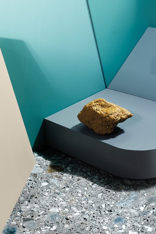
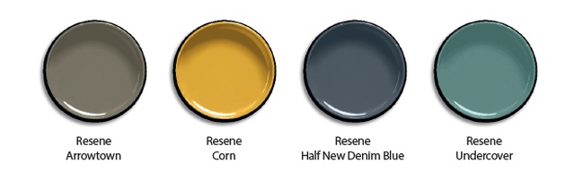
EC: I grew up in northern Lombardy in a small village called Solza and, nearby, the River Adda passes through a narrow valley, making its way from the Alps to the River Po. While up and down stream it is calm and languid, the narrow pass gives it the energy of a fresh, fast-flowing mountain river, with all the magical foam and mist that come with that. Leonardo da Vinci referenced this river and its Ceppo rock formed a backdrop to many of his paintings. My palette represents the landscape of the river and the rocks which line its edge. Ceppo is a natural terrazzo of cool blues and greys but it also has hints of yellow and orange. I walked into Designsource not long ago and felt an overwhelming sense of nostalgia when I saw their new stone-clad reception countertop – we checked the file, which confirmed it came from ‘home’.
How is Ceppo stone normally used as a building material?
EC: It’s mostly used as a cladding material on church façades or for staircases and balustrades in the gardens of Italian villas and historic buildings. There is even a beautiful hydroelectric power station in Trezzo that is clad in it. It’s a traditional stone that is now popping up in design magazines and enjoying a new lease of life on countertops and terraces.
The colour Resene Corn is at the centre of your artwork. What does it depict?
EC: Resene Corn has a real warmth to it. The Resene Half New Denim Blue and Resene Undercover surrounding it remind me of the freshness of the water but there is also a warmth associated with the river rocks that balances the coolness. They possess hues of orange, yellow and brown, which I have introduced through Resene Corn and Resene Arrowtown.
See more from the Resene Colour Collab series here.
ArchitectureNow works with a range of partners in the A&D supply sector to source appropriate content for the site. This article has been supported by Resene.