Colour Collab: Daniel Marshall
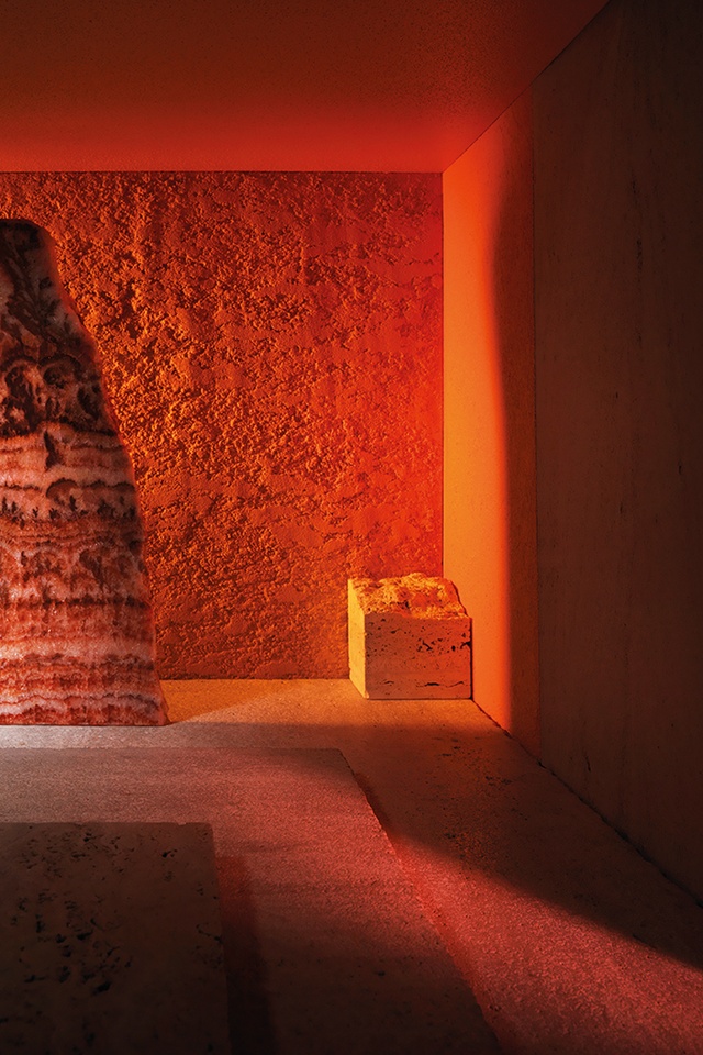
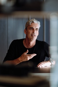
Modernity, Mexican architecture, surrealism and luminescence inspire this Auckland architect to create a moody and highly textural photograph. In this Colour Collab with Resene, Daniel Marshall tells us what inspires him.


Besides architecture, you dabble in the visual arts; correct?
Daniel Marshall (DM): I do, although I don’t have the opportunity to do so often. Roland Barthes described a hobby as something you do but you don’t have to be good at. I look at my work as a whole and the artwork has been extremely complementary to how I approach buildings. It is a way to explore detail and the subtlety of the way light falls upon different surfaces, for example. The act of crafting is quite therapeutic to an architect, who, by the nature of the profession, has to instruct others to craft things.
What inspired this collaboration (image above)?

DM: I was struck by a loggia on a public building in San Cristóbal, a town in the central highlands of Mexico. The evening sunlight fell upon the rich ochre red of the interior of the loggia and just exploded in a kind of otherworldly dissolution of the heavy stone architecture of the form. It is as though space can be altered completely by the combination of colour and light. That is something I am always looking for the opportunity to use. I have been strongly influenced by the work of Luis Barragán. He is most commonly known for his use of strident colour: a vernacular of traditional Mexican towns such as Guanajuato. However, I am most drawn to the sculptural quality of his forms and the careful consideration of detail and surface.
Tell us about your choice of materials for this photo. How did you come up with this combination and why?
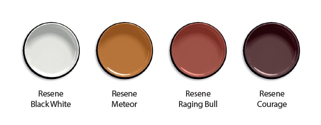
DM: The starting point was the luminosity of my Mexican loggia but, also, the value of materiality, explored in a lecture by Peter Zumthor. Stone was an interesting counterpoint to the surface and colour play we were looking at for the backdrop, and travertine is the favourite stone of the modernist architect. It is interesting that the way in which a stone is treated completely alters your experience of it. The highly textured marble tied in with the Resene Meteor we used for the textured plaster finish, and adds an opulence to the composition. The combination of travertine and veined marble references the materiality of the Barcelona Pavilion.
What about the colours? How were they selected?
DM: The colours were all about the interesting dissolution of space that was the main thing that interested me about the project. A rich orange or red, struck by a light of a similar colour, completely alters one’s experience of the space.
Is luminescence something you have tried to incorporate in your own architectural work?
DM: Yes, I have tried many times; having a client take it on board is a different matter. Both times in my career when a client has let us use strong colour, we have won a Resene colour award (the 2019 Resene Total Colour Residential Exterior Award for the Railley House and the 2011 Resene Total Colour Residential Interior Award for the Corinth Residence). The key [to incorporating luminescence in interiors] is having the right light fall in the right place. Clerestory windows, which let light in from just below the roof line, coming in from either the east or the west, with a wall in the line of light, can render fabulous results.
See more from the Resene Colour Collab series here.
ArchitectureNow works with a range of partners in the A&D supply sector to source appropriate content for the site. This article has been supported by Resene.


