Colour Collab: Daniel Kempka
Warren and Mahoney Senior Associate Daniel Kempka designs deeply empathic spaces that align with an organisation’s culture and prioritise emotional and physical well-being.
What made you choose a career in interior design?
Daniel Kempka (DK): I didn’t make a conscious decision to be an interior designer so it’s by pure chance that my professional title now has the words ‘interior’ and ‘designer’ in it — a role I’d never imagined having. I studied to be an industrial designer, which was what I was going to be. It made sense, too, as I could indulge in my love affair with furniture and obsess over every detail. I had no clue that, almost 10 years later, chance and luck would take my obsession and turn it into actual spatial experiences. I’m reminded, often, that I’m very fortunate to design such projects, now, for people so I’m never giving up this gig!
Are there any designers who influence your work?
DK: I admire designers who have the innate instinct to give purpose and create lasting impact with only the simplest of objects. It takes clarity and courage to do so. It’s doing a lot with not a lot (well, at least, making it seem that way) that is maybe the most veracious test of skill. I’ve always had a fixation with the ruthlessly precise and aesthetically adventurous work of German industrial designer Konstantin Grcic: particularly his early designs of the ’90s and start of the 2000s. An object, a chair or a table of immense technical complexity can possess a vulnerability and empathic qualities while, at the very same time, having no apology for its bluntness.
How do you typically use colour in your projects?

DK: The thing about colour is that it can be interpreted in many different ways — as many as there are actual colours available to a designer. Colour is fantastically universal but hypersensitive to anyone’s subjective or discerning taste. So, the use and grade of colour in our projects are always very deliberate, with purpose: never by accident and based on a rational belief in the creative brief. Colour has great power and holds a lot of influence so our projects benefit from the exploitation of some basic principles of colour — contrast, hierarchy and legibility. And, of course, knowing how much or how little to apply helps, too. We received a Best Awards Resene Colour Award for MediaWorks’ HQ, where we essentially used colour as a statement to carry and amplify the metaphoric soundwaves and soul of the organisation: as much as a visual tool for stimulation as it is a style prompt. We wanted colour, effectively, to have a ‘sound’, creating a dialogue that gave contemporary forms a quality that held a sense of nostalgia to the past.
What was the thinking behind your collab?
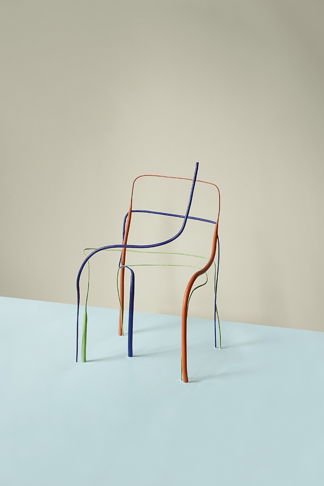
DK: It’s an object with a familiar, identifiable function that is universally understood yet can be equally ambiguous. I gave a sketch to Thomas — a simple study with just a few gestured strokes held together in various line weights and thicknesses to express the basic structural logic of a three dimensional form. The rest became an evolution of concept that invites subtlety over spectacle.
Tell us how you came about choosing these colours.
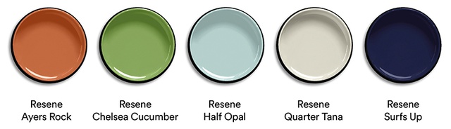
DK: We drew reference from Le Corbusier’s early seminal architectural polychromy set, selecting Resene colours for a composition of eminently technical tones — each with a ‘matter of fact’ quality so very useful when describing the function or relationship of an object. The two darkest colours, Resene Surfs Up and Resene Ayers Rock, possess the personality so exist to ensure the form of the object is understood. The ephemeral quality of the linework is silhouetted against a shadowy neutral background of Resene Half Opal and Resene Quarter Tana. Resene Chelsea Cucumber is used to contrast the distinguishable tension held between the other two dominant tones.
See more from the Resene Colour Collab series here.
ArchitectureNow works with a range of partners in the A&D supply sector to source appropriate content for the site. This article has been supported by Resene.