Houses Revisited: Stratford Street house
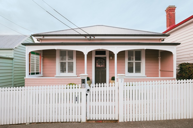
A few surprises lurk behind the front door of this seemingly unassuming villa in Parnell, Auckland. First published in 2018.
Much like Parnell’s charming but narrow streets, the rooms in many of this suburb’s original villas can be difficult spaces for the modern family to navigate. Before renovation, this 1890s’ villa consisted of the standard four small rooms extending from a central hallway, a lean-to containing the bathroom and kitchen, and an ad hoc collection of additions to the rear.
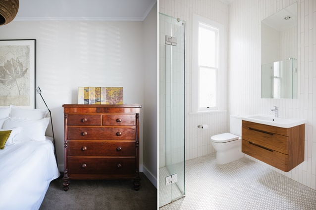
A pair of growing boys and their toys instigated the homeowners to commission Philip Graham of Salmond Reed Architects to renovate and extend the back of the building with a new open-plan kitchen and living area. A new bathroom was added, as well as an en suite for the master bedroom.
“The villa had all the trappings of a building that faces the street but it didn’t make much use of the back,” says Graham. “Now the building effectively has two fronts to it and this informed the architectural response as well, as it was really important to make a distinction between where the old building stopped and the new started.”

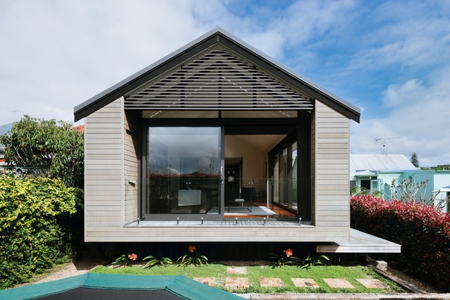
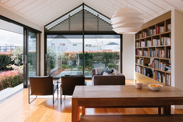
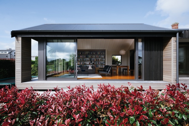
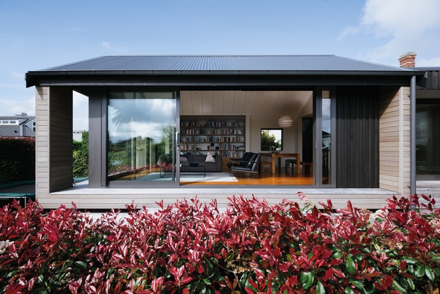
The pavilion gable of the extension echoes the roofline of the original house and also brings about images of the customary shape and form of a wharenui. Board and batten, as a traditional cladding system, is used for the transitional space between the original building and the new, pavilion-style extension. The extension is clad in cedar weatherboards, chosen to echo the rusticated weatherboards on the front façade.
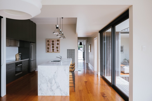
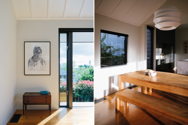
“Everything is textured in villas,” explains Graham, “and I wanted to carry that through to the interior, as well, with the panelled ceiling in the pavilion. The floors are recycled kauri boards in their natural, golden state and these continue on from those in the hallway. These elements ensure there is a clear distinction between the old and new — but it is not too much of a stark contrast.”
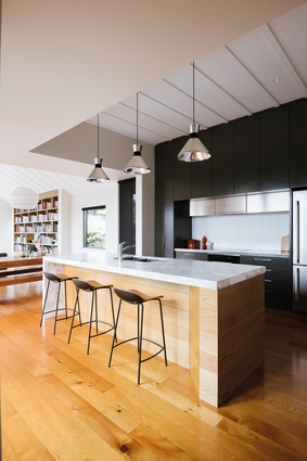
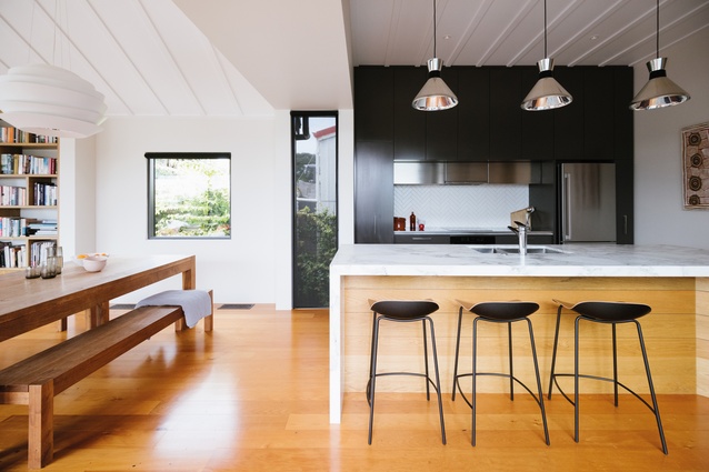
The black-and-stainless-steel back wall of the kitchen is softened by the classic herringbone-tiled splashback and by the island, which, with its marble top and oak boards, lends a subtle transition into the living space.

“The lift in ceiling height from the kitchen to the pavilion also helps to define the living space; this is important in an open-plan area,” says Graham.
The living room opens through large sliding doors to the deck, which wraps around two sides of the extension and features steps that double as bleacher seating, situated to face the city view. While the house takes up most of the site, there is still room for a section of lawn. This is lined with the terracotta bricks from the house’s original chimney, which were found piled up beneath the house during site works.
A quirk of the house is the attic space, which was originally designed as storage but has wound up being used as a plywood-lined den for the homeowners’ sons: a kind of internal tree hut. It is accessed through a ladder that drops down from a trapdoor in the hallway ceiling and features an operable skylight.
Indeed, quite a few surprises lurk behind the front door of this seemingly unassuming villa: proof that it is possible for a house to grow along with a family.
MATERIAL SELECTOR
Philip Graham discusses the materials chosen for the Stratford Street House.
How did you integrate the different material palettes of the new extension and the old villa?
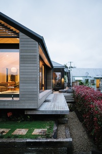
The materials of the extension are of a similar design profile to that of the existing house (rusticated weatherboards, plus board-and-batten cladding). However, they are different in scale and material finish.
This is a deliberate architectural response to allow the original cottage/villa to be legible (and, therefore, not lost) against the new pavilion extension. The board-and-batten ‘link’ between the existing building and the pavilion is stained black as a ‘negative detail’ or separation between the two structures.
Despite the constraints of the site, you’ve used large expanses of glazing in the windows and doors to frame the views — how did you set this up and are they specified to fit exactly?
The glazing was set out to take advantage of the city views to the west and the northerly sun aspect. The generous glazing was designed to add a sense of space to a fairly compact floor plan and as a contrast to the cottage, which has fairly low levels of light.
Click here to see more Houses Revisited. And sign up to our email newsletters to receive Houses Revisited straight to your inbox.
Note: These are stories from our archives and, since the time of writing, some details may have changed including names, personnel of specific firms, registration status, etc.

