Channelling that ’70s’ vibe
West Plaza, Neville Price’s elegant aerofoil, is renamed 1 Albert Street and its podium has a much needed makeover by Ignite Architects. Bill McKay, a child of the ’70s, is feeling the love.
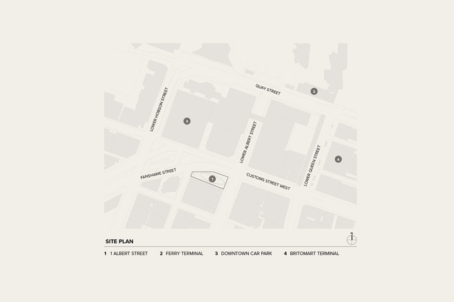
“Last, loneliest, loveliest” etc. etc. etc. That was Kipling’s 1890s’ assessment of Auckland but the city has been made well and truly mediocre, now, and this part of Downtown is one of the mundaneist, motley-ist and most mistreated. The harbour was filled in decades ago and the blight of late-20th century traffic engineering ends up as torrents of cars negotiating knots of awkward intersections, then disgorging into a disparate bunch of very ordinary modernist carparking blocks and office towers. But there is something that, to continue Kipling’s stanza, you could still call exquisite and apart: Neville Price’s West Plaza, 1969–1974, which has now been reborn as 1 Albert Street, with Price as consultant and Ignite Architects as architect and interior designer.
West Plaza was always cool and, unlike most of our city’s afflictions on the whenua, always popular with the public. And it still stars in architecture books about Auckland. Neville Price, however, was always thought of as somewhat apart with his “entrepreneurial inclinations” as John Walsh put it. One cardinal sin of the period was working for developers — now everyone does. A brochure from 1980 makes it perfectly clear that “buildings for commerce are constructed primarily for profit and investment”. It is said that many developers past and present know the price of everything and the value of nothing, but Price’s commercial work with others left us many buildings of great value to the urban environment, such as 82 Symonds Street and New Lynn’s Ceramic House.
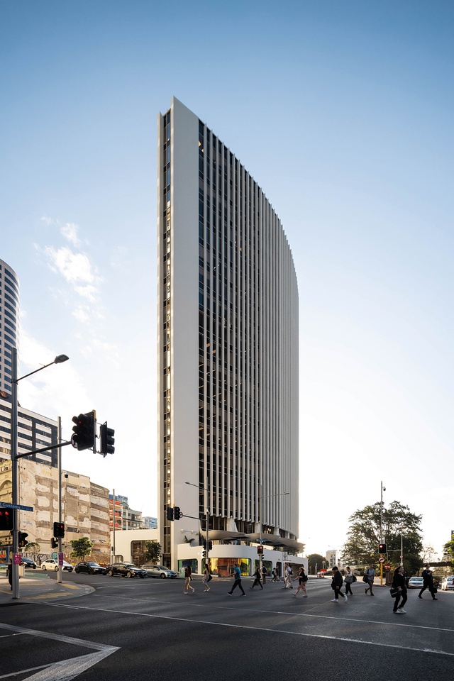
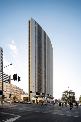
Probably, West Plaza was a bit too slick for the times; despite grumpy architects muttering that it was a Pirelli Tower (Milan, 1958) knock-off, in an era of late-modern ordinariness, Price was a big part of Auckland’s architectural evolution from big town to a more elegant and sophisticated city. West Plaza with its aerofoil form was quite a contrast to the nearby resolutely unglamorous Downtown development and Queen Elizabeth Square: the squat, block of mall and Air New Zealand tower, all windswept concrete with dour brutalist exposed-aggregate finish. You could feel the waterfront breeze there, but not in a good way, and the actual waterfront was still caged off from the public. West Plaza was a breath of fresh air and not in an up-your-skirt or umbrella-exploding way.
It’s not often, from what I’ve seen over the years, that architects work on another’s building without buggering it up, and West Plaza has seen the addition of what Price terms “clutter” over the years. But Ignite has done really good work here and for two reasons. Firstly, the developer, Quattro Asset Management, employed Price as a consultant, in his words, to “ensure the original concept design principles were retained” and, secondly, Ignite has embraced the vibe of his 1970s’ aesthetic. And who could resist that? West Plaza seems to be a building of the zeitgeist of the ’60s and ’70s, channelling not just Pirelli and Cool Italia, but Kubrick’s 2001: A Space Odyssey (1968) and emergent icon, the Sydney Opera House (1957–1973). West Plaza also reflected more immediately local trends, such as the emerging freedoms of big money, new fashions, the increasing ability to import cool stuff, the glamour of air travel and yachting, and so on, right up until the energy crises of the 1970s. It seemed to embody the evolving notion of Auckland as the ‘City of Sails’ and appeared in quite a few advertisements and fashion shoots of the time – there are a few famous photos of skateboarders in those bowls at its base.
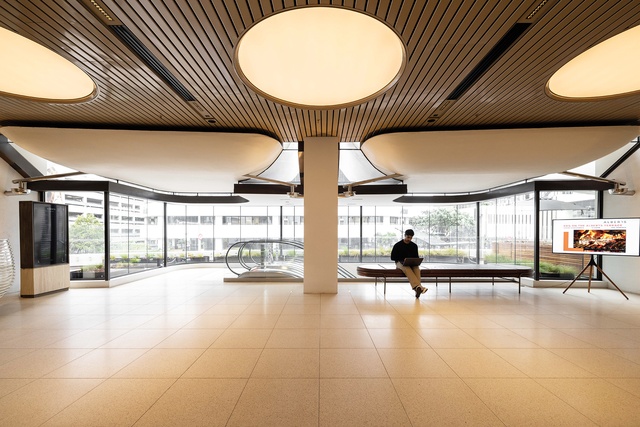
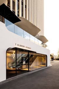
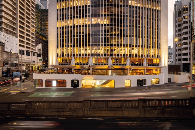
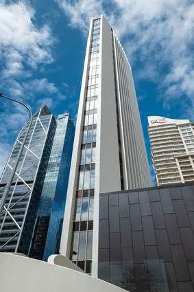
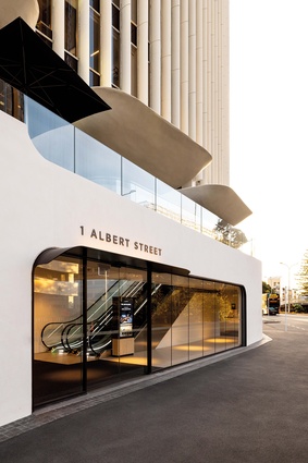
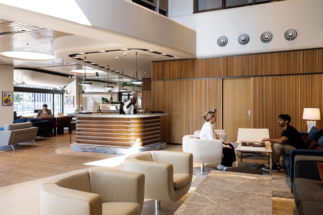
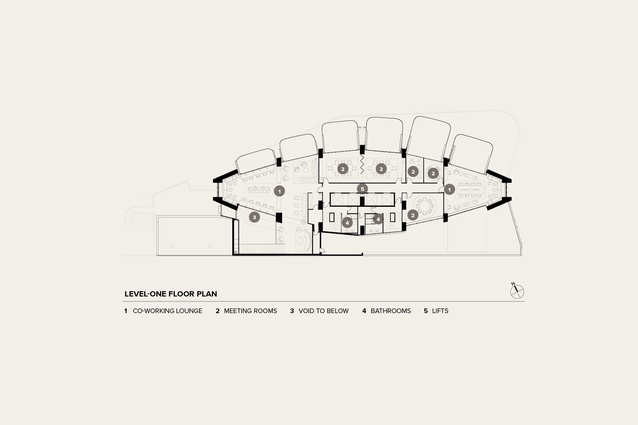
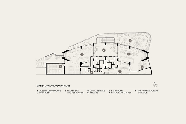
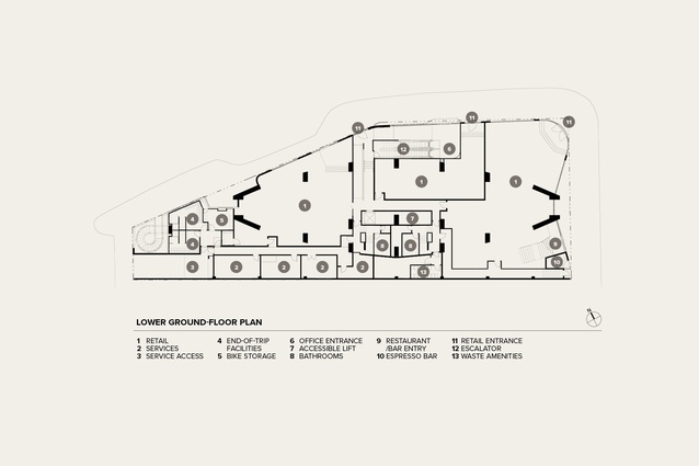
After refurbishment, West Plaza has been relaunched as 1 Albert Street (its street address) and retains a nautical air, its essential components of vertical tower on horizontal podium retained. Being only a block from the harbour and close enough to smell the salt, this slim and elegant building has always had a maritime aspect, its vertical fins (unlike Pirelli) evoking masts above the curved and deck-like plaza on top of the podium. The architectural work has focused on the podium which, although much more enclosed, still sports the ballooning curves of a spiral stair and the bowls: raincollecting scoops also originally designed to deflect wind down draughts. For structural reasons, the lift shafts couldn’t be extended down to the ground level so, from new retail and café premises on the street, an escalator now cruises up to the first-floor reception area and a couple of hospitality spaces there.
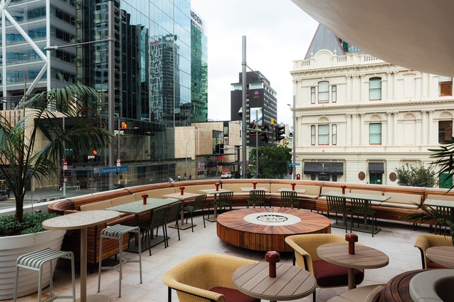
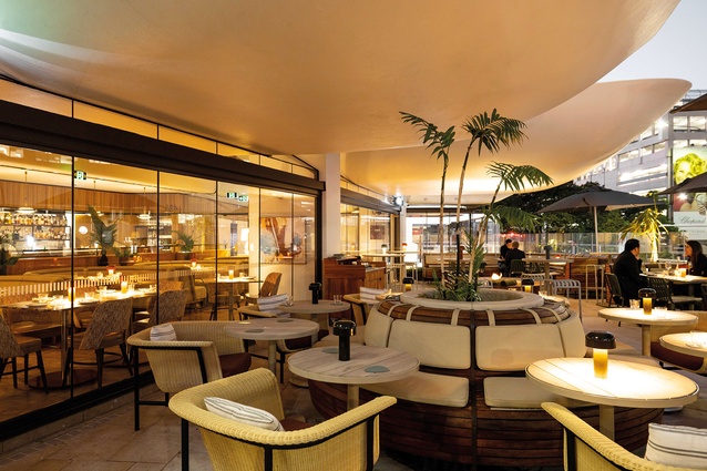
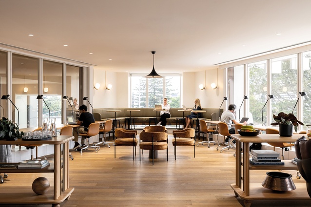
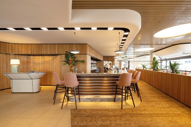
Much of the podium’s plaza has been closed in but not in the clumsy way that we have seen with many modernist buildings, where glass has tangled with pilotis and stultified any sense of a building floating above ground or, even worse, suffocating plastic curtains have been necessary to deal with architects’ inability to cope with weather. Here, there has been great attention to detail, such as preserving the scoops and their stainless-steel downpipe systems. New lighting and detailing reiterate the building’s cool elliptical curves. The open areas of the podium that remain are kitted out not-unlike the deck of a well-appointed yacht or the equivalent motorised gin-palace. This nautical vibe is accomplished mainly through timber decking and slatted banquettes that curve in three dimensions, open fires, cool lighting and so on, ably supported by ample bars in the chic new restaurant and members-only lounge. Architects can amuse themselves by peering into the existing fire egress stairwells, beyond the scope of contract works, and count the points of non-compliance with our current Building Code. A couple of new fit-outs in the office levels have also been done and, despite the smallish floor plates by contemporary standards, a variety of ambiences can be created through playing with the ceilings. The great bonus of the building is that, because of the curved floor plans, the spaces are airy with good daylighting and great views.
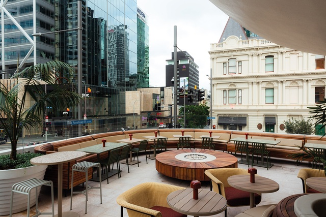
West Plaza has been a flagship of good architecture in the Downtown area since the 1970s. It is great to see it refurbished in a way that respects the original and, with its emphasis on a slightly retro vibe, it suits the development’s aim to appeal to boutique tenants rather than the big-box boys of the law and accountancy towers. It is also a good example of adaptive re-use. From my spot on the sun-drenched deck of the restaurant, with glass of wine in hand at sundown, despite the teeming traffic below, which gifts the sky a sort of smoggy LA sunglass sunset cool, I hope that, in the wake of this lovely work by Ignite, there is renewal and the beginning of some urban regeneration in the area; it sure needs it. And, as for Neville? Give him a well-overdue medal.

