Capital character: Deloitte Wellington
Wellington’s cityscape and natural textures are brought inside Deloitte’s new headquarters.
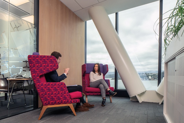
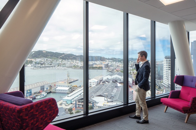
Offices within the new Deloitte building on Wellington’s waterfront enjoy front-row views across the harbour as well as some eclectic vistas of the city and the western hills beyond. For Deloitte’s offices, which take up the 11th, half of the 12th, and the 13th floors, it was important not to compete with these views but to create a workplace with a sense of professionalism and equity, as well as some colourful references to the city below.
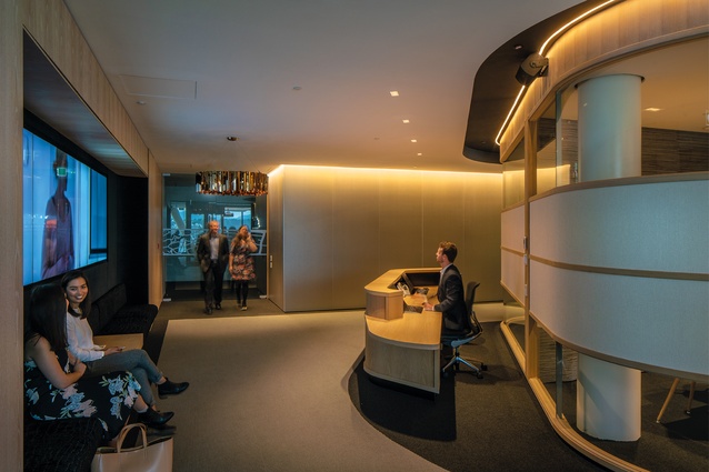
The building was designed by Studio Pacific Architecture (winners of the 2018 Supreme award at the Interior Awards for the He Tohu Document Room), with the interior fit-out led by project architect Marcellus Lilley and director Stephen McDougall. With a deep floor plate, part of the design involved creating internal spaces within the floors that had their own characters. On the central ‘client’ floor, the reception desk is formed within what the architects call ‘the pod’, which is designed with curves in a style that is reminiscent of an art deco theatre.
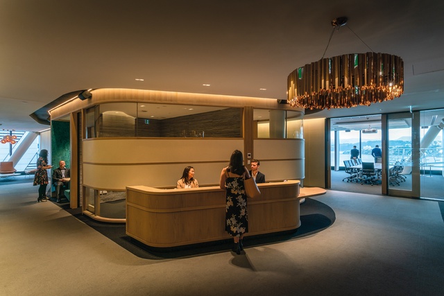
“The meeting rooms are pushed to the perimeter on the central floor, leaving a deep-plan internal space within,” explains McDougall. “We created an island – what we call a pod – which is an object in itself. Its curvature allows circulation to wrap around the outside. The material configuration, quality of finishes and colours give it a sense of being something special in relationship to the grey hues of the meeting rooms.”
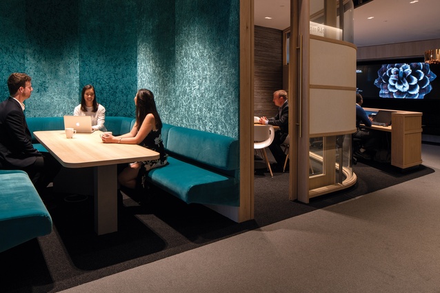
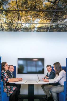
The pod is framed in American white oak, with a belt of white, glass bead wallpaper adding a touch of sparkle, and is illuminated by the dim, dramatic lighting of the chandelier-style Innermost Facet Pendant in the waiting area. Meeting booths are housed in the sides of the pod, clad in a soft-blue-velvet wallcovering and with blue Varese cotton-velvet booth seats.
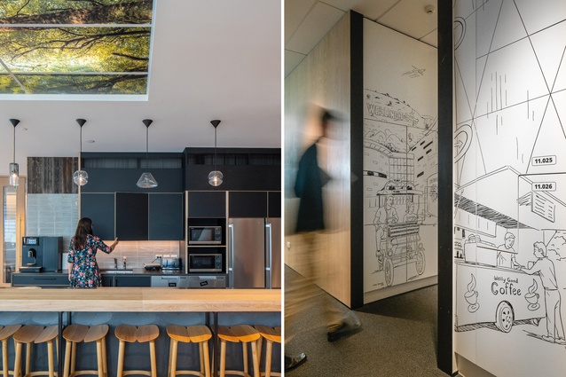
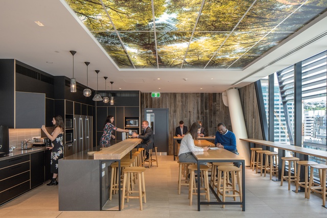
The pod connects to the staff hub beyond, which was located on this central floor to allow people working on the floors above and below to access it easily via the base build stair. The hub encompasses a staff kitchen and lounge and has a casual aesthetic, with Simon James stools and chairs, contemporary Plytech cabinetry and Tom Dixon lighting.

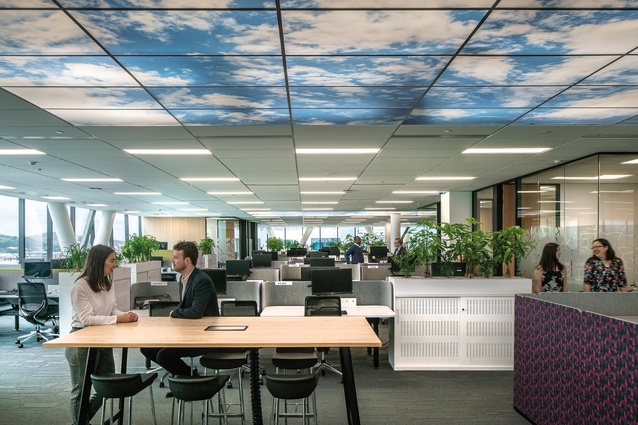
The surprising heroes of this space are the Palsun PSP ceiling panels, which are printed with images from the forest canopy in Wellington’s green belt. “The ceilings are a device we utilised in a couple of locations,” says Lilley. “One is the staff hub; another is one of the partner meeting spaces, a lounge space. They turn up on the work floors as well as being a way to break down the scale of the suspended ceiling. It helps define zones in those areas. The digital images were commissioned for the fit-out with imagery taken from the Wellington region. Part of the articulation of the fit-out was the use of elements of the site-specific context.”
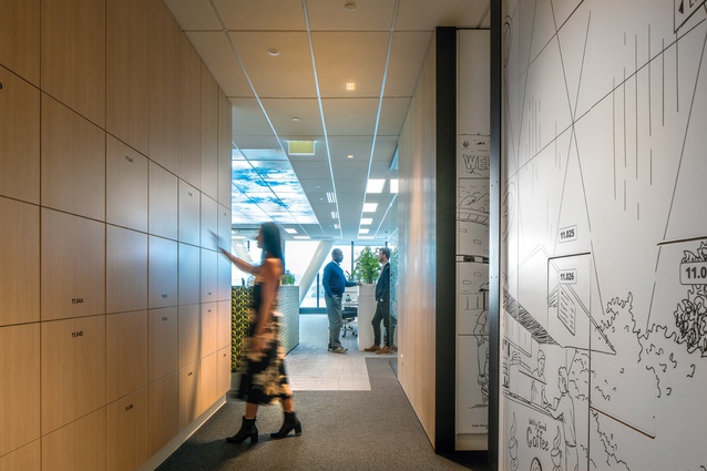
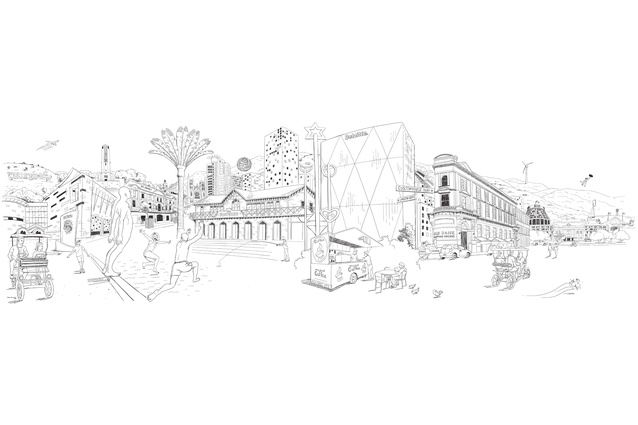
Another of these elements is the cartoon-style Wellington city street illustrations printed on the lockers on the working floors (more on this later). These lockers provide storage for staff who hot desk, and that is around a third of Deloitte staff, says McDougall. “Being an accountant-based company, Deloitte was an early adopter of hot-desking, with staff often mobile while completing audits. Sit-to-stand desks were, at first, a small percentage, but moving people instead of walls and desks is very simple – you can adjust your workplace to suit your ergonomic requirements – so we made every workspace sit-to-stand.”
A previous iteration of the Deloitte Wellington headquarters, also completed by Studio Pacific and rendered uninhabitable by the Kaikōura earthquake, involved a good deal of change to the office layout as the company grew. “Deloitte as an organisation is quite fluid and, over the years, has acquired a number of different businesses,” says McDougall. “Even in former fit-outs, we were continually changing arrangements to suit the acquisition of business groups. The desire here was to allow for blurring the boundaries between the groups so they could ebb and flow organically.”
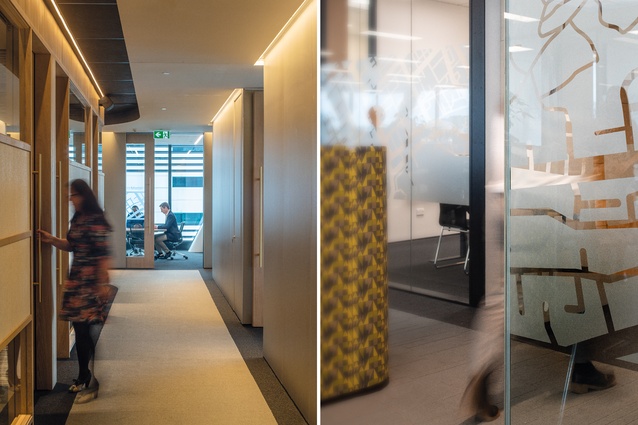
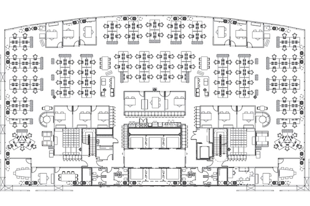
The partners have allocated offices but, rather than these being placed around the periphery or in the corners of the working floors, they are located around the lift core to allow for all members of staff to enjoy the views. The offices also have glass walls printed with a street grid graphic to allow the sharing of daylight and to prevent them from feeling too enclosed and separated.
While designed for a high level of professionalism, there are some colourful surprises to be had in Deloitte’s Wellington offices, which may help to brighten the mood on some of the capital’s greyer days.
Design statement
Christopher Davidson was tasked with creating a mural inside the Deloitte HQ in Wellington. Here, he talks about the objective and the process.
To capture the essence and personality of the city, and a number of key landmarks, as you travel/drift with the wind though the cityscape, with Deloitte at the centre of things.

The client, Insight Creative, and I compiled a list of the key buildings/landmarks to be included. Then it was pencil to paper – this stage is both exciting and a little daunting – working out how this fairly dry list will come together in an interesting, engaging artwork. After I had explored a few ideas, the sketch started to take its final form. Once this was refined and the green light was given, I used it as a template for the final artwork.
The piece was completed over several days, after I had worked on a number of samples looking for the right weight and style of line. The final art for the mural was created using a digitising tablet and pen, set up to render lines with the same effect as is achieved with a Sharpie pen. This method offered the most flexibility for reusing the artwork over a number of walls, at different sizes and scales.
This article first appeared in Interior magazine.


