California dreaming
When interior designer Mandy Graham decided to build her dream home, she wanted to start with a clean slate. It meant tearing down the old beach house in Manhattan Beach, California, where she and her family had lived for seven years and starting from scratch.
“This project has been my baby,” says Graham, 35. “It is a gift for me, as a designer, to design my own home and I’m fortunate to have done it at such a young age.”
Graham’s greatest challenge was working with a postage-stamp-sized lot, not uncommon in Manhattan Beach. Unlike neighbouring Santa Monica or Malibu, the small Southern Californian seaside town is known for its high density. Not that Graham is opposed to a small footprint.
“Americans have this idea that bigger is better,” she says. “I wanted to consider a way of utilising space that is an alternative to what is typically done in the United States.”
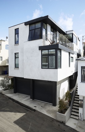
Graham’s vision encompassed the building’s architecture as well as its interior design. Her architect father-in-law generously provided the documentation and she became the project manager, overseeing the 18-month construction that started in June 2009. The resulting three-levelled, 185m² home reflects Graham’s design philosophy and provides a comfortable living environment for her growing family. It has a decidedly international and urban sensibility and wouldn’t look out of place in Sydney or London. Its lines are clean, colours muted and material palette minimal, and together these make for a timeless aesthetic.
For most three-levelled homes in Manhattan Beach, the entry is on the second level: an idea Graham dislikes.
“What happens is that the ground level becomes the forgotten space,” she explains. “To me the home would feel that much smaller if you didn’t include the experience of entering from ground level and walking up through the interior.”
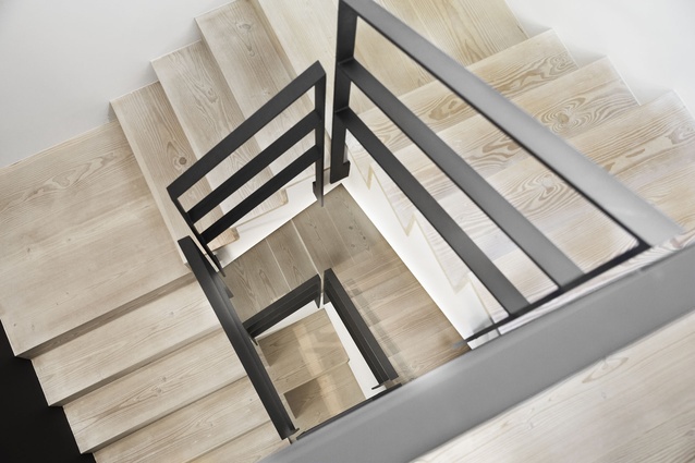
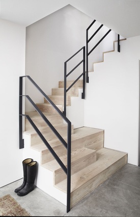
Instead of truncating that circulation path, Graham embraced the ground-level entry and made a feature of a centrally located winding staircase. This light and airy void connects each level and the ascension allows the home to be experienced to full effect.
Graham’s floor plan is neat and logical; an uncomplicated simplicity belies its challenging footprint. A foyer and study/guest room occupy the ground level, while the master bedroom and twins’ bedroom (Graham shares the house with her 39-year-old property investor husband and eight-year-old twin boys) and playroom are on the second level and the kitchen, dining and living areas are on the third.
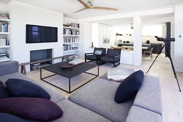
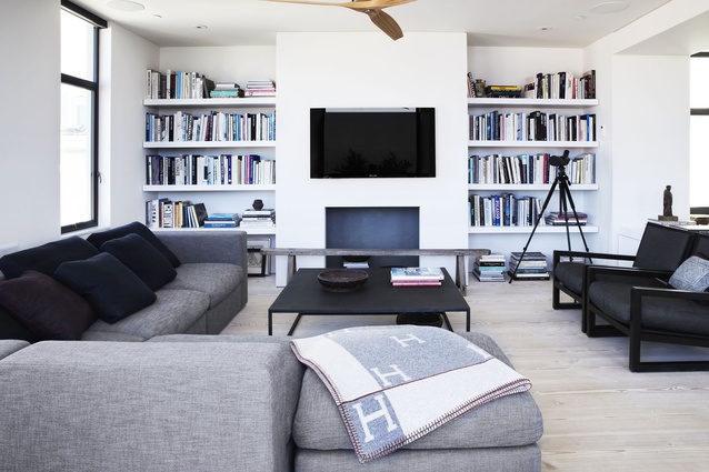
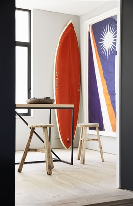
Graham chose to eschew trends in favour of a pared-back interior that functions as a neutral backdrop for antique or rustic furnishings.
“Just because I love something, it didn’t mean it was going to work in our house,” says Graham. “I had to ask myself, ‘What makes sense in this home?’”
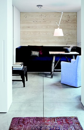
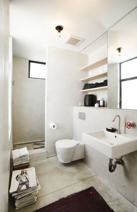
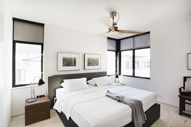
The ground level and all three bathrooms have smooth, matte-finished concrete floors and pale Dinesin Douglas fir floorboards in a silky, white soap finish span the length of the other rooms. They were chosen to complement the white walls. “By including lots of polished materials and shiny finishes in a space, it can really create a cold feeling,” explains Graham. “But this timber’s chalky, raw look lends the home a sense of warmth.”
The designer cleverly continued the visual cohesion by incorporating the floorboards as a feature wall on the ground level and as open shelving in the bathrooms.

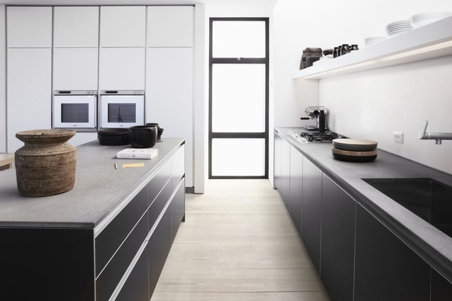
Charcoal steel window frames and balustrades were introduced throughout the home to add contrast to the predominantly white palette. It is the interior’s other resounding design expression and it lends the space an uncompromisingly modern dynamic.
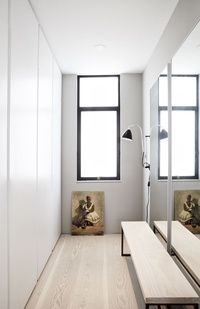
To make each room feel larger, Graham utilised built-in cabinetry as a space-saving storage solution and all interior passage doors slide instead of swing. These doors act as moving walls and further enhance the home’s uncluttered aesthetic. The dwelling’s minimal architectural elements and design accents are repeated across the three levels. This visual cohesion allows the eye to wander effortlessly from room to room, which also successfully extends the space.
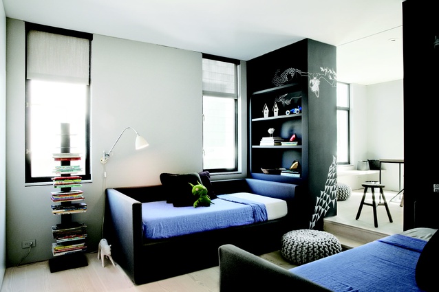
“A lot of minimal interiors are very unwelcoming and you feel you’ve got to put everything away once something is out of place,” reflects Graham. “Books on the open shelving in the living area, toys on the in-built bookcases in the twins’ bedroom, plates and glasses on the kitchen shelves – all add extra warmth to the home.”
It is also evidence of a space that is lived in and enjoyed. Graham’s home is a masterful study in elegance and restraint but ultimately it succeeds because of a thoughtful interior that serves its young family well.

