C1 Espresso
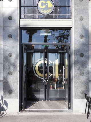
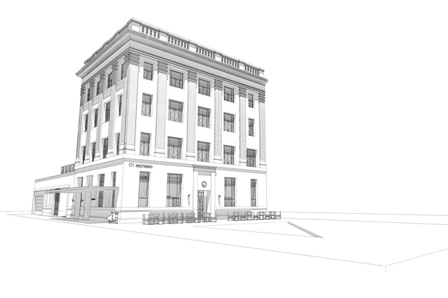
When C1 café was in Christchurch’s bohemian High Street, it was something of a local icon. Since its post-quake relocation to the elegant, art deco old central post office building at 209 Tuam Street, the atmosphere is a little less drum-n-bass skater punk and a little more grown up, but it hasn’t cast off all of its eclectic and rebellious disregard for convention, even if the graffiti murals, skateboards and radio DJ booth are gone.
What makes the refit rather unusual is that no professional designer was involved. The project was conceived and managed entirely by C1’s owners Sam Crofsky and his wife Fleur. In some ways it was a risk. Says Crofsky, “After seventeen years of history, C1 is no longer really ours. It wasn’t until after the earthquake that we realised how important it was to people and their lives. We agonised over every design choice, worried about people not liking it.” The new premises quickly moved out of the shadow of its former incarnation. “We didn’t want to replicate the old café – that would be like a franchise, copying the old style. The old C1 was born in the 1990s.”
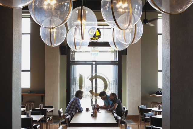
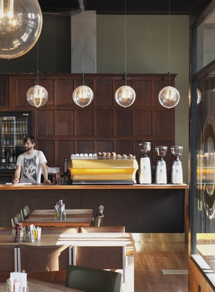
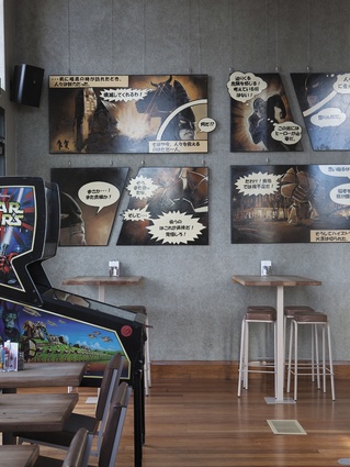
Much of the celebrated quirkiness remains – the original Singer sewing machine water fountain, the toilets concealed behind an automated sliding book shelf, the Manga-esque paintings on the wall and the pinball machines. There’s even a coin-operated horse ride to the side for a touch of gen-X nostalgia. Everything comes from elsewhere. Everything has a story. The light fittings, pure 1970s futuristic, were originally sourced from the Great Hall at the Arts Centre where they clashed horribly with the gothic revival surrounds. The outdoor tables, made by Juliet Arnott’s Rekindle Furniture, are constructed from timber and weatherboards recycled from abandoned houses from the red zone. The antique wood panelling came from a local demolished convent. The kauri and rimu for the inside tables came from a demolished building behind the old café.
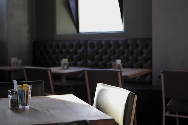
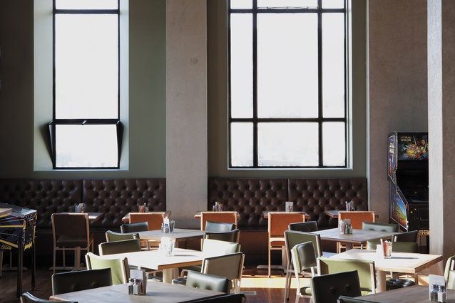
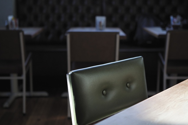
The colour palette is anchored in golds and mellow earth tones unified by a dark charcoal ceiling, reassuringly robust concrete columns in dove grey and walls of soft sage green. The chairs, brand new but made to look found, by a company specialising in institutional furniture, are covered in pistachio and caramel vinyl.
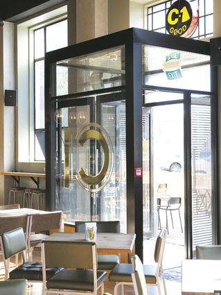
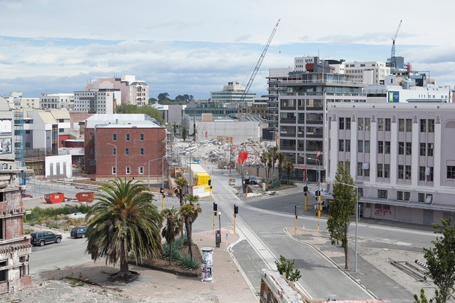
The high ceiling stud and large windows counteract the former small dark spaces of its former function as Alice in Videoland (Alice, a national treasure among video libraries, has moved next door with a connecting door), providing a light, airy space that counterpoints the strength, solidity and clean geometry of the walls and columns – reassuring features for those with earthquake memories. The hard rimu floors had lain hidden under Alice’s carpets and the high ceilings had been covered up since the 1960s. The two most important changes were Crofsky’s “two must-haves”. The original doors had become a drafty nightmare with the loss of so many buildings creating an open wind tunnel. These have been replaced by a small glazed lobby – obvious doorways are important in a community that likes to know where the emergency exits are. The second “must-have” was placing the baristas next to the entrance to greet people.
There are some responses to the site’s original function as a post office. Orders are sent to the kitchen through the vacuum tube system, and the coffee roastery occupies the old vault. Cafés in old post offices are not uncommon thanks to the cuts of the fourth Labour Government – indeed, it’s almost a cliché, but here it’s very subtle. “We didn’t want to be a post office-themed café,” says Crofsky, “but we still wanted to make those references.”
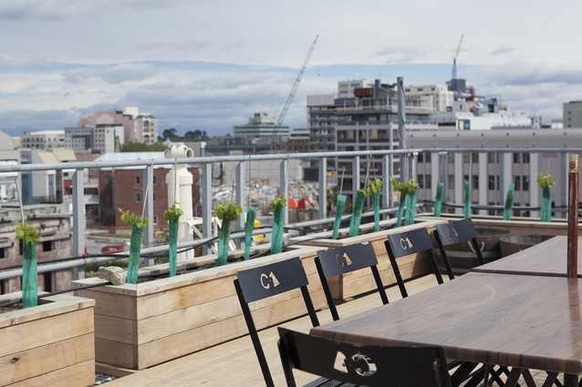
Also incorporated are some utopian features of the sort being loosely raised by architects and developers in the early days of reconstruction: an organic vineyard and beehives on the roof, back-up water tanks and a generator, and in winter warm air is recycled from the roastery through an air pump. The toilets are flushed using grey water. People talk about Christchurch becoming a model for New Zealand cities without many obvious signs of it happening – this development is one of the exceptions.
“We don’t act like New Zealand’s second biggest city,” says Crosky. “We act like the biggest small town in New Zealand.”
The café will always be an ambitious work in process, always evolving until it gains the patina of community of the old café. One future project and a quirky touch will be to clad the bar in Lego bricks – a nod to the old café where the cracks in the brick walls had been carefully filled with a mishmash of Lego bricks, a jokey earthquake strengthening, in the manner of Berlin artist Jan Vormann.
“There is a real opportunity to be the best in the world now – for the first time for Christchurch the world is watching now.”

