Bush modernism: Ivanhoe House
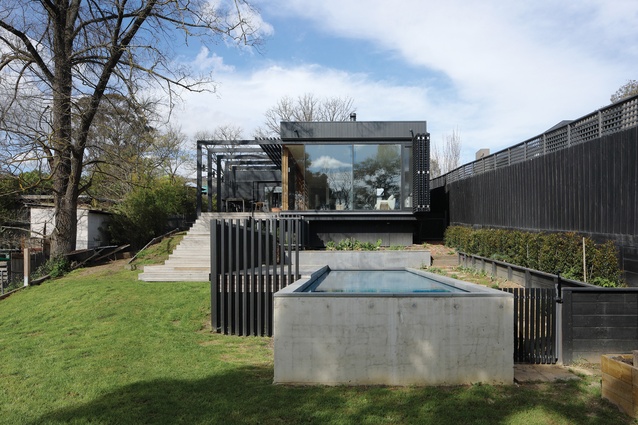
This “open and transparent” addition by Chiverton Architects is tucked neatly behind a weatherboard house, taking inspiration from the client’s love of modernism and fond memories of growing up in a Merchant Builders home.
It would be somewhat glib to say that every project is different. It’s almost a given that each house designed by an architect will be in some way unique. For some projects, the point of difference may stem from the architect’s approach; for some it’s in the response to a complex brief or a challenging site. In the case of Ivanhoe House by Barnaby Chiverton of Chiverton Architects, the client is such a strong presence in the architectural outcomes that the result would be inconceivable without them.
Located in Melbourne’s leafy inner north, this project is a discrete addition tucked neatly behind the original weatherboard house, which, in the client’s words, is “being held together with bits of sticky tape” and will receive some love in a following round of works.
The brief was to create a two-generational home that was open and transparent, one where “we didn’t have to walk into each room and turn a light on,” says the client. It was also important that the design maximized opportunities for the curated display of the client’s curios and artworks. These facts would be an ample springboard for any architect; however, the client also shared fond memories of growing up in a Merchant Builders home, with its openness, rustic brick and warm timber finishes.

The client also has a love of Danish architecture, formed while living in Copenhagen, and is a contemporary jeweller of some note, drawing inspiration from Australian bush forms and focusing on exploring materiality and detail. The architect appears to have taken all this in his stride, noting that the design process was open and collaborative, developing over multiple iterations until everyone was happy.
That the brief wasn’t overwhelming is evidenced by the easy way in which these elements have been woven together. There are the clean lines of the very Danish timber-clad forms, stepping politely down the bushy block in a manner reminiscent of Merchant Builders homes. There is also the planning of the addition. Two Danish-style courtyards were created; one acts as an entry forecourt to the south, the other as a garden courtyard to the north.
This clever move provides a clean separation from the existing dwelling, with only a walkway linking the two buildings, reducing the works intended for the project’s next phase but also leaving space to add further rooms in place of these courtyards should the brief for the next phase expand.

The existing entry, found where you would expect it on the original home, has been abandoned and a new entry subtly inter-rupts the walkway connecting the old and new spaces. To the east is the existing home (for the next generation of family), while heading westward and down the slope are the new spaces (for the current generation). At this juncture, a solid double-brick wall adds reassuring weight and seems to anchor the new form to its site as it transitions from hugging the contours of the site to gliding gracefully above them.
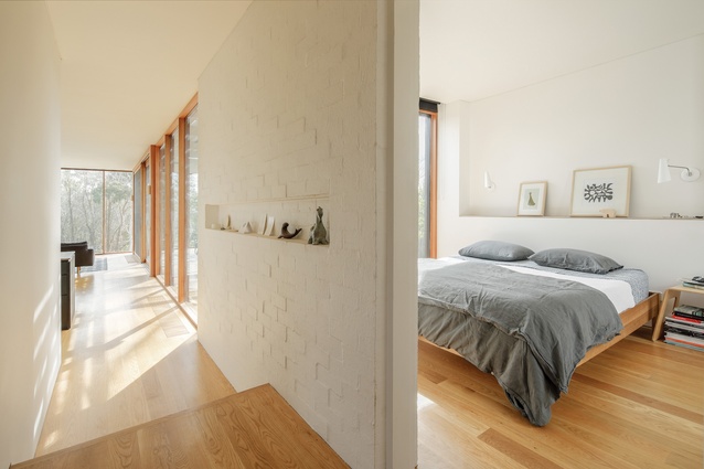
There is a pleasing irregularity ( à la Merchant homes) in this lightly bagged brick wall, something that proved quite a challenge for the perfectionist bricklayer. The team developed a system in which the bricks were laid perfectly, then carefully knocked out of alignment as the mortar set. The result was worth the effort.
The brick wall also reinforces a threshold between the new bedroom and the main spaces. Just beyond this wall, the bedroom exists within a curious zone of full-height glazing shielded with both fixed and operable timber screening. The effect is striking, with the views to the kitchen garden and down the length of the block toward Darebin Creek creating such a strong flow through the space that it almost seems unreasonable to expect the bed to stay put.

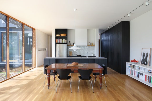
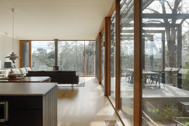
The living areas are contained in a single tall volume executed in a warm and restrained palette. The kitchen joinery is subdued and finished in the same dark-painted vertical cladding as the external walls, while the south wall is bare except for a low bookshelf-cum-gallery space for leaning artworks against. The heroes of the room are the enormous windows that capture the best of the bush block to the north and west.
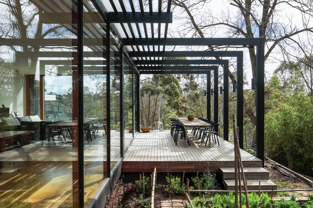
Barnaby notes that among a host of ecologically sustainable design measures, shading these windows effectively was key. The west windows, both in the living room and the bedroom, have full-height batten screens that can be pulled across to moderate the heat, while on the north, pergola shading provides protection all year round.
This alteration and addition came with a suite of potential distractions for the architect. However, Chiverton Architects has successfully synthesized all elements into a composed and unique reflection of the client.

