Broadcast from the future
Sarosh Mulla steps into the impressive refurbishment of the state broadcaster’s headquarters.
Several media outlets have reorganised their work spaces in order to better reflect the changing nature of the sector and new modes of media production.
Both Mediaworks and NZME have recently restructured their businesses and have taken the opportunity to demonstrate this change in the design of their spaces. Adding to this trend is a reimagining of the TVNZ headquarters in Auckland, which was recently opened by Prime Minister John Key, alongside the Minister of Broadcasting, Amy Adams, and TVNZ’s chief executive, Kevin Kenrick.
The renovation of the 26-year-old building was carried out by its original designers, Warren and Mahoney. At the time of its construction, the original building was an innovative example of an atrium-focused office building with a distinctive central staircase and strength in the way it commanded its position on the busy corner site.
But it was constructed before the internet became such a pervasive part of our existence and, therefore, required a substantial internal remodelling to be able to bring it up to the standards required in a fully digitised era of media production.
The continuity of engagement between TVNZ and Warren and Mahoney can be read in the way this internal transformation has been carried out with respect to the original structure of the building (and its quintessentially 1980s’ chrome-panelled lift).
Technically there have been major developments in the way content is created and released to the public through a range of online formats. In particular, a fully-integrated content delivery system enables the automated delivery of video, both to online platforms, such as TVNZ On Demand, and the on-air services, such as ONE News. These advances have required the upgrading of digital services within the building and a rethinking of how the premises will continually transform as these services change in the future.

Driving this transformation has been a conceptual desire to create a workplace and public institution that is ‘open and live’. Kenrick notes that “we wanted more than just an office: we wanted to create the home of New Zealand’s video content. News is the foundation of our content offering and it’s now proudly showcased at the heart of our building. Visitors will be able to feel the unique buzz and energy that comes from a live media environment.”
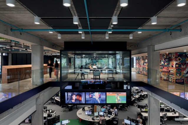
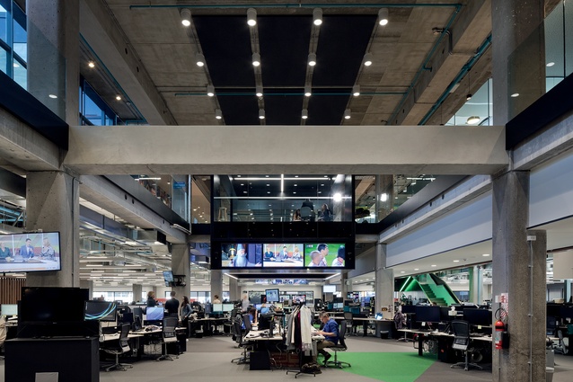
The importance of news reporting at TVNZ is consolidated within the replanned spaces. The news teams were separated previously and as a result faced difficulties in collaborating. The larger newsroom now accommodates all of these teams together in a planning arrangement that mimics the flow of information from the news team through to the central editing desk.

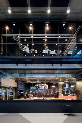
The visual connection of the newsroom from other parts of the building, particularly the central atrium, is also improved. Double-height volumes are created as part of the existing concrete structure by removing sections of floors within the structural grid, further connecting the newsroom to other spaces throughout the building.
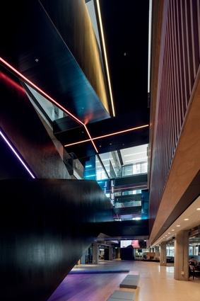
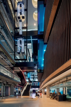
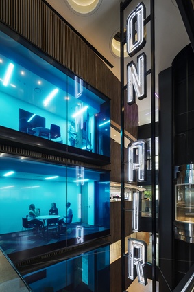
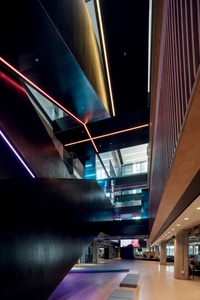
The renovation circles around the reshaped and styled atrium. The black interior finishes, linear coloured lighting and cantilevered neon lighting are drawn from iconic sci-fi film Blade Runner. The activity of the space supports this reference and separates this atrium from other banal corporate ones.
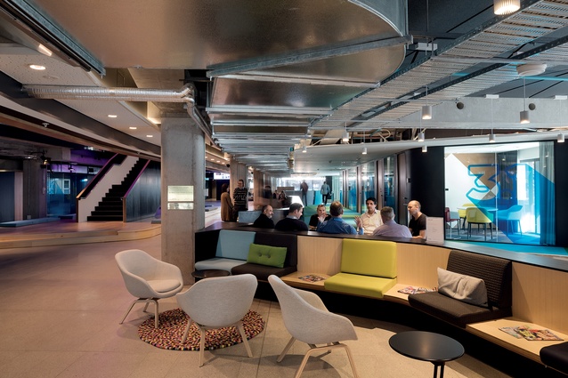
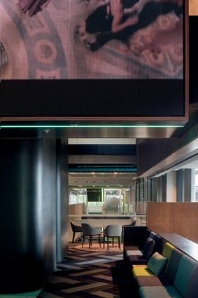
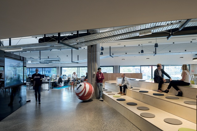
Aside from the neon lights and the graphic styling of this central space, the ground-floor atrium is cleverly-planned to demarcate zones for different activities without formal separations. Subtle level changes and integrated seating make the atrium feel both active and considered.
The colour and dynamism of the workspaces are at their best where the designers have stepped away from the standard. For example, different creative and content-producing teams are gathered around a serpentine table that jogs its way through an open floor. The number of staff accommodated is substantial, without resorting to a grid of off-the-shelf furniture.
Similarly, the coloured accents of the interior are vibrant and demarcate new attentions to the structure of the building, such as the new lime-green steel portals.

The renovation of TVNZ’s home highlights its complicated position between commercial entity and public amenity. It must compete – not only against other commercial media outlets – but also for the affections of the Government, in order to continue to provide its particular service.
This tension is not at the foreground of the interior design but it does exist in the spaces. The fit-out is not that of a banal government office, yet, at the same time, it lacks the ruthlessness of its commercial competitors. Instead, the design team has walked a line between creating a space that is both humane and professional for TVNZ.

