Behind the Object: Colour Theory
MAD Studio, a collaboration between Matt Liggins Studio and Angus Muir Design, talk about its installation for Splore Festival 2024, an object dedicated to colour theory.
Jacinda Rogers (JR): Tell me about your creative dynamic and how your working relationship started.
MAD Studios (MAD): It’s a long story. I first met Angus at a mate’s party in Kingsland in 2015, upon moving back to Auckland from Sydney. A few years later in 2017, my thesis student at James Russell wanted to build a light installation for his thesis project, and I told him to talk to Angus. He built a great installation for late night Art in the City and ended up working for Angus for a few years. The following year in 2018, I asked if I could build House of 9,783 plastic bags/house for the homeless 2 at his workshop in Avondale with a friend of mine, Kyle. He agreed and did the internal LED strip lighting for it. In 2019, he was running Bright Nights festival at the waterfront and asked if I wanted to enter. His team helped me build the Vitruvian Tunnel and then helped me set it up at various light festivals in the North Island. He also did the lighting for the Architect’s EGO Tower. In 2022, he asked if I wanted to collaborate on the Christmas Pavilion for Auckland Council, and my answer — “hell yes”. Then, in 2023, he helped do the lighting and install The Euclidean Tower for Splore 2023, with Colour Theory for Splore Festival our first collaboration from scratch.
JR: How did this Colour Theory installation for Splore come about? Was it commissioned or did the initial idea come to you first?
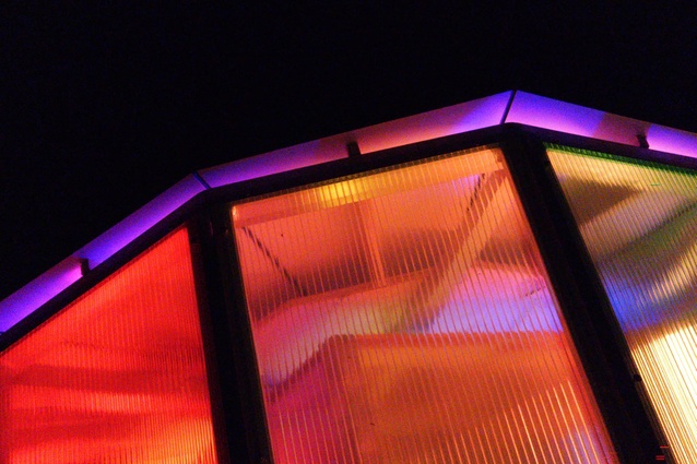
MAD: It was commissioned. In 2022, I had the front triangle section at Splore, then the [Euclidian] Tower the year after. The initial idea actually came when we did our first lighting test for the Christmas Pavilion and saw the amazing colour mixing from the vinyl-wrapped polycarb present shapes from the colour LED neon light strips — Bingo!
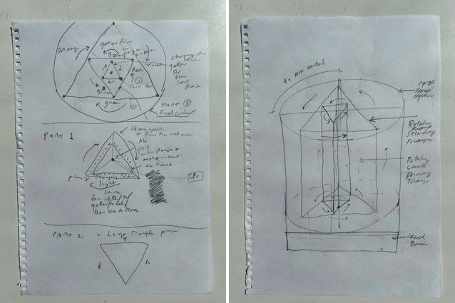
We said to ourselves there’s something in this! The original installation idea came from a sketch I did for the Objectspace plinth competition my friend Maggie Hubert said I should enter. It never eventuated but I did but kept the sketches among my evergrowing future projects.
When I was asked to do a new installation for Splore I met Angus at Daily Bread for a coffee and chat, with a pile of possible sketches and he chose the Colour Theory design. The rest is history.
JR: What did you want to achieve with this particular object or design?
MAD: We wanted to create an interactive, kinetic, light installation which subtly teaches the public about the theory, history, knowledge and beauty of the various colour combinations in the colour wheel and their inherent emotive qualities.
JR: What is the idea behind Colour Theory?
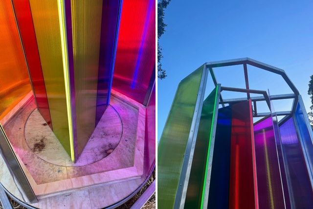
MAD: After numerous sketch design iterations of colour wheel and geometric prisms, the final design decision was to build the Goethe colour wheel.
In 1809, Johann Wolfgang von Goethe published Theory of Colours. The book is considered the first systematic study of the psychological impact of colours. This angle of approach led Goethe to also consider the effect of colour combinations — particularly of opposed colours. He posited that “diametrically opposed colours,” when placed side by side, would enhance each other. To more easily study and demonstrate these ideas, Goethe created a colour circle with equally portioned spaces for each colour.
JR: What exactly is the theory that has informed this object?
MAD: There are typically 12 colors on the wheel:
1. Primary colours: Red, blue, and yellow. These colours cannot be created by mixing other colors together.
2. Secondary colours: Green, orange, and purple. These are formed by mixing equal parts of two primary colours:
- Red + Blue = Purple
- Blue + Yellow = Green
- Yellow + Red = Orange
3. Tertiary colours: These are created by mixing a primary colour with an adjacent secondary colour on the wheel.
JR: Did you create many prototypes or did you land on this design quite quickly?
MAD: We did numerous sketches. We also kicked around ideas on WhatsApp chat until it turned into what you see today.
JR: How did you bring this idea to life materially?
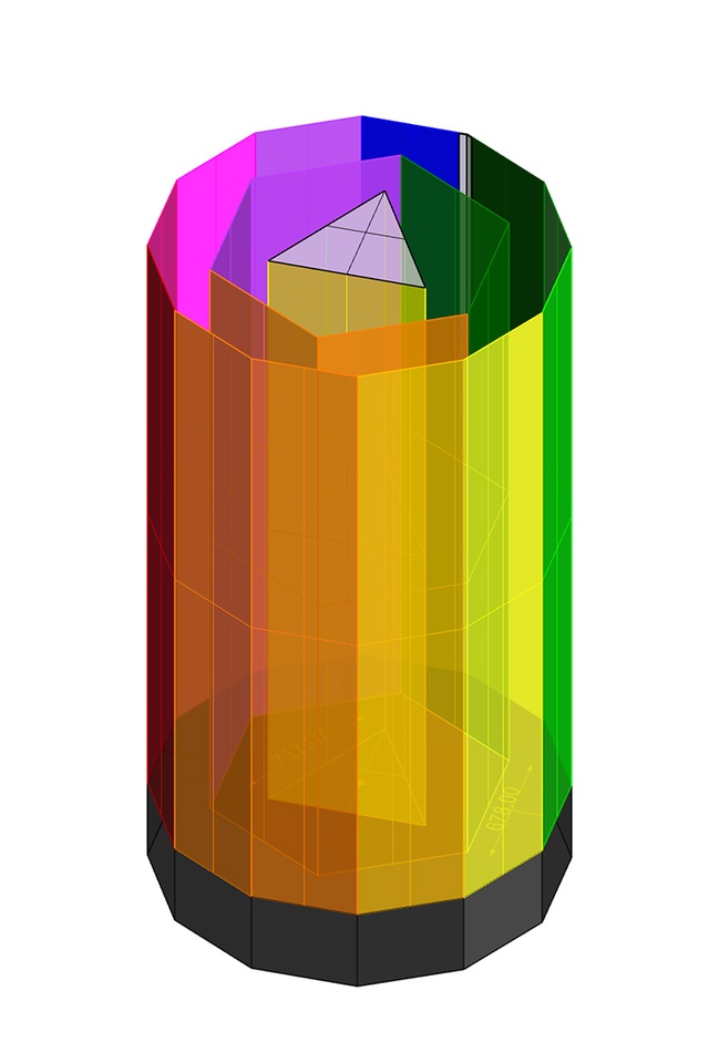
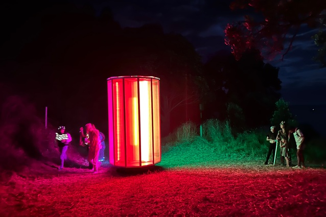
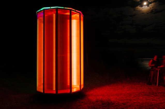
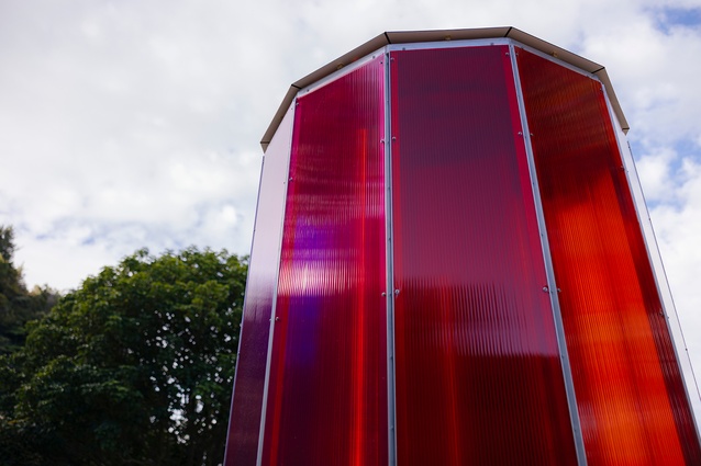
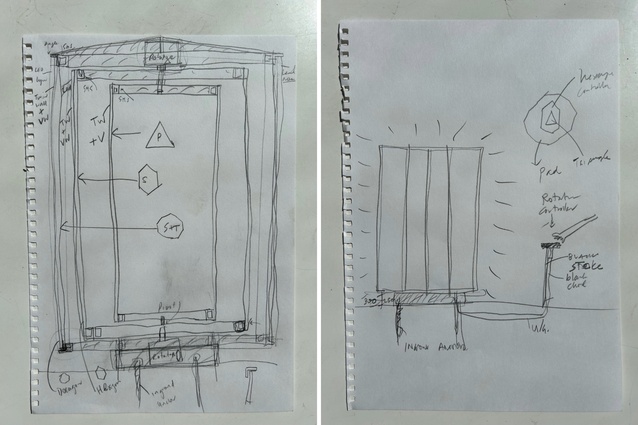
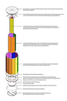
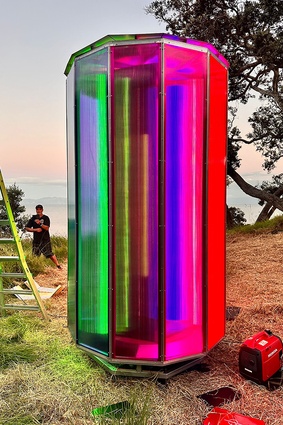
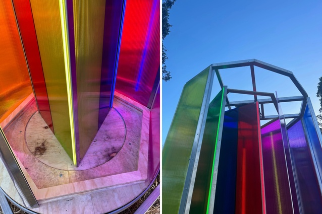
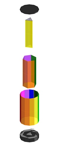
MAD: The Colour Theory installation consists of three layers of coloured transparent shapes. On the outside is a 3m high x 1.8m wide fixed decagon prism, within that sits a rotating hexagon prism and inside that in the centre sits a rotating triangular prism.
The two internal triangular and hexagonal shapes rotate independently from each other and mix the three primary colours of the triangle with the three secondary colours with the hexagon with the twelve colours of the primary, secondary and tertiary colours of the decagon to create an array of different emotive and impactful colour combinations.
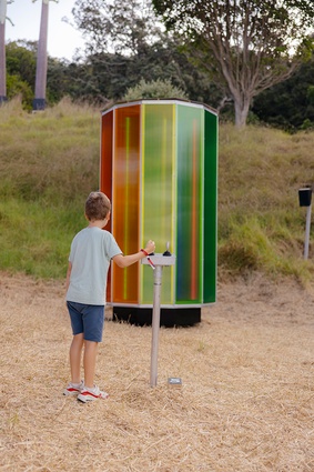
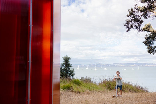
The top hung rotating triangular prism and the bottom hexagonal prisms rotate on two independent rotator motors, separately controlled by two joysticks on an aluminium control box mounted to a steel pedestal, allowing the public to create their own custom colour mixes.
JR: What was important to you about the interactive aspect?
MAD: The colour wheel theory is a fundamental concept in art and design that organises colours into a circular arrangement to illustrate their relationships and interactions. It’s based on the three primary colours — red, blue, and yellow — along with the secondary and tertiary colours created by mixing these primaries.
Understanding the colour wheel helps in colour mixing, creating colour palettes, and achieving balance and harmony in various visual compositions, whether in painting, design, fashion, or any other creative field.
The colour theory installation is designed to heighten awareness around the history, knowledge and beauty of the colour wheel and to create and enhance an understanding of the intrinsic role it plays both spiritually and psychologically across all cultures.
JR: Did you face any unexpected challenges or changes along the way when developing the object?
MAD: The design development part went pretty smoothly and quickly. I met Angus at his bach in Orere Point one day and we sat together while he smashed out a 3D Revit model of the installation in a few hours. Then he got Rob Jones on his team to draw it up for fabrication. Peter Hopperus made the steel and aluminium frames for the top rotator motor and the bottom rotator already existed.
The biggest challenge was getting enough tolerance for the triangle to rotate above the plywood for the hexagon base. Then the order of installation took a bit of thought… we called upon Alistair Munro of Alistair Munro Design who is super talented with the tools and together we did a test install in Angus’ workshop, testing it out several times before the installation at Splore.
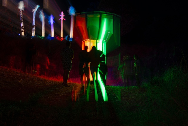
During the Festival, the joysticks got a hammering from kids so we need to fix that before it comes back out again. We have a few ideas to make the installation quicker by making a bottom triangular frame for the primary triangle so it can be pre-constructed, bought in, and fixed into place from the outside. We might also cut the triangle down a little so there is a bit more tolerance too. You live and learn!
JR: Do you have plans for any further collaborations?
MAD: Yes definitely. We are still young! Once we get Colour Theory back out and the dust settles, this is on the cards for sure. Angus is crazy-busy most the time, so the next collaboration will happen whenever he is ready. We hope to install Colour Theory for a few days and nights in Freyberg Place for late night Art in the City on 10-13 October. Watch this space!
Colour Theory team: Design: MAD Studio a collaboration between Matt Liggins Studio and Angus Muir Design; steel fabricator: Peter Hopperus; fabricator: Rob Jones; builder: Marc Logan; installer: Alistair Munro.
See more from the Behind the Object series here.
