A material experience: Balmain Rock
Taking a restorative approach to the renovation of a sandstone cottage in Sydney’s inner-west, Benn and Penna has composed contemporary materials to pay homage to the quality of the original historic home.
Balmain Rock by Benn and Penna is the product of a familiar downsizing story. In the pursuit of more efficient living after their children moved out, clients Vanessa and Chris decided to bid farewell to their large five-bedroom family home. They set their sights on an 1860s cottage in Sydney’s inner-west, originally built to support industrial workers associated with the neighbouring working harbour of White Bay. At the time of purchase, the house, with a number of shoddy lean-to structures off the back, was “very dilapidated” and in need of some attention.
In selecting an architect, Vanessa and Chris were determined to find someone who would work with them for the life of the project. “We wanted an architect who was willing to listen but also challenge some of our thinking,” says Vanessa.
It’s evident that this aspiration was met in the form of Andrew Benn, director of Benn and Penna, who expressed the need for the new work to be restorative and protect the significant history of the house. This respect for heritage resonates through Benn and Penna’s sensitive and thoughtful design, which acknowledges the importance of the site and its contribution to the urban character of Balmain.
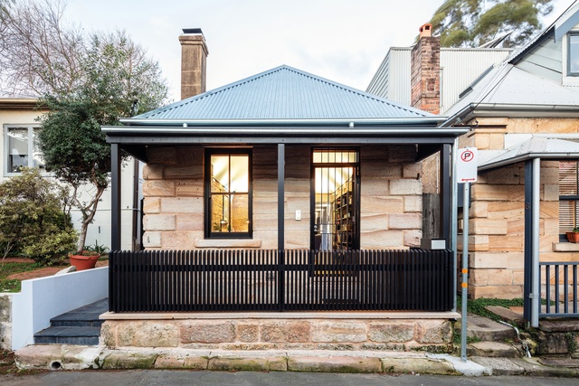
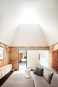
Approached from a narrow street, the original cottage has been transformed into the living room and entry to the house. The existing sandstone walls have been revealed and are celebrated through thoughtful details that work to respect the fabric of the original cottage. The most striking move has been achieved by replacing the roof and reconfiguring the ceiling geometry to frame a view to the sky above. The new ceiling appears to hover over the space, floating free of the sandstone walls. Vanessa describes the room as exceptionally special: “I love this room … when you sit here in the evening, you can look up and see the stars.”
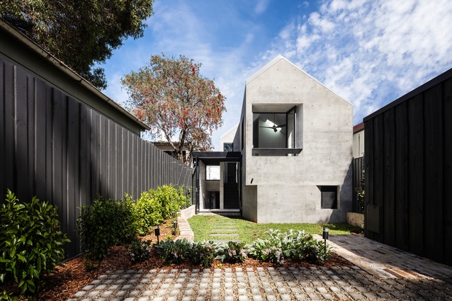
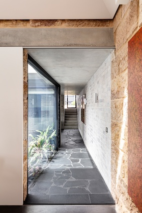
Moving beyond the old cottage, a clear logic is revealed, with the house organized around a central courtyard. The courtyard plays two important roles – first, allowing natural light to enter deep into the core of the house and, second, establishing “breathing space” between the cottage and the extension. This separation delineates the public living area located in the old cottage to the north and the more private kitchen and bedroom spaces of the new extension to the south.
The material experience of the house further acknowledges the distinction between old and new components. Three materials are featured, each playing an important role in communicating the house’s history. The first, the original sandstone, defines the experience of the cottage and helps to demarcate the “old.”
The material selection in the extension reflects a desire to pay homage to the quality of the sandstone cottage. “The real challenge was how to give this new building a connection to the old, without imitating it,” says Andrew. For this reason, the remaining two materials are of the same “family” and mirror the quality of permanence associated with the sandstone.
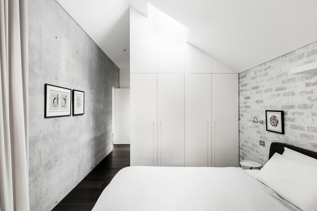
The second material, concrete, is introduced in the transition between the cottage and the addition and defines the “new.” It appears as a lintel at the threshold and carefully sleeves into the existing sandstone wall. The heavy, raw quality of the concrete echoes the longevity of the sandstone. “The materials don’t compete with one another,” says Vanessa. “The concrete is silent but beautiful; there is a real calmness to it.”
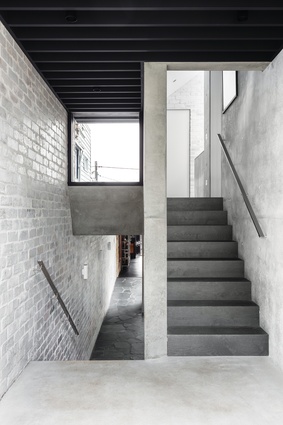
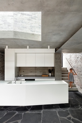
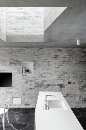
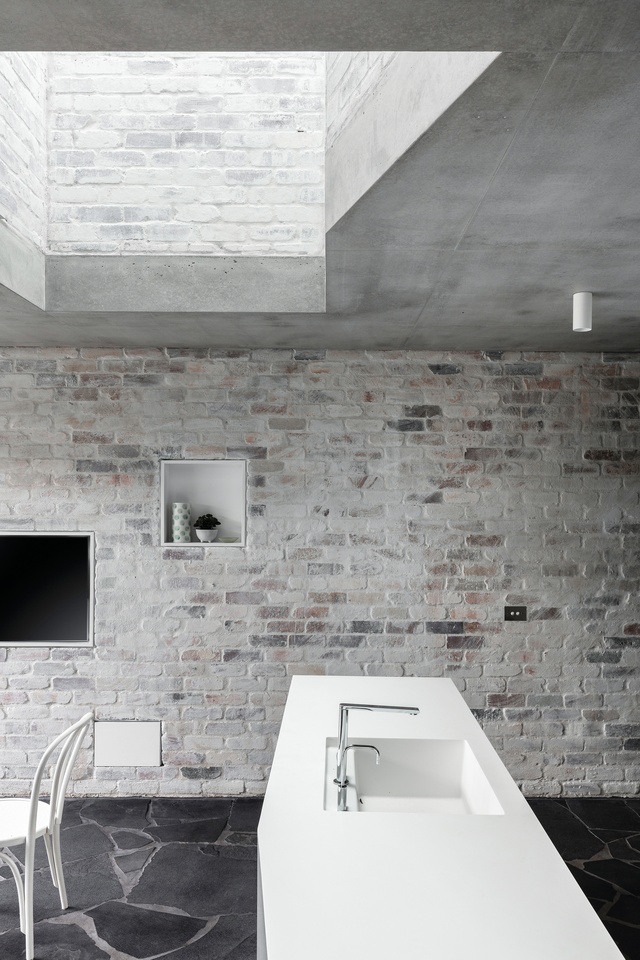
The third material, recycled brick, defines a generous light well that connects the ground-level kitchen and first-floor bedrooms. The whitewashed and lightly glazed finish tempers natural light while simultaneously hinting at the varied brick tones underneath. Andrew describes the importance of arriving at the right finish to ensure the tone of the bricks doesn’t compete with but rather complements the sandstone, noting the “many different samples” they tried before getting it right.
Cleverly negotiating the physical limitations of the site, the design is successful in optimizing natural light, cross-ventilation and views. This is achieved through a simultaneously complex and calm spatial arrangement that encourages light and air to permeate throughout. Strategic, borrowed views to neighbouring green spaces, tree canopies, vegetable gardens and sky constantly refocus and reframe, connecting the interior and exterior. These fragmented and framed views are fundamental in shaping the internal experience. “It’s what I love about every room,” says Vanessa. “From any space, I can see the garden, the cottage, the sky, the courtyard…”
Beyond a great architectural outcome, the Balmain Rock house exemplifies a genuinely collaborative process between the client and architect. Strikingly evident is the mutually respectful relationship that has developed over the life of the project, whereby the role and value of the architect is understood. “There was so much value in having Andrew involved throughout the process, to deliver the vision,” says Vanessa. “Engaging an architect during construction absolutely pays in spades. Otherwise, there is the risk you compromise on getting the outcome you have worked so hard to get to.”
Balmain Rock is built on the land of the Gadigal and Wangal peoples of the Eora nation.
This article first appeared on architecreau.com.

