AUT University environs
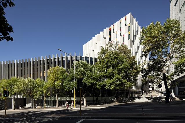
From an urban organisation point of view, this part of town had until recently been quite a different proposition. The Sir Paul Reeves Building, which now occupies the patch of central Auckland enclosed by St Paul Street, Mayoral Drive and what has now been dubbed Governor Fitzroy Place (formerly known as Upper Lorne Street), demystifies the surroundings somewhat. Primarily, this is because the building has been designed with an emphasis on making more direct connections between what were once convoluted areas of the university. Where the building now stands, there was once a collection of low-rise structures and service alleys. The building itself wears its organisational heart on its sleeve; the interior features a significant, bridge-crossed atrium; the entrance to the library has been enclosed by the atrium of the new building; the Wellesley Street plaza space has been brought into line. There is also a connection to a neat, and often sunny, ‘lilypad’ space that sits at a node of Lecture Theatre Lane. This, in particular, with its proximity to the quad, is a pleasant space in which students can gather and wait.
All that’s part of the narrower picture, but there has also been some significant axial alignment going on that makes more obvious the connections to the wider neighbourhood. During the last couple of years, the city council has achieved good results near this precinct: on (lower) Lorne Street the Architectus-designed shared space in front of the library, with those significant stair modules so admired by skateboarders, has friendlied things up no end; and this reworking of upper Lorne into Governor Fitzroy Place, which is, really, more of a small plaza connecting AUT’s Business School to it new building, is a strong directional incentive to jump the asphalt moat of Mayoral Drive.
Claire O’Shaughnessy, from Jasmax, the firm that undertook both the design of the building and the landscape architecture, describes working on the landscape portion of the project as almost akin to having two clients. AUT was paying the bills, but Auckland Council and Auckland Transport, who will maintain the landscape, also had input.
O’Shaughnessy says it was important that the new space connect into the shared space network, and originally there were thoughts that the space should be treated as downtown had been treated – entirely basalt, in other words. Jasmax’s position was that this was a different quarter – the learning quarter – so a different palette could be implemented that would indicate this change in use. The width of Governor Fitzroy Place offered possibilities for greater use, for functions or gatherings, for instance, should the need arise. That all said, when it came to material selections, the palette was kept to a minimum in recognition that “once you’ve got people in here it feels small”.
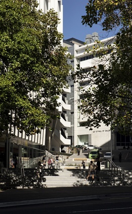
There is also a nod to the rest of the city in the use of basalt on the steps; elsewhere there is honed concrete. Restrained use of tactiles, textured surfaces at the top and bottom of Governor Fitzroy Place, indicate a change of zone.
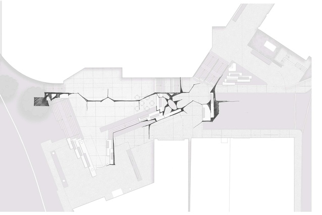
In the early stages of the design work, O’Shaughnessy says Jasmax worked with Hokianga-based artist Bernard Makaore. A sculpture by Makaore to be completed next year, an interpretation of an anchor stone, will elaborate on the theme of a “cracking” or “cracked landscape” that the landscape architects and artist developed.

“That’s where a lot of the cracking language came from. We had workshops with Bernard and his intentions quite nicely aligned with ours. This was part of the land that was gifted to the city for education by Ngati Whatua. So this was kind of the symbolism of the anchor stone – that it dropped in the land and cracked and revealed layers of native vegetation and the Wai Horotiu stream that used to run through central Auckland,” she says.
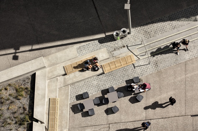
Given the cracking theme, and the necessity for a tough urban space that could handle the wear of thousands of students per day, the landscape works to Governor Fitzroy Place are necessarily quite hard. There are moments of particular interest in the geometric forms of the planters that pick up on the triangulation of the plaza’s main focal point – the great concrete cornerstone which supports the new building, the planters also reference the line of the underground stormwater works, and there are concrete bleachers, where timber seats, with a more rounded form, propose a more inviting place to deposit ones girth. O’Shaughnessy says that there were initial ideas about utilising more permeable surfaces; trails, for instance, across planted areas,
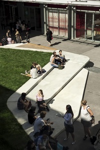
to try and find “moments for softness”. For the most part, the node’s busyness countered this possibility, and emphasis was instead placed on making sure the pedestrian axes worked, softer moments do however exist in the form of a rain garden, where the place connects to Lecture Theatre Lane. As you continue around the Sir Paul Reeves building, past the rain garden, and into this shady lane, you’ll encounter a softer, more curvaceous moment; an outdoor room. It’s a real highlight – a multi-layered, cantilevered concrete pad that gets plenty of sun. As the building curves through here, so too does this seating feature, which transforms what was previously a “nothing space”into definitely something, a well-used and popular area.
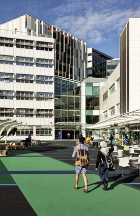
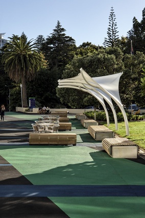
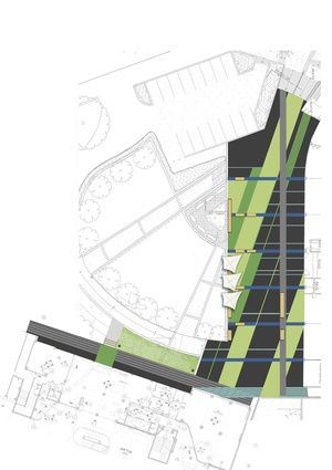
There is a final component to the environs of AUT. The Wellesley Street plaza, which feels like the natural entrance to AUT, whether it is or not, has had a temporary revamp. The space has been spruced up with some linear-patterned paintwork. The carpark below, once leaking, has been repaired, with hefty wooden furniture and sun shelters installed above, and space freed up along the building perimeter so that there is now new space to enjoy eating al fresco.

