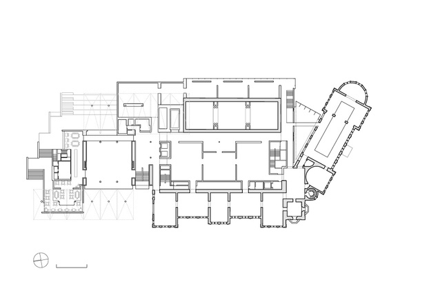
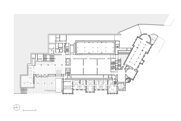
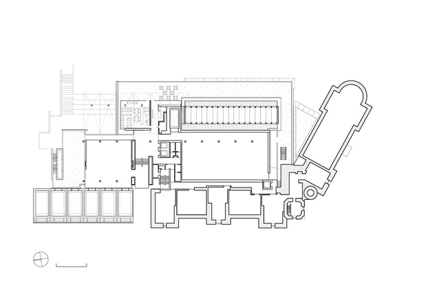
Auckland Art Gallery addition
Carefully nuanced additions to the gallery by FJMT and Archimedia invite graceful and unhindered navigation through New Zealand’s largest art collection.
Review: Marshall Cook, architect
“Architecture is a conversation between generations carried out over time.” – Vincent Scully.
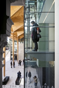
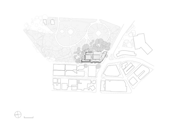
Few buildings can hold a corner and take command of their surrounding quarter as the old Auckland City Gallery does. Blessed with a quirky road geometry and its elevation above the Queen Street valley floor, the faux French Renaissance building juts forward from its corner on lower Albert Park to lord over the neighbouring streets. In all of its previous civic duties it has survived both political whims and numerous architectural scalpels. An 1887 competition-winning design by Melbourne architect Grainger and d’Ebro, the building’s mass, modulation, colour and scale was a confident symbol of Victorian Auckland’s growing stature. Originally occupied by the city library and then jointly by the library and Auckland City Art Gallery, the building contained some of the region’s great rooms. The original reading room was a calm, deftly lit sanctuary, the mood of which is etched in the memory of all who experienced it. The grand Carrara marble entrance stairs and polished balustrades, burnished by the backsides of a thousand schoolboys, were a reason in themselves to make a library visit a pleasurable event.
In the previous major makeover, the main entrance was moved from under the defining clock tower to the quieter precinct of Kitchener Street. The city library was moved across the street, allowing the gallery to take over character-filled rooms not originally designed for the display of works of art – and spectacular in their own right.
The new remodelled gallery brought about a change in attitude to the organisation. Visitor numbers dramatically increased, there was mute praisefor the architectural qualities of the remodel but, more importantly, there was a sense of ownership by the local cognoscenti. A factor in the revival of patronage was the socially interactive entrance courtyard with its noisy, gregarious fountain that prevented the cacophony of the city from intruding into the gallery spaces, contrasting with a nearby silent, wind-driven sculpture that gave off a sense of calm while contradicting the forces of gravity. Auckland City Gallery was a much loved and respected institution.
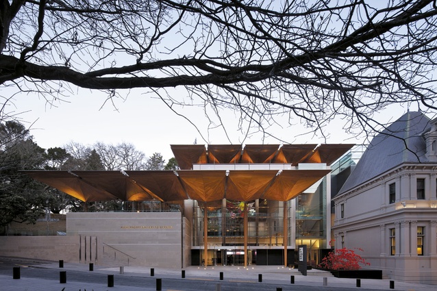
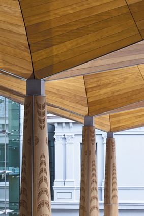
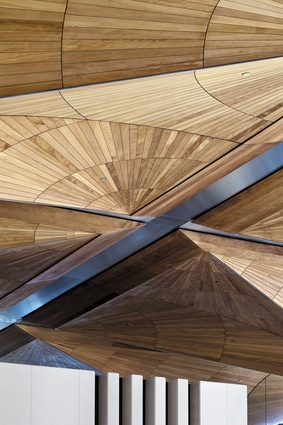
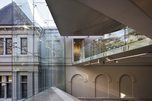
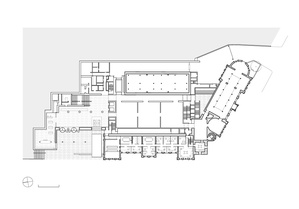
The newly completed additions to the gallery by Sydney’s FJMT in association with Auckland’s Archimedia, also a competition-winning design, have taken the gold from the existing gallery building, its memories and its strong, understated elegance and assayed them into another renaissance. The entrance courtyard remains in the same location on Kitchener Street but now it is surrounded by a glass wall modulated by a three-dimensional game of openings, solids and voids, topped by tree-like, sculptured kauri-lined canopies of surprising delicacy. Roof and canopies layer back from the entry square like repetitive bird calls withdrawing into the surrounding parkland.
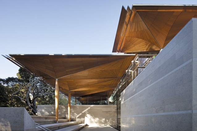
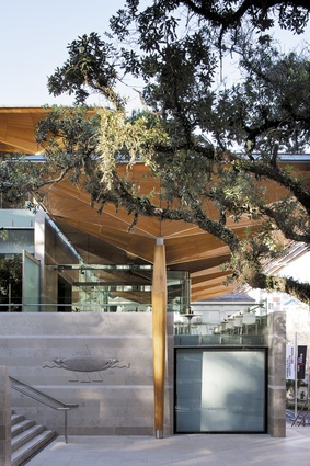
While the entry courtyard generously opens the gallery and the works within to the city, the walls to the park are equally demonstrative. The north elevation opens to prime pedestrian access up through the park, past the gallery cafe, children’s art classes and outdoor amphitheatre, to culminate at the members room and sculpture terrace at the top. The theatre of art is played out against the movement of impartial park users, adding to the resonant process of communication between man and nature.
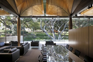
The nominal rear elevation to Albert Park is far from a building’s lesser face. It is richly articulated, solidly grounded and has a remarkable lightness created by beautifully judged facade articulation. On the upper levels, sensitively proportioned setbacks diminish the impact of the new additions under the shadows of the pohutukawa boughs. Topped by the elegant, full-length kauri vaulted roofs that hold the design, the upper and sculpture court levels complement rather than compete with the old established parkscape. It is satisfying that the roof vaults – the defining design elements that create the conversation between the new building and the city – also contribute to the connection between the old galleries and the new.
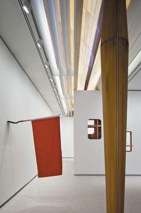
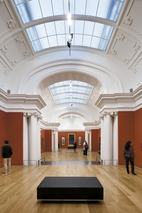
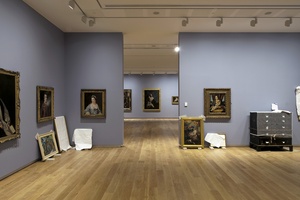
Although each series of galleries proposes a potentially different context for exhibitions, they carry touchstones of reference between them. Groups of galleries are defined by a timber-lined neutral portal and then comfortably navigated in logical progression, with the timber vaults appearing in some and old plaster vaults in others. In some galleries, seemingly familiar spaces from the past, subtle architectural detail from former iterations emerges as memory and quietly crosses the room. Although limited to the entrance zone and rear galleries, the highly patterned and richly coloured roof vaults have a presence throughout the whole building. They are acknowledged in glimpses throughout adjoining galleries or shards framed by the few working windows retained from the building’s past days as a library.
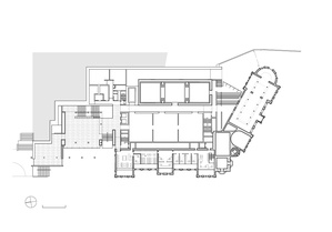
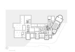
The reading room reemerges as its graceful old self and fittingly stamps its mark as the home for the New Zealand collection. A modified Edmundson Wing coolly maintains its grand scale among the more dynamic, flexible spaces of the new exhibition galleries. The prime connection of the galleries is the graceful and unhindered movement between them. There are no moments of discomfort or discord; there is simply an overwhelming pleasure in being there, even without the bannister to slide down.
As well as being the point of reference for all activities, the highly visible central entrance stair is the main distributor for all levels of the new and old parts of the building. Although now playing a supporting role, it has centre stage impact. The whole of the immediate surroundings are visible from it, as are the people ascending or descending, recognitions and echoing throughout the dramatically generous foyer, a space that is already a quintessential part of Auckland’s cityspace.
Washed by light and shadow, the sensual package of external materials, polished stone facings, dressed timber, bright stainless steel and matt painted plasterwork confidently reaffirms the remodelled building’s place in the city’s consciousness. The loss of the vigorous fountain to its mute replacement seems a reductive choice, as are the incongruous random-sized Turkish Jura stone wall facings and thinly veneered architectural punctuation marks that terminate the building’s footprint to the north. Traditionally, stonework on public buildings was regionally sourced, reinforcing local pride.
A more intriguing design gesture is the confused junction of paving materials. A mysterious invisible boundary line in the middle of the footpath randomly dissects the lightly coloured entry court paving from the established bluestone footpath and kerbing that defines most of the inner city. Maybe it’s an artwork by Billy Apple, without his precision. The delicate off-whiteness and sensitive joinery colours of the old building sharpened its shadow lines and defined it against the variegated colours of the park. It was always off-white and seemingly naturally so. The new colouration – a mushroom tone seemingly randomly plucked from a decorator’s swatch – has no reason and brings no familiarity.
Standing before the old gallery building and its new additions built 125 years apart tells us something about the values of our community: permanence, beauty and the right to pleasurable engagement with the artefacts of the city live on.
Review: Sarah Hopkinson, art writer
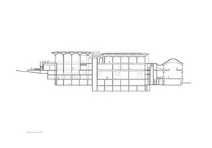
On the third of September, the Auckland Art Gallery opened its doors after an almost decade-long renovation project. The new building is an amalgamated structure; a mediation between the old building’s mixed architectural heritage and the desire for a contemporary civic building with aspirations to “cultural landmark” status. Walking through the new Auckland Art Gallery, what is immediately striking is how successfully the composite parts have been woven together and how easily one drifts through the different ambiences; there is little backtracking and very few dead ends. You can wander into grand new ground-floor galleries through to older, more intimately scaled historic exhibition spaces that have undergone major restorations, and out again into the atrium and onto the terraces, where you have the pleasant sensation of not noticing you are going outside until you are outside. This almost seamless journey is disorienting at times – this is not a space that gives up a sense of its overall form as you traverse it, due to its hybrid foundations.
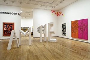
The balancing act that becomes apparent here is not so much that between old and new; rather, it is between spaces for “architecture” and spaces for art. The new exhibition spaces are very neutral; they look and feel markedly different, even disengaged, from the soaring pillars and airy glass of the adjacent atrium. This is not necessarily a bad thing, and certainly if it were the other way around there would surely be far harsher criticisms. There are also exceptions: in the new level-two galleries, if you look up you can catch glimpses of the kauri “tree canopy” behind the white ceiling, and there are three spaces for new sculpture commissions in the atrium and on the east and north outdoor terraces (currently occupied by South Korean artist Choi Jeong Hwa’s Flower Chandelier, Danish artist Jeppe Hein’s Long Modified Bench Auckland, and New Zealander Kate Newby’s I’m just like a pile of leaves, respectively).
I heard many comments from both architects and art-worlders about the detailing in the atrium and terraces, the already infamous canopy roof, the expansive glass, and the combinations of grey and alabaster stone.These are slick, distinctly designed spaces.It will be interesting to see how artists negotiate them, as art, especially contemporary art, does not always play by the rules. There will be projects, like Newby’s commission and et al.’s bunker-like installation in one of the new level-two galleries, that engage directly with and purposefully complicate the aesthetic of, and prescribed use for, a given space.
Of the concerns voiced by the art public after the initial plans were released for the renovation in 2005, two stood out, both born of dissatisfaction with the existing gallery building. The first was a simple lack of space to display the gallery’s sizeable collection (at over forty thousand artworks, it is New Zealand’s largest) not to mention Chartwell Trust’s extensive collection of contemporary art. The second was over the gallery’s ability, or then inability, to both make and take on large-scale international exhibitions.
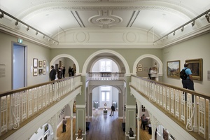
The former concern has been assuaged by the sheer scale of the new building – exhibition space has more than doubled – and the promise of regularly rotating exhibitions from the permanent collection in dedicated galleries. The opening exhibitions (a total of twelve) are exclusively curated from the gallery collections. They range from Toi Aotearoa – a chronological journey starting with contemporary New Zealand art and winding back to nineteenth-century depictions of “early New Zealand” – to exhibitions of French and British modernism, Victorian aestheticism, and the much-anticipated exhibition of artworks recently gifted by Julian and Josie Robertson. The latter concern is more complicated, as it not only identifies a practical problem, it also implicates the gallery’s curatorial vision. The new Auckland Art Gallery building is now fully equipped to handle large-scale exhibitions with a new internal loading bay, improved access and, of course, more wall and floor space. It is also a building that, as a cultural landmark, will attract a wider public.
But what is most exciting, at least for members of the art audience I have spoken to, is not the architecture itself, but the prospect of a curatorial team given the means to build an ambitious and engaging programme.

