Empathy materialised
How do you design for those grieving the loss of a loved one? We talk to Nicholas Auld of OTO Group Architecture, about how he drew from personal experience to transform an industrial steel box into a sympathetic space for those final and special moments between family members and friends, and the rewards and challenges that come with designing the interior of a funeral home.
What started as a relatively straightforward brief to remodel the interior of Aroha Funerals’ main headquarters in Ellerslie inside a charming old villa surrounded by trees, took a dramatic turn. Instead, the project brief given to Nicholas Auld by funeral director Janet Mikkelson was to create, from scratch, an interior design within an industrial building in Penrose, presenting a far bigger challenge to OTO Group Architecture’s head designer in how to execute an empathetic design.
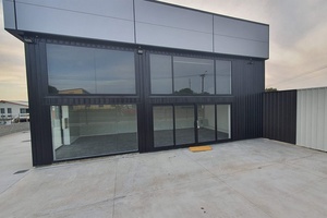
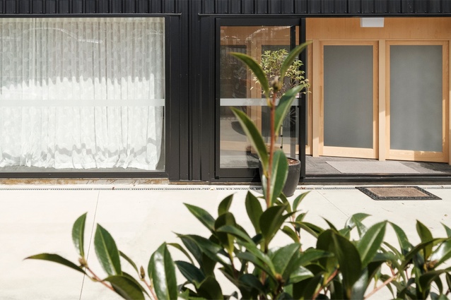
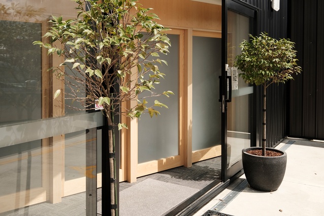
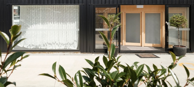
The building, described by Auld as a “tilt slab commercial building in a busy industrial area,” was to be transformed into a comforting and sympathetic environment for grieving families. “Not the kind of place I thought we were going to be designing for,” he adds. An austere steel façade surrounded by stark, flat concrete landscape, the site didn’t lend itself to the brief, saying of the first site visit: “My mind went straight to the question of how I could bring softness and welcome to a harsh and sterile box.”
So where does one start when presented with such a blank slate? In Auld’s case, he drew on his own personal experiences with grief. “Incidentally, Aroha Funerals had facilitated the embalming and funeral of my younger brother five years beforehand”. This informed the architecture studio’s detailed talks with the funeral directors and staff on how they curate different experiences for different families, noting “Everyone’s grief is different, everyone’s death is different.”
Out of these talks, they learned that from one day to the next, the funeral home might have three people or 30 people come to view a body. Another consideration was if the deceased would be taken straight home or whether this would be the only opportunity family members would have to see the body before the funeral. Auld says that the understanding gained from these talks was invaluable, expanding his comprehension of the complexities involved. “There are so many different conditions on how the process can be played out and the funeral staff are adept at being relational and understanding.”


Mikkelson said choosing a designer was diificult. “Our biggest concern before we worked with Nick was whether he would understand what we wanted. It was a difficult space that we were dealing with. We just had a rectangular box and we didn’t know if he would be able to make that more creative. Knowing Nick’s brother had died, we thought he’d have an appreciation for what’s important for people in terms of death, dying and the environment. Right from the time we met with Nick, we knew he understood how we wanted people to feel when they came in.”
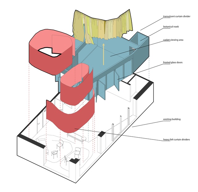
In terms of the design solution, importance was placed on ensuring that there were comfortable and private spaces to have those initial conversations — the unknowns being how many people were going to come, or how the space was going to be used. Says Auld: “To accommodate these unknowns, the end design is all about flexibility, while treating the funeral directors as set directors.”
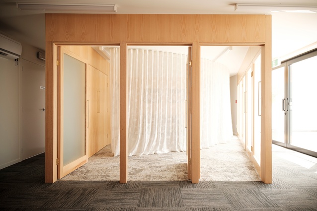
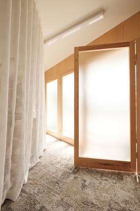
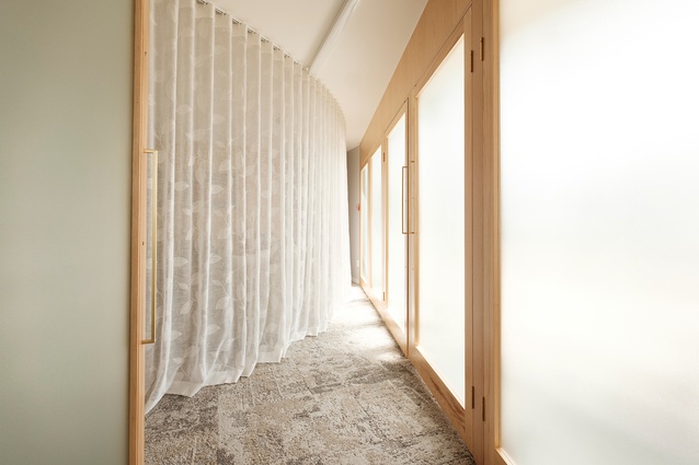
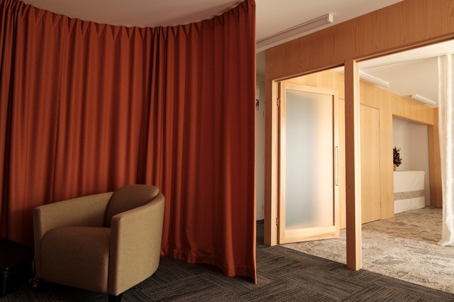
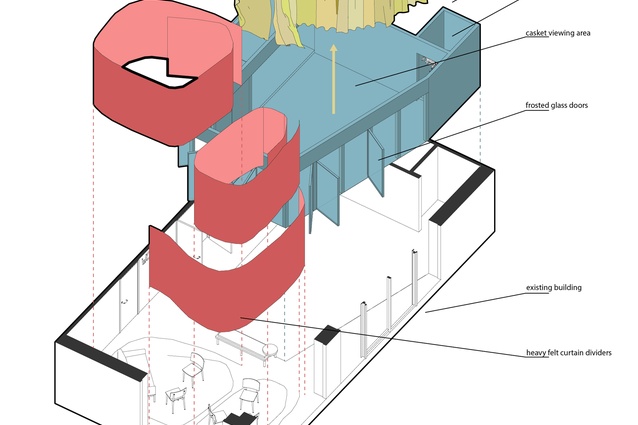
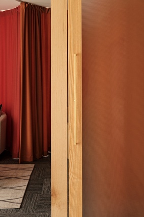
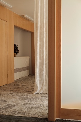
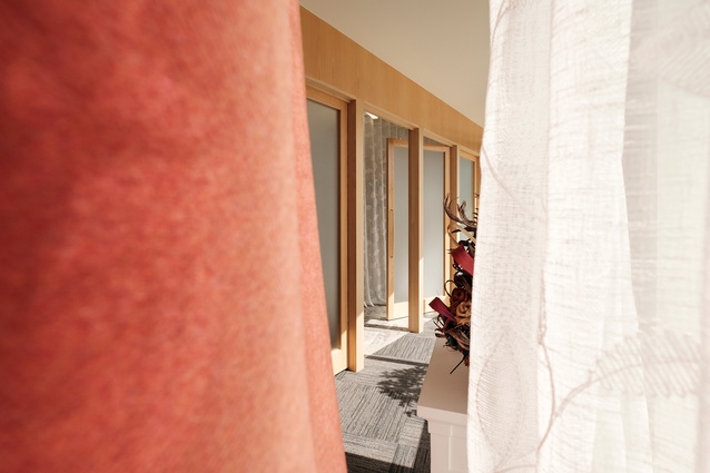
“They [the directors] can sculpt and curate the space to the mood that they feel works well for their next clients. For the meeting spaces, I used heavy felt curtains on curved tracks, which can be closed down to little, intimate cocoons for two or three people, or linked up, so you have five or more people. These curtains can further be opened up and reconfigured again, for even more people or different groups.”
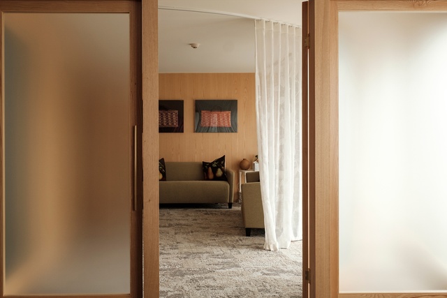
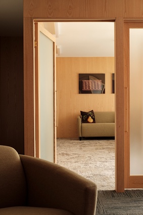
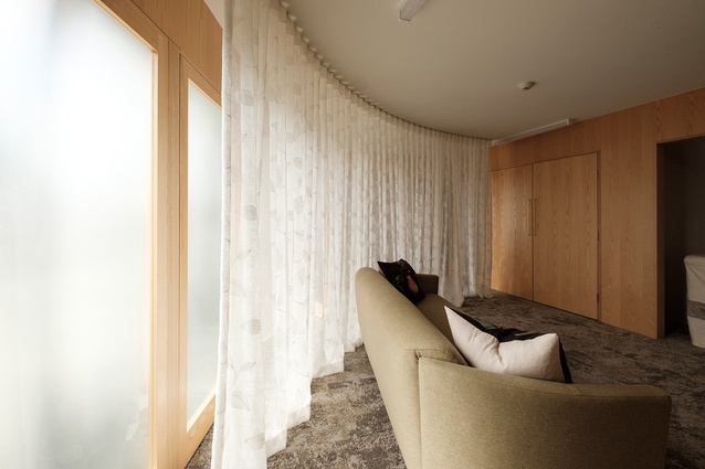
Another priority was to create comfortable, private and safe spaces to grieve within. Acoustics and lighting would be a main consideration in the design approach. “I thought a lot about the quality of the light and sound. The soft fabrics were important but the angles of the wood and glass walls were studied in detail to design an acoustic response in the room that absorbed sound.” The result creates what Auld describes as “a very warm-sound tone” and, in turn, creates a considerably restful and relaxing atmosphere.
“On a sunny day or a cloudy day, there is a unifying atmosphere of softness, warmth — and that time slows down”
- Nicholas Auld
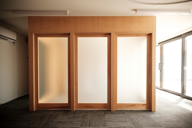
In regard to the lighting, this became more challenging when the OTO design team learned that they couldn’t remove the ceiling lights that the tenancy came with. Instead, they opted to design light reflectors to diffuse these [ceiling lights] and lean more into filtering the available natural light. The addition of translucent fabric and frosted glass offers further softness and diffusion. “On a sunny day or a cloudy day, there is a unifying atmosphere of softness, warmth — and that time slows down,” says Auld.
The clients are very happy with the outcome: “Nick was able to bring in shape and softness; from circular curtains through to his attention to lighting. Nick can look at something and see things that we couldn’t. What pleasantly surprised us was that when we weren’t sure if an idea was right, he was completely flexible to rejig it. It was really important that we didn’t just have to settle on one idea.”
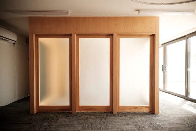

On completing the project, Auld says it’s the sort of project that he would like to keep working on, “as I feel I only got to touch the surface of the quality of space that I want to design for people grieving.” He adds that there is a real need for empathetic space in all manners of our society but particularly around the grieving process, siting Gunnar Asplund’s work as an important source of inspiration.
When speaking on the many “drab” funeral home settings around the country he feels they “bring down the experience of passing on a loved one.” An inevitable and extremely personal part of life, Auld says he’s been privileged to attend funerals at Purewa Cemetery and and Skogskyrkogården and that experience of “being able to come together with other grieving people, to collectively share our experience and say goodbye in a beautiful setting is something that I think we can make even stronger and available for more families.”
Although this was the first funeral home OTO Group Architecture has designed, the project draws from its residential and educational work. When thinking of common threads across his design work, Auld says he tries to “design in ease, peace and comfort in all his work”, with the task of designing this funeral home allowing him to lean into those particular directives while weaving in all the complexities of the brief. However, his main guidance was to ask himself: “What would I want if I was coming here to say goodbye to a loved one?”
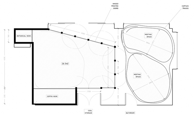
For OTO Group Architecture, the process has been immensely satisfying, receiving many comments from people who “hadn’t expected this”. Mikkelson adds that Auld’s creative and innovative approach to architecture resulted in a fantastic space. “I’m not very good at visualising things based on plans so the exciting bit for me was once it started happening. I just thought, ‘Oh my gosh. This is gorgeous.’ We’ve been here a year now and the families that have come here love it. It’s such a beautiful space. We enjoy showing it off.”
Learn more at www.otogroup.nz

