Architecture and sports shoes
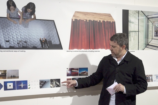
Stephen Olsen takes in the words of wisdom of Michael Lavery, a visiting speaker from m3 Architecture in Wellington for Crit Week.
Michael Lavery has the distinction of being a director of what must surely be the only architectural practice in ‘Austrazealand’, if not the world, to have its own shoe sponsor. In Wellington for the VUW Architecture School’s Crit Week, Lavery of Brisbane-based m3architecture, told the story of how the shoe sponsorship came about, at one of the public lectures being delivered at the school this week.
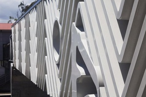
Presented with the challenge of enlivening a pedestrian piece of infrastructure by the Board for Urban Places and the Queensland State Government Architect – literally a footbridge between a railway station and the Queensland Tennis Centre – the response was to equate the array of warren trusses with the serendipitous pattern on the simple zig-zag underside of a rubber shoe.

The obvious choice was the Dunlop Volley Shoe – marketed as the ‘sole of Australia’, available in NZ at $24.50 a pair at The Warehouse and also described by Michael as the “roofer’s shoe of choice”.
The design that emerged ended up winning the state’s Karl Langer Award for Urban Design in 2011. The jury citation lauded the “rare combination of iconic form derived from the humble sandshoe in a well detailed prefabricated form that has provided a genuine place making outcome with style and wit”.
As a result of having said ‘yes’ to the project instead of ‘you must be kidding’, m3architecture also acquired their first, and very probably only, shoe sponsor. This provided everyone in the practice with pragmatic footwear that you might not choose to play competitive tennis in, but that perfectly reflects the purposes of a practice that has a reputation for framing everything it does around an idiosyncractic rubric of nine defining ideas.
Lavery played off all of those ideas during his talk at the VUW Architecture School by conducting a laconic tour of the full gamut of m3architecture’s associated projects, under the overall heading of Specificity That Surprises.
In turn the the audience were beguiled by the practice’s deployment of language, prompting Lavery to add to his initial explanation that the practice’s mental map of ideas had mostly been decanted through a Masters of Architecture that all four directors of m3architecture (three Michaels and one Ben, all old boys of QUT) studied for under Leon van Schaik at RMIT and completed in 2010.
“(Doing that degree gave us) new rigour to provide insights to our own work,” said Lavery, adding that assigning a fresh language to their idea-infused practice was firstly “a way to explain the ideas to ourselves and a way to hang on to things we knew to be valuable”.
“Initially we’d confirmed we were terrible with words but condensing them better described to us and other people how our processes worked. It’s been a roundabout way of getting to a better language”.
Lavery opened his talk with a disclaimer. “We’re neither educators nor academics per se . Our role is to get people excited about the architecture of buildings”.
He pointed out that other people can pick up the baton in broader allied areas such as housing. Another overarching principle he emphasised at the outset was the the active importance of creative collaboration, especially in order to “demystify” the notion of lone designers.
He then delved into m3architecture’s preoccupations and technique, as an overlay upon a series of non-linear, non-formulaic projects.
Prominent among these has been a strong core of work for clients in the education sector, notably the University of Queensland or UQ as well as award-winning work at St Joseph’s Nudgee College, a Catholic school for boys, and Brisbane Girls Grammar School (BGGS).
A lesson throughout is that “what’s not in the brief turns out to be as important as what is”.
Gutting and refitting an old lecture room at UQ became a spur to repurpose seats as ceiling panels and built-in desks as vertically anchored window shutters, also serving as a way into “highlighting things (and aged surfaces) that in the past had only been hidden away”.
At Nudgee College the informing idea of “extending conventions” guided the transformation of a tatty gym into a cocoon-like theatre.

Standard keystones available in plaster were used to reference existing theatre spaces around Australia, former palaces of dreams often with a meso-American sensibility. “We had fun with the geometries, and with mirrored surfaces to create a rich interior world”.
BGGS presented a site of 3D complexity, with the six storey Cherrell Hirst Creative Learning Centre traversing eight storeys of terrain.
It lent itself to becoming the fulfilment of an idea called the pragmatic/ poetic which saw a spatial conflagration of stairways translated into an ‘Escher-like’/ ‘Hogwarts-like’ solution to accommodate the circulatory daily churn of social life in the school.
As a joyful testimony to the outcome Lavery showed a video clip that becomes most remarkable in the last minute ( watch it here on You Tube ).
Other ideas that m3architecture resolutely pursue within their new rubric are expressed by words like hyping, extra-ordinary and subverting material. The ideas now have a life of their own that is in synch with news and old projects alike. Lavery: “The ideas are now starting to take precedence.”
Confronted with a long corridor? Think time tunnel. An architectural awards event? Think paper wall. Using a site that was formerly the home of a cinema? Think curtain facade on an epic suburban scale. Building a house embedded in lush green bush? Think mirror-clad exterior. Dealing with a dehumanised study hall? Think a forest of hanging lights with individual pull chords. No meaningful budget allocated for an internal fit-out? Think of no-brow construction utilising nothing more than different types and eras of plaster board.
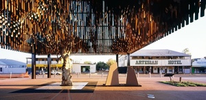
As a pièce de résistance in m3architecture’s gallery of projects it’s hard to go past the rural setting of their Barcaldine Tree of Knowledge project.
This resurrection of a landmark site of a grand old tree swept up a swag full of awards for public architecture, heritage and timber design.
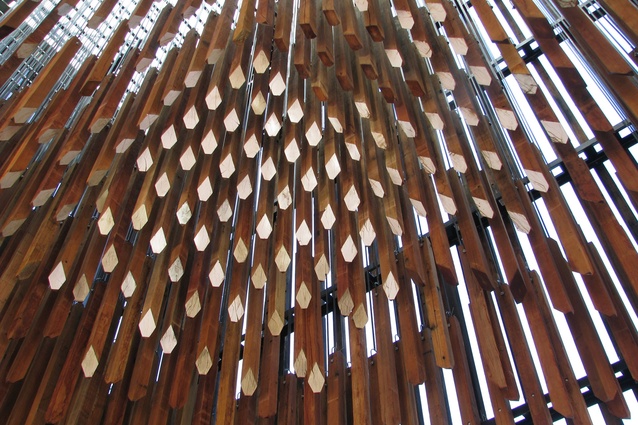
The design saw a grid-bound mecanno-like box occupy the full extent of the tree’s canopy at its zenith in the 19th century, centred atop the symbolic relic of its trunk and root-ball. This recreated the tree’s shadow on the ground and became what Lavery likes to call a “bush cathedral”. At its lower hanging fringes it is hung with timber-mobiles with the loudest harmonic sounds occurring in lighter winds and the external veil acting as a baffle if the wind picks up.
In its early phase the memorial project was lambasted in the regional press. Yet as Lavery joyfully noted it quickly went from supposed “eyesore” to souvenir status, becoming emblazoned on t-shirts and offering the historic township of Barcaldine a tagline: Thinking outside the box. Specificity that surprises – to a tree.
Lavery’s last two coda were the idea of being explicit – “if all else fails, tell it like it is” – and to follow trails that focus on the idea of finding humour.
Both qualities are easily found in a practice that continues to gently confound expectations - be that its office location in the former premises of a car show room and carpet warehouse, or its transgressive tromp l’oiel, or its willingness to take risks in public exhibitions and competitions through the Queensland Art Gallery (GoMA), or the outlet that m3architecture has found in contributing pieces of design to Small Australian Projects in the cause of engaging with and celebrating identity and environmental sensitivity.
Lavery is hopeful the legacy of a GoMA exhibition of 2009, a rebellious cemetery to commemorate Brisbane’s cruelly deceased cultural buildings and locales, will some day find its way into book form.
This would consist of publishing In Loving Memory cards that visitors to the mock grave-site were invited to write as a collective ode to things past. Thousands of cards were collected including such favourites as: “(In loving memory of) The old tree on Coronation Drive and behind the Arnotts Biscuit Factory. The smell – oh, that smell!”
One of the things that Lavery sees as a commonality between Australia and New Zealand is a “shared sense of humour that is both low key and dry”.
The fact that one of m3architecture’s Small Australian Projects is a tea towel designed to drape over an oven handle that depicts a roasting chicken is ample evidence of that.


