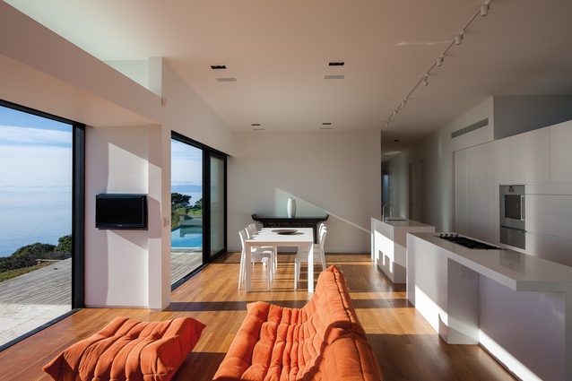
Architects in Profile: Daniel Marshall Architects
While the studio is influenced by Brazilian architect Oscar Niemeyer and Italian architect Renzo Piano, it is the distinctive New Zealand landscape that provides the greatest inspiration for Daniel Marshall Architects.
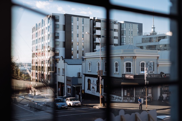
Justine Harvey spoke with Daniel Marshall at his studio on K Road in Auckland to find out how he draws on international influences and reinterprets them for the New Zealand environment.
Justine Harvey (JH): When did you start your practice?
Daniel Marshall (DM): About 20 years ago, in 1998. I’d just come back from travelling through the States, Europe and London for about eight months and I was wondering how one gets projects. They don’t teach you that in architecture school. Luckily, Nick Stevens from Stevens Lawson Architects gave me some small projects and it just started snowballing from that. I had previously worked for Richard Priest for about four years after graduating from architecture school in Auckland and before I headed overseas.

JH: Did you have any idea that you were going to have your own practice?
DM: Definitely. It’s an attractive idea because it’s creative. You experience the whole realm of architecture: the craft, the technical, the communication, the business, everything – which is challenging for me but it’s also interesting. Experience comes into play and you can conceptualise something a lot faster after 20 years. But you also know there are all these things that will happen throughout the process.
JH: Your studio’s grown from just you to its current size.
DM: Currently there are eight of us but that’s about as big as we get. As a sole director, I can take on only so many projects while still maintaining a personal connection with each of the clients. Our clients always have strong visions and, while you have verbal conversations, there’s a certain level of intuition that’s required.
JH: Do you have a particular approach to architecture?
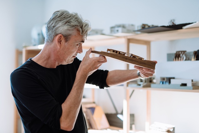
DM: I come from a fine arts background so there’s a painterly quality to my drawing. I did the Glenn Murcutt Masterclass in 2010 and realised that things go beyond rational. You incorporate a kind of still drawing board with 3D modelling and anything else you can get your hands on. I like the Renzo Piano idea of experimentation where you use one medium, take it to a certain point, and make a model, change it, go back to drawing and a computer model. So, a concept will always develop – it’s constant experimentation with an idea.

JH: How do you think that approach affects the way clients experience and appreciate your houses?
DM: The biggest thing that clients say to me is that the houses have a sense of calmness and harmony. I do think that, in going through that process, you develop a balanced architecture… or a balance between the landscape and what is happening spatially within. The Herne Bay House was designed after I went to Brazil. I’d always been a fan of Oscar Niemeyer and I was able to visit those concrete extravaganzas, which was pretty amazing. And, after being in Tokyo, the spatiality and the forms influenced my work too. You know, for an architect, that’s the most valuable thing you can do – bring that back to New Zealand.
JH: How do you interpret that into the New Zealand condition and the knowledge you have of working in this environment?
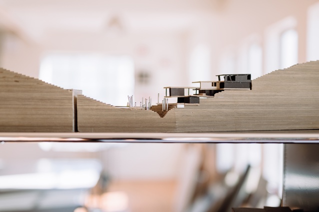
DM: I’ve always had an issue with the search for a New Zealand architecture, per se. Our cultural thread is always changing. And, for me, more importantly for sculptural form is the landscape. Even in an urban setting, we have such a distinctive landscape and I definitely respond to that and make an opportunity out of it: like the fact that all the sites slope. You have a rationale for creating different spatial relationships between each functional part of the house. So, we often have a ‘scissored’ approach, where you start at one level and go down and down, with the house ‘scissoring’ around a central core. It’s rational – you’re always in contact with what the topography is doing.

JH: Your roofs are often interesting shapes. It’s as though you are thinking about them in the fifth dimension, even if that’s not the case.
DM: For the Rongoa house we’ve just finished, it was very much the idea of creating some tension. If you pull the ground up, you’re creating a tension between the roof and the ground. If you’re pulling these things apart, there’s a tensile quality to the space within which you occupy. It has a very practical application: that we’re not just having big areas of roofs that stop but that go right beyond the wall so that rain water is flowing away from the building. And, if you’re following the angles, you’re creating different spatial qualities internally, from space to space.
JH: Do you have a particular approach when it comes to working with your clients?
DM: Most of our clients are very specific about exactly what they want. Usually, each one has a list of rooms they need and places where things would go. I will give them a concept plan, which is essentially an experiment that asks: “Will the things that you want fit in here? Yes?” And then you carry on with that so you achieve a good formal response that doesn’t have to keep changing to accommodate function. It’s part of having a succinct brief, which is really important… and making sure that as much as possible can be resolved within that framework. Often the site speaks a lot anyway so there is a lot of common sense involved. It’s like camping, you know. Don’t camp in a stream.
***
Herne Bay House
Auckland
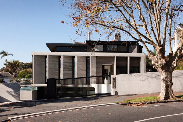
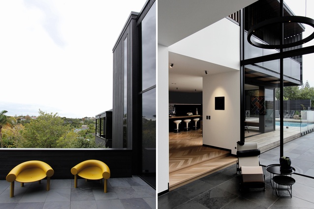
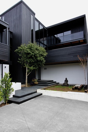
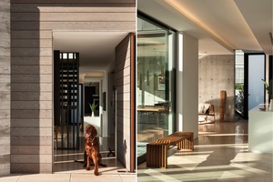
This project has been one of Marshall’s favourites and he describes the angles taken on this house as similar to those of the Pamela Place House. “It was sort of an untangled villa,” he says. Because the area at the time was considered to be heritage by the Council, “we took the idea of the verandah or the villa form and we just unpeeled it so the house started wrapping around itself.”
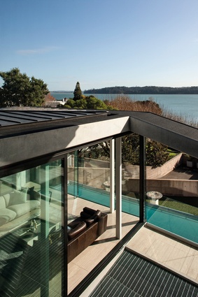
Sculpturally formed over three levels that rotate around a central core, the house abstracts a traditional street verandah with a series of horizontal weatherboard-impressed concrete fins. “This is the house that was designed after I’d visited the Oscar Niemeyer sites overseas,” says Marshall, “so it’s very strongly relating to the idea of monumental use of concrete.”
The structural concept is one of a ring beam, with a concrete soffit that runs right around the edge of the build, forming the gutter. “But it’s also like the design of a barrel, holding the whole building together,” says Marshall. “So, it ends up being actually quite efficient because it has this double ring beam that runs right around the edges.”
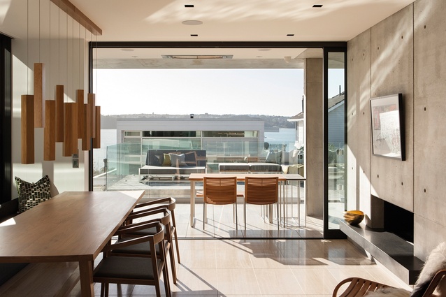
“We wanted the house to have views – it looks over a park on the way to the beach – but we had to be careful not to close it in for privacy. The garaging drops down a ramp under the living area, creating a central atrium, which is a void all the way through the house, so it has none of the usual suburban qualities.”
Aker Wood House
Christchurch
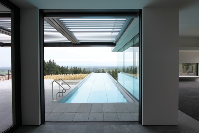
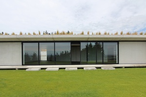
Aker Wood House is located on a 100-acre forestry block in the hills above Tai Tapu, with views across the Canterbury Plains from Lake Ellesmere through to the Southern Alps. The owner’s brief to the architects was to build a main house for themselves and a guest house for extended family, and a series of running tracks and a semi-public pavilion for their running club.
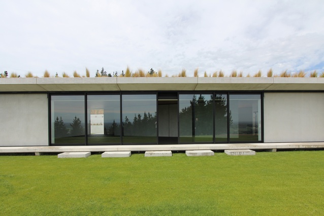
The main and guest houses are essentially three pre-cast concrete volumes, each of the same size, expressed according to each of their functions and outlook. These are connected via gable-roofed elements, creating a series of courtyards and axial views throughout the house. The entrance is marked by black-stained timber double doors, which have been CNC-sculpted to evoke the approach to a ryokan, a traditional Japanese inn believed to be the oldest type of hotel in the world.
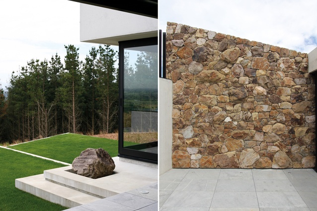
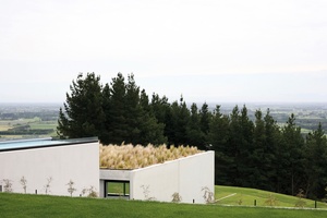
The house is approached via a narrow country lane. A wrapped courtyard faces out to the Southern Alps in the distance. A tussock roof helps anchor the pavilion into the landscape while terraces form a series of plinths that ties the entire complex together. “We terraced the pavilion into the slope and connected it to the rest of the structures by a wall built with stone we’d uncovered during the site excavations,” says Marshall. A lap pool seemingly leads to infinity, with an outlook over the tussock roof and the neighbouring forest.
Pamela Place House
St Heliers, Auckland
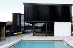
Marshall describes the original Pamela Place House, which was built in 1973, as “a Victorian Remuera house masquerading as a modernist house. None of the living spaces faced out to the landscape and everything was sort of tucked in – it was all back to front.”
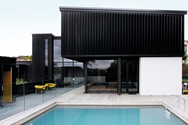
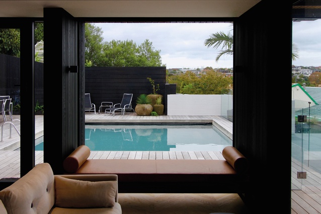
The two-storeyed house had a modern concrete-block base with cedar upper levels and a built-up landscaped area facing a pool. DMA’s transformation involved swapping the house around in terms of the living areas and adding a main bedroom, using the existing stair as a link for the new bedroom. “We used the new bedroom as a way of getting rid of the existing 1970s’ flat roofs, which were no longer functioning properly,” says Marshall.
The sitting room was kept in more or less original condition but all the windows and doors had to change, and all the cladding had to be replaced. “Both we and the clients were really happy that there was an existing condition,” says Marshall. “An existing constraint often pulls the best work out of architects. It’s a surgical thing and the change is also a dramatic process for the clients. I think that New Zealand has to keep pushing through the Victorian notion of relationship to landscape; it’s taken a while.”
Kororā
Waiheke, Auckland
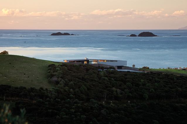
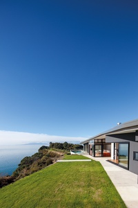
Kororā, meaning little penguin, is the name of a house built on Waiheke Island for Kiwi expats living in Hong Kong. The spectacular site, on a north-facing ridge looking out to sea, had a 4.5m height limit and a 300m2 footprint limit. “It was challenging to stick under this height and still achieve our brief, so it was the beginning of an exploration of the long gable,” says Marshall. “It’s really just tilted to reflect the terrain and the other elements fit in under there.”
A landscaped wall creates the entry, separating the access into the two pavilions and creating two courtyards, which are home to objects brought back from overseas. The smaller of the two courtyards is an informal arrival space, “so, instead of a hallway and a front door, we have a courtyard,” says Marshall. “It’s the New Zealand idea of an exterior greeting space that is more landscape than architectural.”
This courtyard is home to a water feature, which is bound by the house and the walls. “It’s what I love; having water as you arrive creates humidity but also sound as well as the visual aspect. It’s what architecture is all about – fire, water, earth, sky – the recurring elements.”
Our Palette
Materials and concepts
Daniel Marshall Architects thoughtfully designs and crafts each of its houses to maximise its sculptural quality and form a strong connection with the landscape.
Roof forms
Marshall describes designing roof forms as “like an orchestral process: where the area has the lowest roof, you would put the functional things like the back of the kitchen or wardrobes. It goes back to that really simple idea of a cave – go back for security and forward for aspect.”
Water
Water is an important element in many of DMA’s designs. With the Hollway House in Howick, the site had a spring at the bottom. “We had a notional gap and this idea of reinstating a natural flow of water,” says Marshall. “And that gap now has a cascading water feature.”
Fluidity of materials
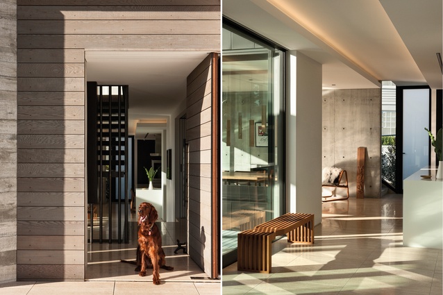
The Herne Bay House included travertine tiles, dark steel, timber and concrete. “We’ve always been quite fluid with our use of materials,” says Marshall. “I love concrete and the fact that no two pieces of concrete are the same but I’m happy to keep exploring.”
Secret weapon
Another material that Marshall uses is gypsum plaster. “It’s a plaster that’s been smoothed, almost burnished. It’s completely natural and has this incredible limestone quality. It absorbs moisture as well, which is perfect for the humid Auckland climate.”


