Anchored in the bay
A house in Auckland’s Castor Bay with an intrinsic rhythm and movement and a tad of local poetry.
When the owners of this Castor Bay house, Tim Duffett and Caroline Boot, were looking to build, they happened across the Strachan Group Architects-designed Boatsheds house in Takapuna. The stunning house, which won a national NZIA award in 2015, features black-stained vertical cedar pavilions and plywood interior walls and ceilings.
“One of our neighbours recommended builder Gary Bonham, who had recently finished Boatsheds,” says Duffett. “A visit to the property was arranged, and the minute I saw it, I knew it was the look I was after.”

The Castor Bay site presented a number of challenges for Strachan Group Architects (SGA). Long and thin, it runs east-west, faces south and has a cross fall of four metres towards the south. It is also surrounded by other homes on three sides and has a shared driveway.
“The view is also to the south,” says architect Roy Tebbutt, who worked alongside director Dave Strachan and graduate Joanna Jack. “This raised an issue around opening the house up to the view without subjecting it too much to the effects of the cold and prevailing south-west winds and still providing north-facing outdoor spaces and maximising natural light penetration.”

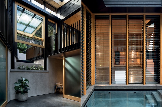
The challenge was significant and the solution proved daring: to break up the massing of the house and skew the axis of one of the volumes so that it presented more fully to the view. This had the added benefit of creating a wedge-shaped, double-height atrium with a glazed roof, which carries natural light through the house.
The atrium also forms a central circulation space from which to anchor all the other spaces, while adding visibility between levels and a certain embedded sense of energy and movement to the interior.
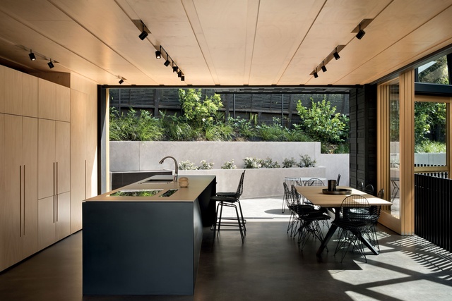
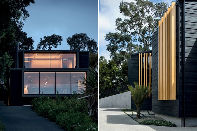
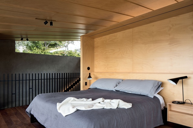
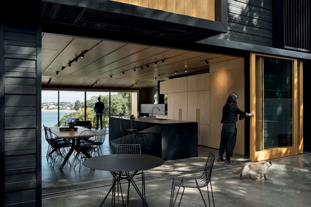
“Similarly, by treating the home as a series of stacked and staggered black boxes, we were able to situate the living areas on a ‘raised platform’ mid-level, giving the homeowners access to the view through the glazed southern elevation while creating meaningful outdoor spaces on the northern frontage. Below this floor is a basement level where you enter, and above it is a third level, which features a ‘crow’s-nest’ master suite,” says Tebbutt.
The home’s exterior uses some strong ideas to stitch the structure onto its context. Intended to mimic the lines of stratification seen in the cliff faces along Castor Bay, the cedar weatherboards were stained black so as to recede into the surroundings when viewed from the roadside and adjoining beach. These have been augmented by vertical cedar screens and fins in natural timber tones, which are both functional and highly aesthetic.

“Although situated in a beautiful seaside locale, the site is still a suburban one, so primarily the vertical screening serves to filter and edit the view of the surrounding houses while providing privacy and still allowing sun and light in where required,” says Tebbutt. “Externally, they serve as visual relief and modulation to the dark façade, juxtaposing the horizontality of the weatherboards.”
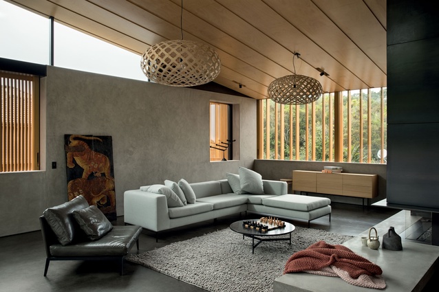
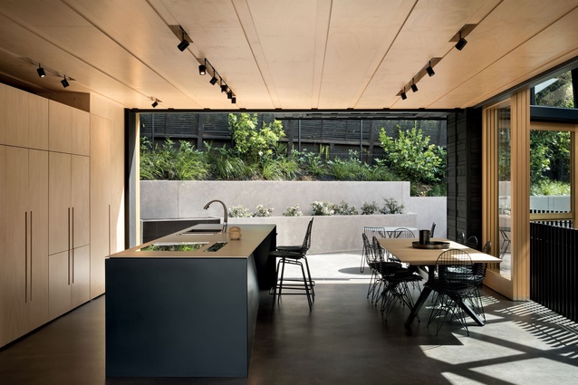
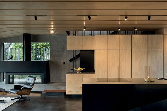
The pattern repeats internally in the treatment of the plywood ceiling. The use of plywood is a key feature of many SGA designs, and in this home, it was used to complement the rendered masonry walls, a requirement of the clients who had seen similar walls in Montana, USA, and were keen to import the idea into their home.

“The homeowners didn’t want a flat, monolithic finish for the ceiling, so we introduced large-format ‘planking’, which gave it character and enabled us to integrate the lighting as part of the ceiling system,” says Tebbutt.
This detail further activates the space, lending movement and a rhythmic pattern that modulates the reflection of natural light in ever-changing ways and directs the eye while accentuating the perspective.
Another ingrained philosophy in SGA designs is the careful consideration of green building practices. In this house, glazed areas are positioned over concrete floors and walls to create thermal mass, with overhangs, canopies and eaves created to allow low-angled winter sun deep into the building, but prevent summer sun from causing overheating.
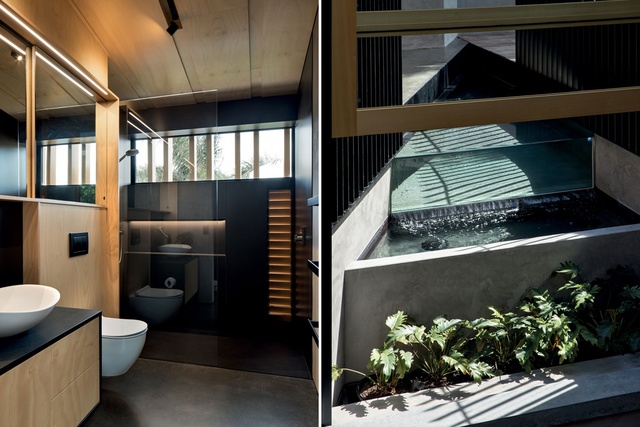
Natural ventilation is created through the use of low louvre windows on the southern façade and high automated hopper windows on the north; the cool air is drawn from the shaded side and flushes the hot air from the northern side by natural convection.
A cedar-framed, double-hung window in the atrium directs the gaze outdoors towards planting and a water feature. This area is a sort of juncture where materials and geometries converge, lending the space a sense of sculpture and abstraction – a Mondrian-like stillness bound by concrete, glass, timber, water and plants.
“The ‘lines’ of the architecture extrude out into the landscape and are trimmed with steel angles, with the pond contained within. The pond has a glazed infinity edge, with retained planters that cascade down below it towards the atrium,” says Tebbutt.

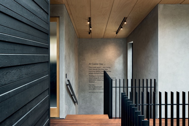
Both internally and externally, large timber planks line stairs, bridges and decks, creating a casual boardwalk feel that references the beach. And on and on… the motifs and gestures of this house, combined with what has become signature moves from the SGA gang, have resulted in an abode that is subtle, conceptual and meditative.
Duffett adds: “We really wanted the honesty of the materials to shine through and for the architectural details to speak to how the house connects to its setting. I can’t imagine a more successful example of this, which is why I chose to have a passage from Sam Hunt’s poem ‘At Castor Bay’ written on the wall — it is, to my mind, the perfect homage to what the team has achieved in creating a sense of place. It is the final element that anchors the house to Castor Bay.”

