An artist and an architect return to Europe
After two years of Covid postponements, Pete Bossley and Mir van Wezel headed to Europe for a six-week tour, getting up close and personal with Le Corbusier, Renzo Piano and Herzog & de Meuron, amongst others. Here, Bossley considers the first stage of their trip.
Three years is a long time to be separated from whānau and friends so it was with relief and gleeful anticipation that we were finally able to head to the Netherlands, France and Germany to catch up with family. Of course, for us, no trip is complete without copious doses of architecture and art. This time, we added trips to Firminy, Basel and Zurich, to check out some new work and revisit old favourites.
Is it too nostalgic to visit more Le Corbusier? Or more work by star architects? Are star buildings in themselves expressions of nostalgia? Is Architecture itself a form of nostalgia? Especially architecture with a capital A.
In the back seat of the car, I am alternately gazing at the countryside, sketching and reading. We have with us Colomina and Wigley’s book, Are We Human?1, and are enjoying their descriptions of our absolute immersion in Design, from 35,000 years ago, from Voyager 1 out in deep space beyond our solar system (and expanding our view of ourselves by a million miles a day), to deep within our gene structure. We humans are surrounded by design from unknown others; we are trying to define ourselves by design and, as it becomes more pervasive, design is tending to redesign us. We are trying to define and cope with the rate of change and impending catastrophes, many of which we haven’t recognised yet. There is a war with a madman going on just a few countries away. Mir and I are heading for Finland, which could be Russia by the time we get there (fanciful, but a possibility). In this pot-boiling maelstrom, are we wasting our time looking, again, at architecture and art?
The world goes on. Humans resolutely continue, for better or worse. As we drive from Amsterdam to southern France, millions of cars and trucks keep us company on the motorways, millions more tinder-dry trees struggle to sequester our carbon outpourings, despite heatwaves and unprecedented water shortages. We drive through a rolling countryside of withered maize.
We can’t solve all the problems through architecture but we can accompany the new conditions. It doesn’t have to be in the ways of our predecessors, certainly not with the same methods, beliefs or materials but with the same faith. It may be foolhardy but do we have a choice?
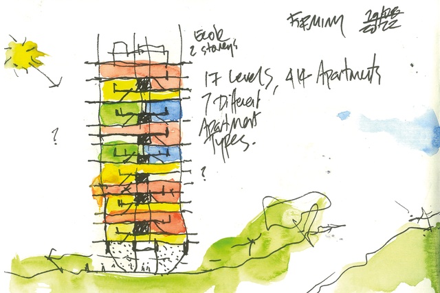
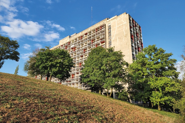
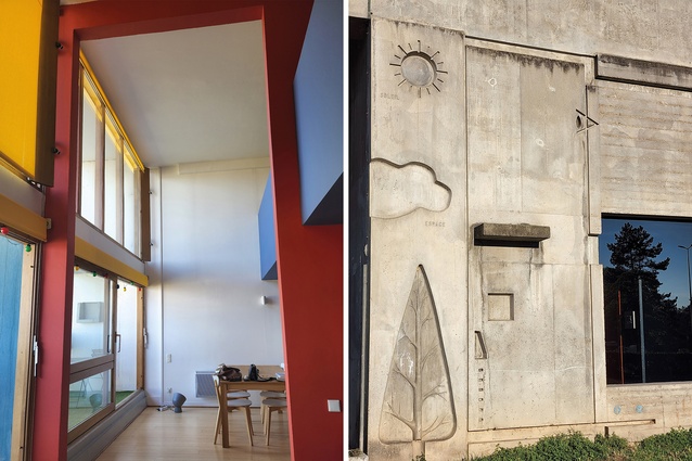
And, so, to Firminy, just south of Lyon: a small town which, during the 1960s, had a visionary mayor, Eugène Claudius-Petit, who believed in the potential of urban design and had a housing shortage to resolve. He commissioned his friend Le Corbusier, who proposed a city campus incorporating his well-trod themes: good health, sports, housing and the spiritual, with an abundance of fresh air and verdure thrown in. There was an athletic track, a sports stadium, a cultural centre, a church and, of course, another version of his Unité housing block, the fourth and final one to be built. A drawing in one of the lifts shows the plan of the building, surrounded by the equivalent green space which would otherwise have been swallowed up by traditional buildings. A relief cast into concrete near the entry proclaims Soleil, Espace, Verdure: wholesome aims, surely. As often with Corb, this is pedagogical architecture, not only offering us ways to live but telling us, also.
Whilst most of the apartments are still social housing, many are privately owned and we were lucky enough to discover one on Airbnb. The building originally housed 1600 people, now 1000, and seems remarkably original in most regards. The innovative apartments that wrap up over and under the central corridors (or Rues as Corb named them, to give them more status) are accompanied by other types, seven in all. Ours is one of the innovative wrap-overs, folded over the central corridor, with a double-height living/ dining area, and four bedrooms, stretching the full width of the building with terraces at each end. The famous cross-ventilation works, at least as long as the upper bedroom doors are open. Privacy does not seem a concern. The two main bedrooms are on mezzanines open to the living areas below. Do the French not have noisy sex? Or crying babies? Or do they just accept it?
Our apartment is owned by an architect, and it seems reasonably original, with colours similar to remembered photographs. It would be interesting to see inside some of the other apartment types, to see what sort of décor accompanies the wide range of domestic accoutrements visible on the terraces, what changes have been made and to what extent they compromise the original intentions. There is a sense of generosity engendered by the double-height space, unfortunately not obvious in newer social housing versions nearby which have no terraces, let alone two.
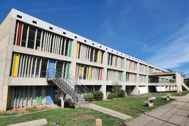
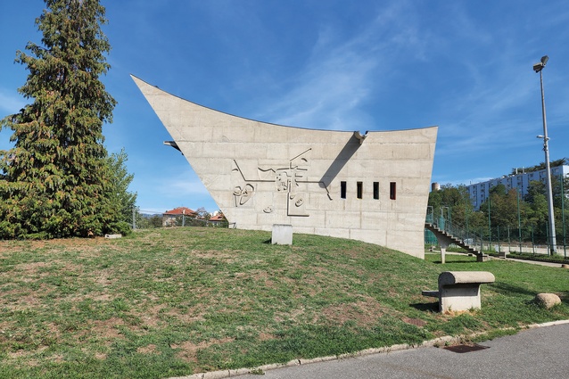
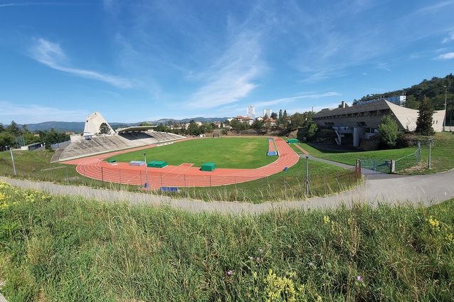
The cultural centre is the only building of the four actually completed during Corb’s lifetime; it was finished in 1965, the year of his death. The intriguing cross-section is generated from the raking walls which orient towards the running track, provide for the seating in the internal auditorium, and resist the tension of the cable suspension roof. No opportunity for architectural intervention is missed, from the rhythmic concrete façade mullions, generated with Greek musician Xenakis, to the delicate concrete stair supports, or the exterior benches with bulbous rolled backs like upturned musical notes, which also house downlights.
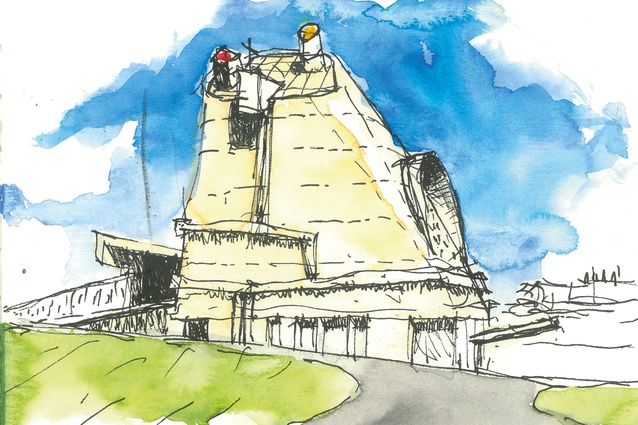
Across the bright-red athletics track, the Church of Saint-Pierre is a contrast in mass and weight. Like an upturned bucket, it proclaims itself immediately as something you’ve never seen before. What are its precedents? What are those heavy extrusions stuck onto the exterior, or that large eyebrow arcing across the east face?
Started in 1971, left to moulder unfunded for 28 years, then completed in 2006, the church is the result of incredible devotion by architect José Oubrerie and a team of supporters. But, by a bizarre twist of bureaucracy (although maybe not, given this is France), it cannot be consecrated because public funds were used for its construction. So, it is used as a church only once a month and for a few religious celebrations. Otherwise, it is a tourist attraction. Even the agnostic Corbusier would be upset.
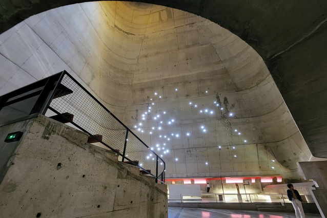
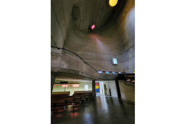
Architecturally, it is pure Corb; the ‘promenade architecturale’ begins at the street, taking us through the air along a curving ramp, reminiscent of the Carpenter Center at Harvard University, leading up to the first floor to a colourful door. Once inside, though, we feel as though we are back underground: dark with a low mezzanine above and the floor (ground) sloping further up. It is not until we emerge from under the mezzanine that the fullness of the space is exposed, lit by a galaxy of light-dots, small glass discs in the east wall and three ‘light cannons’ way above: yellow, red and green. And strips of light, horizontal reflectors, also coloured, in the sloping walls bring light up from the outside. The chapel at La Tourette again. These strips follow the raking floors and, in fact, are one of the multifunctioning elements Corbusier delighted in. They introduce light and, on the outside, they act as gutters, catching the flow from the mighty walls above, channelling it to sculptural droppers that fall into the channel below.
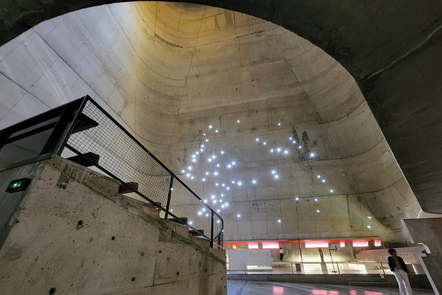
Maybe to keep a sense of community, the pews are gathered in asymmetrical groupings, set on raking floors, the ones under the mezzanine even raking upwards towards the altar.
Overall, it has the mediaeval atmosphere evident at Ronchamp, without the lightness: no white- painted walls, no coloured-glass windows, less light in general. But it is still special, working directly with your emotions, demanding a response. Now it just needs a use that befits its expectations. By contrast, the lower level is a successful, if slightly contorted, exhibition space and shop, with views out to the surrounding garden.
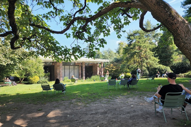
A few days later, we return to the Fondation Beyeler, just outside Basel. In 1982, I visited Ronchamp for the first time and, later, was in Aalto’s Chapel of the Three Crosses in Imatra, Finland. The breathtaking disparity between the mediaeval heaviness of Ronchamp and the luminescence of Imatra has never left me. Here it is again. From Saint-Pierre to Beyeler is a universe of architectural approach. The light in Renzo Piano’s spaces is sublime, predominantly from above, through layers of glass and mesh: magical in the way the harsh outside sun is tamed to be soft, pale and immersive. By contrast, the views out to the superbly crafted pond, to the old museum villa or over the paddocks locate the galleries in the landscape.
A superbly curated Mondrian show exhibits the painter’s gradual shift from realism to impressionism to abstraction but, also, shows it was not a straight-line development. Some of the abstractions were painted well before the impressionist works. Above all, the oeuvre exposes his intense personal commitment to developing a new way of seeing and taking painting further into abstraction.
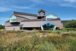
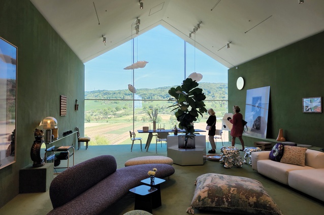
The Vitra Campus at Weil am Rhein, Germany, has had a few additions since we were last here. Complementing the collection by Hadid, Gehry, Prouvé, Grimshaw, Ando and Siza are two Herzog & de Meuron buildings, a Piet Oudolf garden and various minor works, including a technically innovative accommodation unit by Piano totalling 6m2. The garden is gorgeous and typical of Oudolf’s work: a disarmingly intricate variety. Overlooking this is the H&de M VitraHaus. The intention is to display Vitra furniture through the ages in various domestic settings; I had previously thought a pile of child-like gable house forms was a somewhat trite approach. Well, maybe it is, but the experience within more than compensates. Four levels of extrusions, laid out like pick-up sticks, create a giddying circulation experience, which somehow manages never to overpower. The scale of the rooms is ideal for the furniture and the various domestic settings, and the internal forms and the ramps and stairs adopt curvilinear forms that contrast with the angularity of the gables. Everywhere are glimpses through, up or down into other spaces and, at the end of each extrusion, pleasant seating areas and outlooks capitalise on the views out to rolling country. Units and shelves by the Eames and every other designer you can think of, filled with books, objects and plants, make it a wonderfully rich yet pleasant experience.
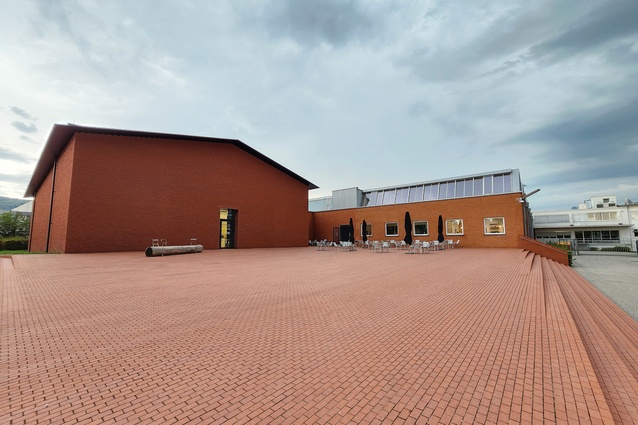
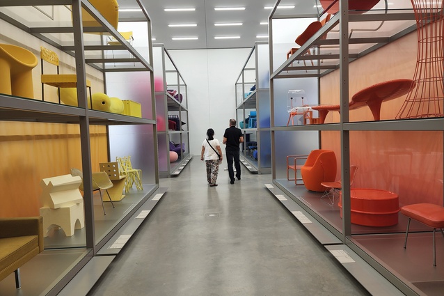
Schaulager, also by H&de M, is a taut brick shed: a gabled and windowless archive. The only way in is through a small, unmarked door. Just inside is a shop but there is no acknowledgement of this as a shop, no accessibility or transparency; fight your way in to see what you find. We do, and what we find is a wonder of curated furniture, sorted in vast shelving units by colour. Aisles of bright red, orange, black and browns entice exploration. Bizarre adjacencies of time and type crop up because of the colour determinant. Downstairs, a huge basement of racked furniture disappears into the distance, radiating out from a lovely exhibition of materials and processes contained in deep drawers. Open a drawer and you are likely to find a small screen showing a film of the construction of an Aalto laminated stool (28 pieces and 60 processes), or pottles of pigments used in specific fabric production, or aluminium anodising processes. It also houses a replica of Ray and Charles Eames’ messy personal design office: eccentric, eclectic, charming.
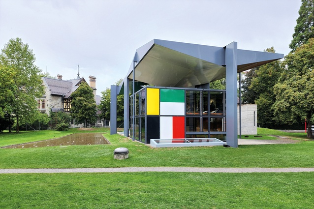
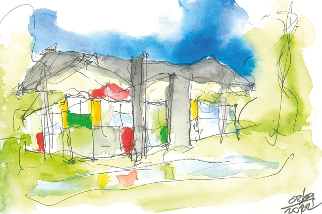
A quick train trip takes me from Basel to Zurich, and a pleasant walk through the city and along the lake leads to the Pavillon Le Corbusier, one of his last buildings. Originally a house and exhibition space for Heidi Weber, it is now a museum. As a contrast to the church in Firminy, we couldn’t find greater: the medieval heaviness of Saint-Pierre versus the lightness of steel and glass, the shafts of coloured light replaced by brightly painted panels. The church absorbs and refracts light; the pavilion emits it. And, while the steel frame and detailing, bolted joints and metal panels herald a new direction, it also houses all the familiar elements: le modulor, the ramp, the roof terrace. Here, the roof terrace is protected by the spectacular triangulated and inverted canopy, which closes in whilst it opens up, wraps over while it releases.

This building is astonishing. Crisp, light and light filled: intense yet relaxed. Sitting on the roof terrace, I have just written in my sketchbook that it ‘makes my heart smile’, when two young guys emerge through the Jean Prouvé-like door onto the terrace and their faces break into huge grins: delightful.
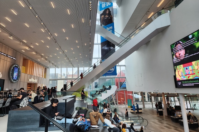
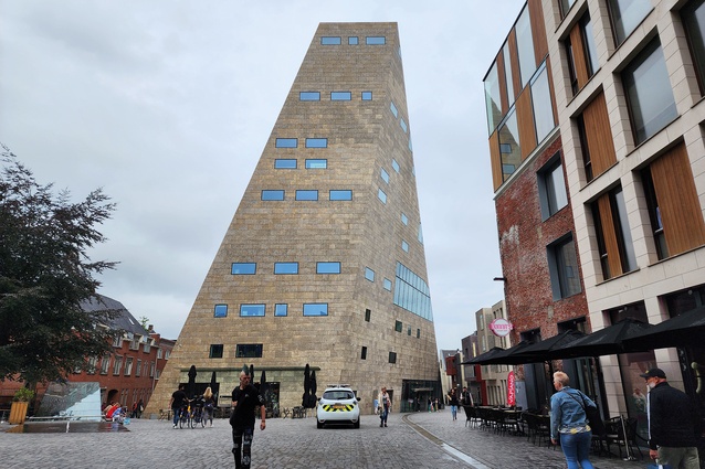
A few days and 900km later, we are in Groningen where NL Architects recently completed the Forum. This eight-storey asymmetrical stone-clad edifice seems thrown down from afar into the finely detailed and modestly scaled old city centre. Where it comes from and what its precedents might be are unclear. It contains the public library, expanded in the now-normal way to include cafés, seating and conversing areas, workspaces, shops and exhibition areas. Even more civilised than its New Zealand counterparts, it has a wine bar. And, on the roof, another bar and party space for functions.
Whereas the exterior is forbidding, and even at ground level makes little concession to public accessibility, with nothing more than a mean little canopy over the front door, the interior is both spectacular and cosy. The white, free-form atrium runs full height with a plethora of escalators crossing at angles, light penetrating from all directions, and people occupying every visible area. The spaces all manage to have that level of comfort described by the unique Dutch expression ‘gezellig…’ full of well-being and warmth. People settle in, working or reading or playing, and look as though they are there for the duration.
In height, it rises well above the surroundings to match the adjacent Martinitoren, the traditional church tower, much loved for city viewing. Culture and democratic occupation rise to rival the traditional religious virtues, architecture representing shifting cultural balances.
So, are we wasting our time visiting these icons, viewing architecture again, renewing links interrupted by the pandemic and in the face of global warming?
Whether it is Corb’s conviction, even arrogance, that his way was the better way, or Piano’s quiet skill in proving that the soul can be nurtured by the finessing of space and natural light, or Mondrian’s push for new ways of seeing, or Herzog & de Meuron’s insistence on hunting down original forms and materials seemingly to lead us who-knows-where, or NL Architects representing cultural aspirations, we can learn from great architecture. We come to understand that, indeed, we can improve, we can do it better, we can address the human condition through architecture. Even more: in these times of impending planetary turmoil and unsustainability, we must. As the poet Kenneth Rexroth wrote, “Against the ruin of the world there is only one defence: the creative act.”
Next, we are off to Finland for a 14-day tour of Aalto and others. Instalment two is coming up in the Jan/Feb 2023 edition of Architecture NZ.

1. Beatriz Colomina and Mark Wigley, Are We Human?, Lars Müller Publishers, 2016/2022.

