Houses Revisited: Forest Pavilion
A linear pavilion pays homage to California modernism, offering an oasis of calm on the edge of a forested enclave in Titirangi. First published in 2018.
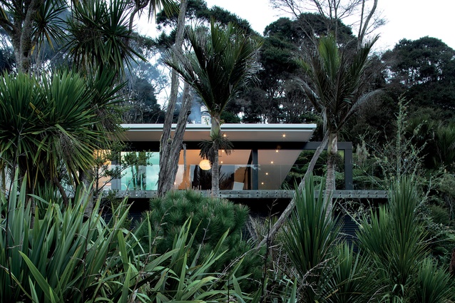
A sleek home peeks out of the trees on the edge of lush native New Zealand forest. The sounds of cicadas and birdsong fill the air. Mountain bike trails run up and down the forested hills around the property and, below the house, a home-made bike ramp and a huge mountain of bark pieces (to break any falls) provide plenty of entertainment for the owners’ teenaged son.
A creek meanders across the one-hectare property and a small garden pavilion, lawn and fire-pit area, built by the owner, provide a summer oasis where the family can host barbeques and parties with live bands.
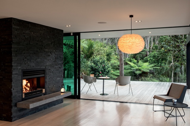
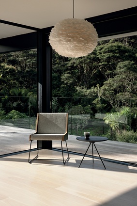
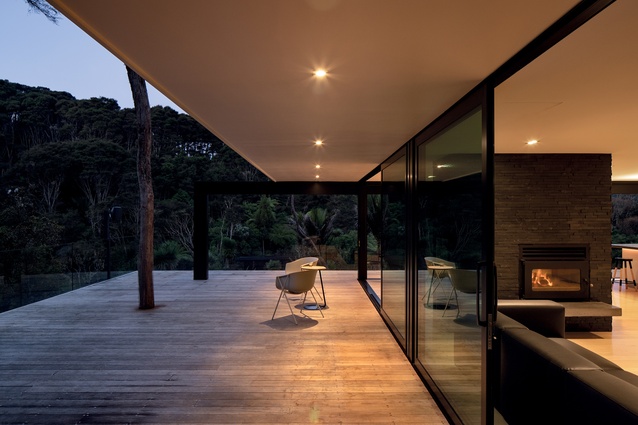
Designed by Chris Tate Architecture, Forest Pavilion is sited on a swampy piece of land at the back of a new subdivision situated at the southern end of the Waitakere ranges in the West Auckland suburb of Titirangi. In Māori, Titirangi means ‘fringe of heaven’, which seems apt here. A heavenly view of foliage is framed by a dramatic piece of steel structure that extends out of the building like “an arm or a spider’s leg”, suggests Chris Tate.

“It’s a piece of California modernism in the forest,” he says. “I love these clean, machined edges in a very undulating, rugged forest. It works really well with our climate and the look of it – this combination of the clean and the crazy.”
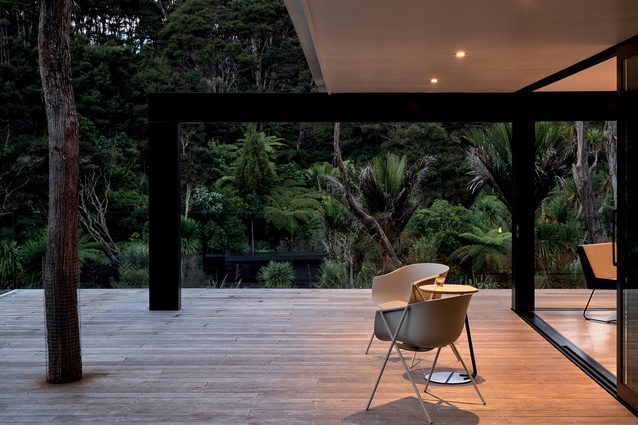
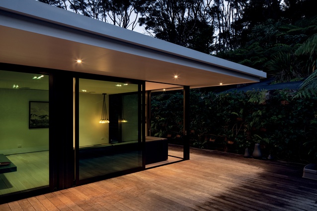
Tate wanted the structure to pay homage to the work of Austrian-American Richard Neutra – one of the most famous of the great modernist architects – who built homes mainly in California and who often extended structures out with ‘an arm’. Also in the modernist tradition, a large overhang extends the roofline out over a sheltered outdoor terrace, while the gutter forms a clean fascia edge around the building.
The pavilion was built by one of its owners, Guy Cobcroft – a builder with his own construction firm – for himself, his wife and their son. It is Cobcroft and Tate’s sixth collaboration over six years. “Guy is a really good builder and we work very well together,” says Tate.
Cobcroft adds, “We trust each other and our close relationship is critical. This house is like a ‘meet ’n’ greet’ for Chris and I, where we can show potential clients what we do. Of course, it was a budget-driven project and built under the proposed time frame. But I was the worst client,” jests Cobcroft.
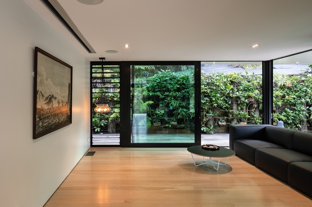
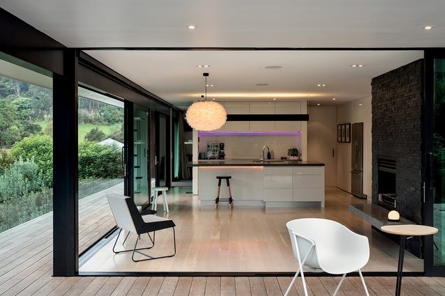
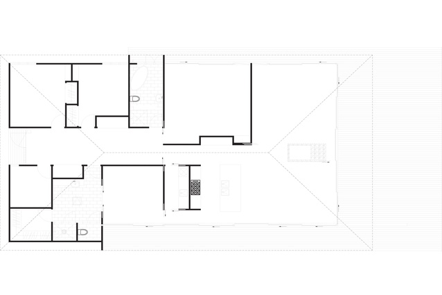
There are no windows at the front of this house, making it private and a bit fortress-like upon first view – but then it opens up to the forest at the rear of the site. The plan is basically a villa layout with a wide central corridor and rooms coming off it: three bedrooms, two bathrooms, storage and a study. In the middle of the house is a media/music room.
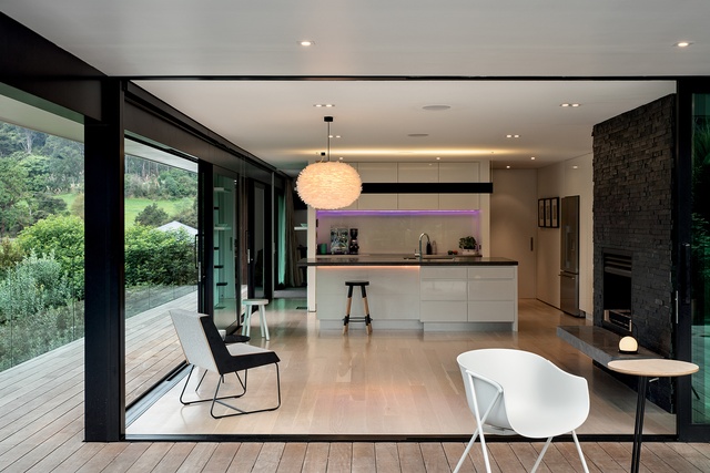
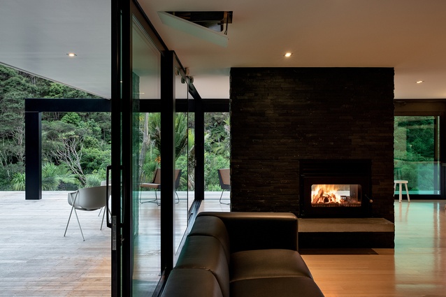
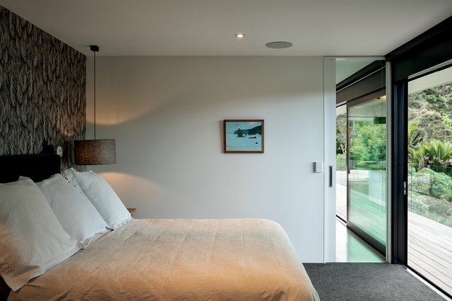
At the end of the corridor is an open-plan kitchen/dining area with a double-fronted open fireplace, which also sends warmth into the living area on the opposite side. In between the kitchen and the master bedroom is a concealed scullery/laundry, which enables Cobcroft to make his coffee in the morning and return back to the bedroom effortlessly.
“The corridor is not a waste of space; it’s actually ‘the space’ in the design because it connects all the rooms together,” Tate explains.
The only neighbouring house to be seen from the inside is a low-slung, L-shaped pavilion, also designed by Tate. The overall result is two similar forms nestled together like sleeping whanau. The next project to be constructed here is a second pavilion to sit underneath Forest Pavilion; it will offer guest accommodation and will be ready in a year’s time.
Material Selector
Chris Tate explains the materials he chose for the design of Forest Pavilion.

Why did you use steel framing?
All my buildings use lightweight steel framing because it’s easy to assemble, stable and can handle the humidity. You also gain a lot of engineering strength.
The guttering forms a distinctive edge around the building and seems to be a common motif in your work.
Yes, it creates nice, clean, machined edges in the modernist tradition as well as getting rid of the rainwater. The roof here was also quite tricky to design. It could easily have acted like a sail because the site is elevated so the roof could have been ripped off in a storm.
Can you explain the steel arm that extends from the building?
In all my buildings, I choose to expose one piece of structure, while everything else is hidden so there are no visible bracing elements or structure. Everything’s concealed. It’s often an unconscious decision but probably made to honour the engineering; it’s as simple as that. Basically, everything else gets sucked into the joinery.
Click here to see more Houses Revisited. And sign up to our email newsletters to receive Houses Revisited straight to your inbox.
Note: These are stories from our archives and, since the time of writing, some details may have changed including names, personnel of specific firms, registration status, etc.

