Alt country: Bendigo House
Although set among native bushland on the outskirts of Melbourne, this multi-generational home exudes a very urban sophistication.
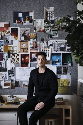
It wasn’t too soon after establishing his eponymous studio that interior designer David Flack landed a dream job. His clients, empty nesters with three adult children and grandchildren, needed a new abode to accommodate their growing family and they were willing to give him free design reign.
Located on three acres of native bushland just outside Melbourne in the historically significant city of Bendigo – a boomtown during the Victorian gold rush of the 1850s – the generously sized site gave Flack Studio’s director plenty of room to play.
However, the landscape was treated with the utmost respect during construction and not a single tree was removed, ensconcing the four-bedroom house in its idyllic country setting.
Achieving the couple’s brief for a big, comfortable home that’s high-end, yet doesn’t feel precious in either concept or aesthetic, was easy in this context. And Flack’s resulting plan is impressive for the flexibility its three-wing configuration enables.
“It had to be large enough to accommodate everyone at the one time, but the couple had to also be able to occupy it comfortably when it was just the two of them,” he says.

Each wing can be zoned off from the rest of the house and so the south wing, comprising the three guest bedrooms and a third lounge room, for example, can be closed off when the children and grandchildren aren’t visiting.
In this respect it makes heating and cooling the 520m² interior much more energy efficient, a necessity in an Australian inland city like Bendigo where temperatures range from very cold to extremely hot.
The use of concrete as the primary building material gives the single-level residence high thermal mass too, while complying with the region’s requisite Bushfire Attack Level (BAL) rating. This robust materiality also lends the interior its most compelling design expression.
As Flack explains, “People often think concrete is quite cold, but I think the opposite because when it’s mixed with other materials it has a warm sensibility.”
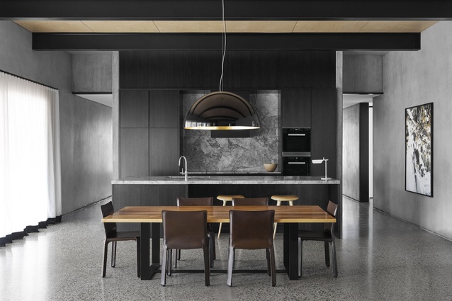
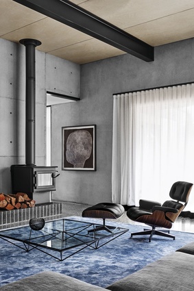
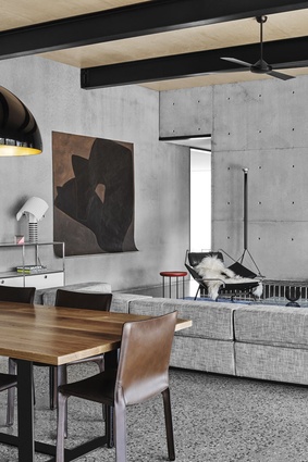
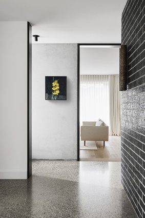
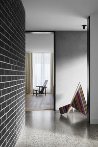
Concrete dominates the minimalist material palette as polished flooring and pre-cast walls, though timber is used judiciously to soften the overall scheme. It makes the home appear elegant and inviting rather than austere.
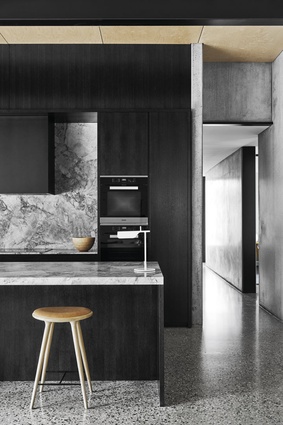
The timber is applied to particularly great effect in the central wing’s open-plan lounge, dining and kitchen areas, which function as the heart of the home. Flack wisely selected an economical Russian birch plywood for the ceiling to allow for greater investment in the kitchen’s joinery – fine quarter-cut American oak finished with a black Japan stain – and richly patterned quartz marble benchtops and splashback.
“There was a budget,” he notes. “But it’s about picking and choosing where you detail to get all those spaces working really well.”
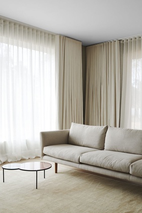
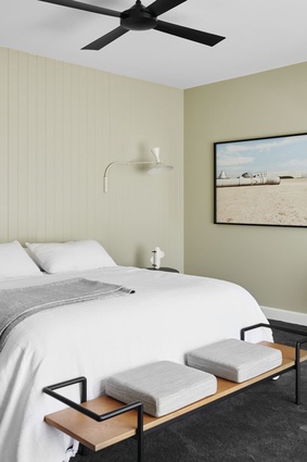
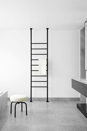
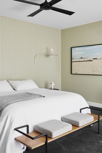
While carpet in the bedrooms and timber boards in the north and south wings’ lounge rooms break up the polished-concrete flooring, the use of a black accent throughout the home further reinforces the scheme’s overall cohesion. It creates a narrative that begins with the kitchen joinery, steel ceiling beams and doorframes, and ends with the bathroom’s tapware and towel rack.
Flack chose black because it adds a strong graphic punch, although he was mindful to exercise restraint. When it’s overused it can dominate a design, but Flack has applied it as a subtle thread that weaves its way gently through the different spaces, adding visual interest.
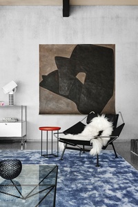
This accent, along with the concrete’s deep-grey tones, creates an unexpectedly neutral backdrop for a distinctly high-end selection of furniture. The clients previously owned some of the pieces and Flack worked around these, adding other key items, such as Mario Bellini’s Cab dining chair and the classic Eames lounge chair and ottoman.
A bright-blue Flack-designed rug anchors the open plan living areas, where the ceiling is almost 4m high, and large abstract artworks in every room complement the home’s bold angles and materiality.
Flack’s love of Modernist architecture, especially the mid-century gems of Palm Springs, is evident in the pavilion-style plan and generous spatial proportions. He’s literally given the clients and their family a home with plenty of room in which to move that’s flexible enough to accommodate multiple generations.
The interior may boast all the aspirational charms of a stylish showroom, but it’s ultimately highly functional, making it extremely relaxed and liveable.

