All hail the Queen
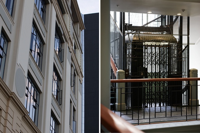
Queen Street, Auckland, with its chain stores and tourist shops, has lost much of its original glamour. But at the very end of the inner-city thoroughfare, almost at the water, sits 2 Queen Street, a building that has managed to retain its Victorian quirks and charms.
The Endeans Building, named after its original owner, John Endean, was designed by architects Chilwell & Trevithick (the masterminds behind the Myers Free Kindergarten in Myers Park and other Auckland structures) and completed in 1915. More recently, it’s had a facelift and, inside, it sports a newly renovated third-floor home that is a perfect example of just how good apartment living can be in our largest city.
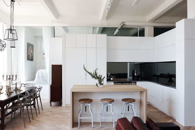
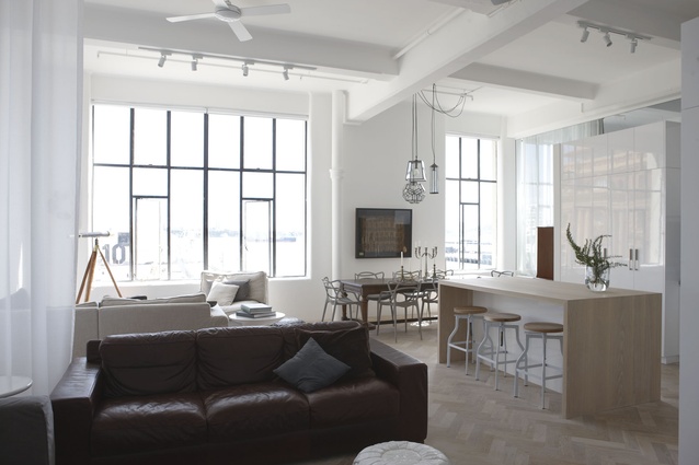
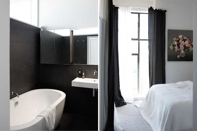
The 115m² space was previously an art gallery but its new owners, a couple with two children who live with them part time, commissioned Rachel Higgs of Integrado to transform it into a functional, open-feeling pied-à-terre. Theirs was a tricky brief: the small space had to accommodate three bedrooms; a master ensuite with a bath; as much storage as possible; and enjoy natural light in every room (no mean feat with windows on only one side of the apartment).
“There were quite a few components,” says the designer of her customers’ wish list. “When clients come to you, they know their life better than anyone else and these clients had an extensive list because they’re a complex couple. And, I wanted to reference the old – the columns, the sprinklers, the original floors – in the place as well.”
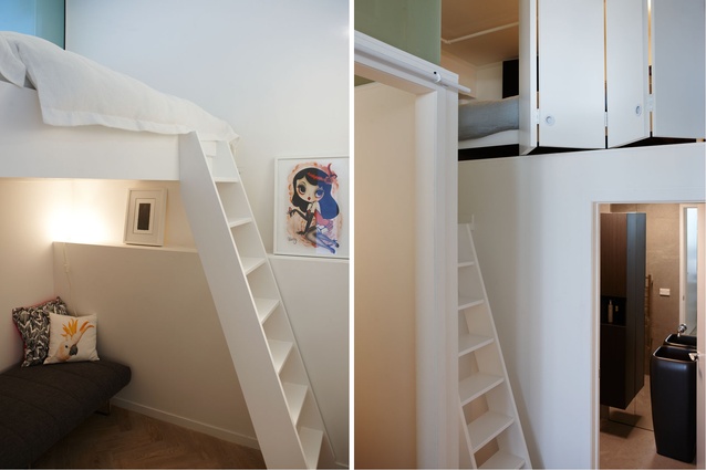
To achieve three bedrooms, Higgs created a floor plan with one decent-sized master bedroom and two children’s sleeping pods – one next to the master bedroom, with a mezzanine bed; the other accessed via a ladder next to the guest bathroom.
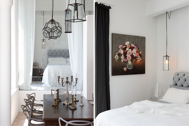
The owners’ bedroom, at the front of the apartment, is visible from the kitchen and lounge area, thanks to a glass wall that lets in ample light and phenomenal views of the Edwardian-era Ferry Building and the harbour.
“We wanted maximum views in the bedroom – that’s why there’s the glass element,” explains Higgs, 34. “The glazing and the layering of curtaining means you can totally close it off or you can see the view; I love that you can lie in bed and get the full width of the view. With a small space, you need to have that flexibility.”
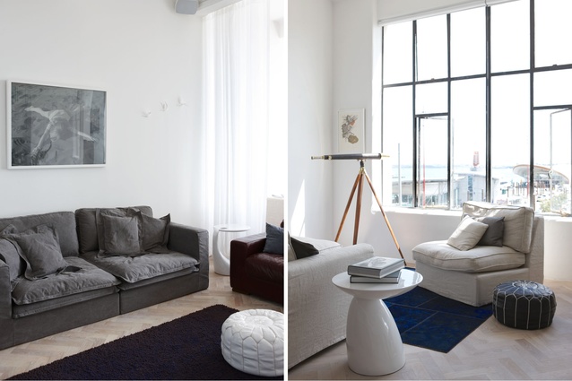
The steel-paned windows in the bedroom are original; a glass balustrade in front of them assured that they met the council’s requirements. The same joinery is found in the living area, which includes an open-plan kitchen, a dining area and two sitting areas filled with furniture from the owners’ previous homes. Greys, whites and muted tones help the space to feel calm, relaxed and much bigger than it really is.
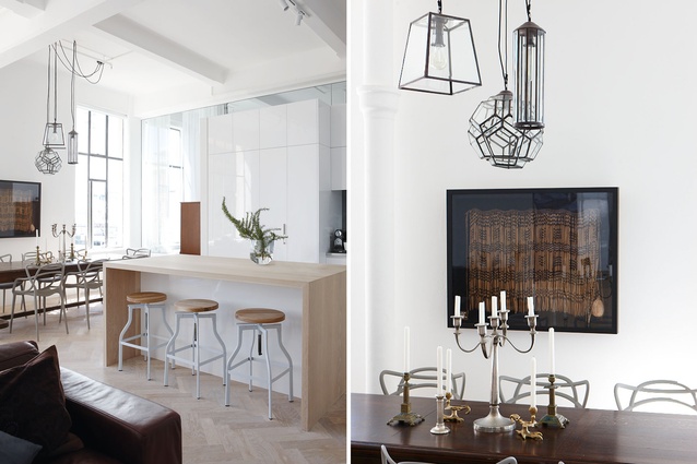
“I love the feeling of space; it feels like you could entertain in it,” says Higgs, who designed the home’s lighting plan, including the impressive collection of glass hanging pendants, which were sourced overseas, above the dining table.
Plenty of built-in storage has created zones in the apartment, as well a recessed entryway, a laundry that lives behind closed doors and lots of other hidden cupboards. A datum line – a single, not quite floor-to-ceiling height that all of the cabinetry and storage elements measures – means that natural light can sneak above any of the fixtures and into rooms that wouldn’t otherwise see the light of day. In the guest bathroom, a wall of mirrors cleverly reflects the view from the bedroom windows and gives the illusion that natural light gets to the very back of the home.
“I’m so pleased with the amount of storage we accommodated,” says Higgs, who worked for Fearon Hay Architects for five years before going out on her own. “I’ve always had this romantic idea of doing boat design, which is similar to this in that you have to have dual functions for everything.”
The biggest challenge in refurbishing the apartment was something that can’t even be seen – the plumbing. “Dealing with plumbing is the hardest thing in apartments. All of your pipework has to be within the four walls so it’s one of the earliest design drivers,” explains Higgs. “In this case, all of the plumbing is below the steps that lead up to the master suite. In other places, we packed out the walls and did the plumbing on the sides.”
The project was finished in September 2014 – nine months later than initially thought. The owners, who lived in their Waiheke Island beach house while construction took place, are thrilled with the results. Their designer is pleased with the light and the feel of the project, but loves the floors: “It’s the original, American-oak, parquet flooring,” she says. “We stripped back the high-gloss varnish and finished it with a white-washed wax. It’s so nice to have something that’s original.”

