A subliminal link: Tree House
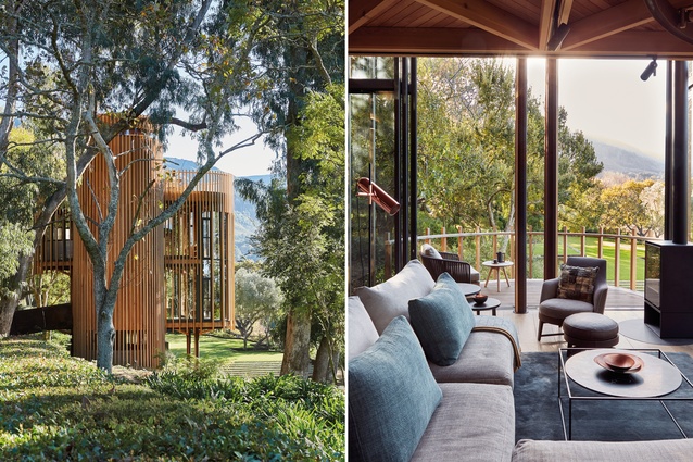
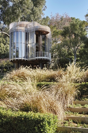
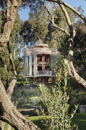
This modern cedar-clad cabin reinterprets tradition as it mimics its surroundings, blending with the trees and making a bold statement.
The starting point for Graham Paarman’s cabin-like tree house in the famously beautiful wine region of Constantia in Cape Town was a particular spot he’d chosen on his family estate – a clearing among the trees overlooking four square reflection ponds.
The estate has extensive landscaped gardens, a manor house and a number of dwellings and buildings arranged along the lines of a modern interpretation of a ‘Cape Dutch Werf’ or traditional Cape farmyard.

Architects Pieter Malan, Jan-Heyn Vorster and Peter Urry of Cape Town-based firm Malan Vorster Architecture Interior Design had worked on various buildings on the property, and together with garden designer Mary Maurel, had been instrumental in creating a quartet of reflection ponds in what had previously been a field of lavender. The ponds seemed to bring a certain magic to the clearing and galvanised Paarman’s decision to build a cabin there.
He called on Malan, Vorster and Urry to help him realise his idea for a tree house. “I always wanted something in the tree canopy,” says Paarman. “I never wanted a building that was going to impose itself. I didn’t want something symmetrical. I hoped it would blend in and enhance its surroundings and would invite the outside in.”
And he wanted something small. The “pure geometry of the square” prompted by the ponds became a “subliminal link”, as Vorster puts it, in their scheme to bind together the various elements of the floating architectural interpretation of the forest. To mediate the combination of inspirations for the tree house – the organic forms of the woods on the one hand and the sharp-edged squares of the ponds on the other – the architects turned to the work of the likes of Louis Kahn and Carlo Scarpa.
“There are certain geometrical ideas that they used that inspired us,” says Malan. “We investigated a rigorous geometric framework that also allows a sense of freedom, curves flowing from straight lines, rectangular shapes that become drums and the celebration of the connections between different elements.”
So the tree house began its existence as a sketch of a square (the same size as one of the reflection ponds, divided into nine smaller squares). Along the edges of each side of the square, four circles represented four trees, creating a floor plan resembling a pinwheel. Steel pillars, in groups of four, represent the trunks of the trees, and rings overhead suggest branches. Branch-like beams in turn support the floors above.
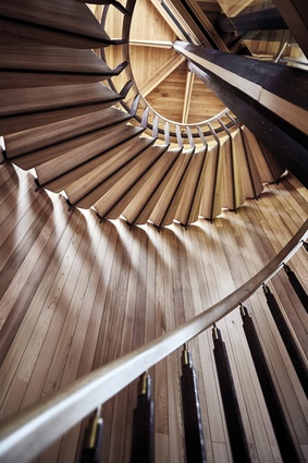
Each “tree” is a slightly different height. “The tree that terminates at roof level became the circular drum for the staircase,” says Malan. It leads to a rooftop deck, an entertainment space that doubles as a viewing platform, looking over the beautifully landscaped gardens, and, of course, the reflection ponds. Ascending the stairs feels a little like climbing a tree.
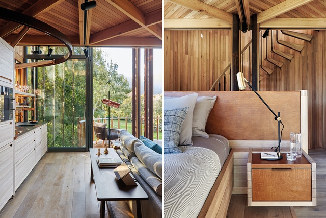
The rooms are arranged vertically: one living space per floor. The living area is on the first level, the bedroom on the next, and at the top, the open-air deck. At the same time, a double-volume space makes for a vertical connection between the levels, and some of the rings extend beyond the edge of the almost imperceptibly square floor plate, creating cantilevered outside balcony spaces.

The structure is glassed in and covered with a veil of vertical cedar-wood slats. “They create privacy at certain points and articulate the building in others,” says Malan. The lines they create echo the “verticality of the surrounding trees”, so the building blends beautifully with its surroundings. The staircase ‘drum’ is the only really solid mass in the building.
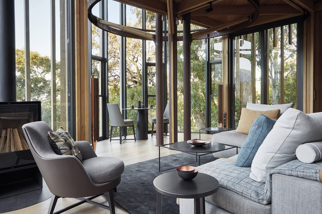
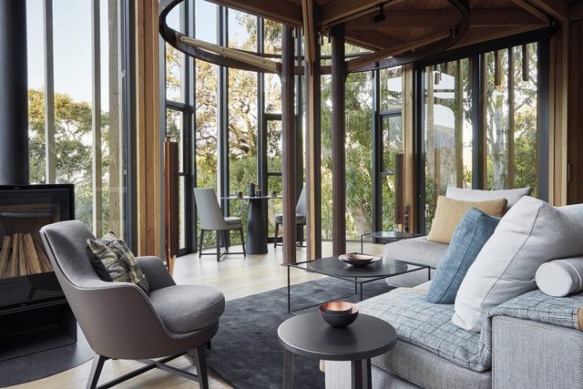
“We wanted the contrast between something that is completely open and one really solid volume,” says Malan. Despite its compact size, the house doesn’t feel small. “There are tall sliding doors at the front that open up over both levels,” says Malan. The large vertical space opens up the living area, blurring the inside and outside.
“It also plays with the idea of scale,” says Vorster. “You are in this vastness of the landscape, but you are also in the building.”
“It’s the encapsulation of cocoon living,” says Paarman. “But at the same time, I think we all have a connection to nature, and this house captures that in a very special way. You can see the fantastic night skies and the squirrels in the trees. You can hear the birds from inside, too.”
The fact that the building is small, making minute attention to detail possible, and that the structure is expressed in every aspect of the design means nothing could be hidden. As Vorster says, “all of the mechanics of the building are aesthetic, design elements.”

The architects found their choice of materials provided prompt many of their final design decisions. Malan provides a useful example: “Generally the vertical elements are steel. They support the horizontal elements, which are timber beams and floor plates. Those connections are expressed in little turned brass, hand-machined connections. The idea of crafting the structural components, to express it, gave us an opportunity to design those things beautifully. We turned them into beautiful, elegant sculptural elements so they would not appear too engineered.”
The architects used corten steel, manufactured only in flat sheets, rather than standard, round mild steel sections. The idea of the steel being folded appealed to them, as well as the fact that it gains a patina in time, rusting and turning a coppery or ferrous orange colour. The cedar will also weather. “Materials are allowed to change,” says Vorster. “It works in a natural, organic direction.”
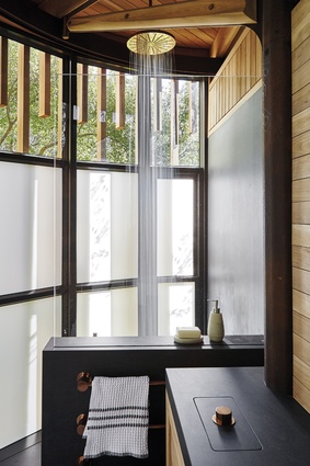
The colour of the corten’s patination, and its high copper content, led to the decision to use warm metals such as brass and copper for the junctions. This was picked up again in many of the other finishings, such as the taps, shower head and lamps. The architects designed the interiors and chose the furnishings too.
As Vorster points out, “It’s lovely to have the opportunity to take the concept right through to the furnishings. The same care goes into choosing a piece of furniture as making the space.”

