A slice of shed, diced
Architect Anna-Marie Chin visits the Central Otago House in Alexandra by RTA Studio and is impressed with the play of sculptural wedges and light.
As architects, we are inherently curious about what other architects are creating and how they interpret a building, especially to gain a perspective on another response to building in the surroundings in which we predominantly design.
This site is located in the Central Otago region. The climate is harsh: hot, dry summers with cold-but-beautiful winters, with the days long in summer and short in winter.
The contextual environment is of partially barren, rugged landscapes; textures of rocky outcrops and gravelly soils are interspersed with structured layers of manipulated horticultural and vineyard plantings. The rural farm architecture is one of sheds and barns built of stone and corrugated iron: simple and rudimentary in form but practical in application.
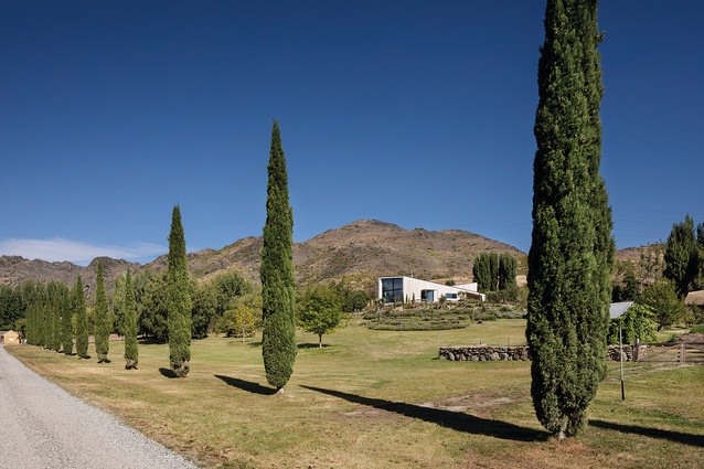
A meandering drive leads to the site through a horticultural landscape, over a bridge and down a tree-lined road. The trees step along the gravel driveway, winding up to the house, existing trees on one side and recent exotic cypress trees on the other. The noise of the gravel announces visitors.
The house sits on a hill on a plateau, sited beside an existing shed and a corrugated-iron barn, which was previously used as the accommodation. These buildings form a sheltered car courtyard, reminiscent of the working farmyards of the area, and are nestled in and surrounded to the north by a small, established pond and flanked by a rising hill to the west. The other end of the site gives way to an elevated long view over the property, extending out to the mountains beyond.
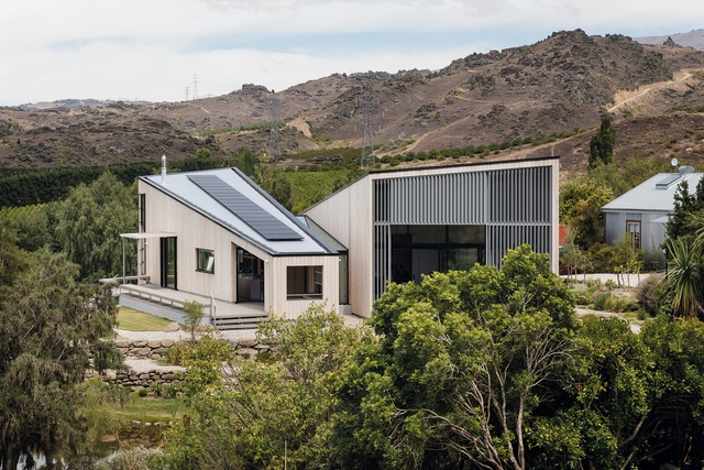
Architect Richard Naish of RTA Studio says the owners’ brief was for the house to be simple, with one bedroom, so the existing barn house could be used by repurposing it into a revamped guest house. “Other than that, it was to have one study/library near the bedroom and then the usual kitchen, dining and living spaces.” From here, it was up to him. Not that this makes it easy.
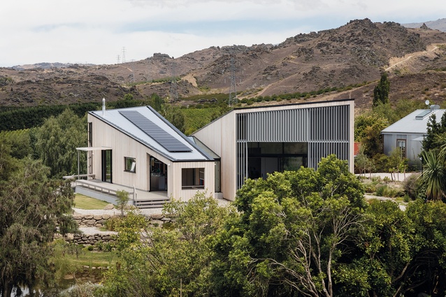
Naish has taken the vernacular of the area, the basic form of shed buildings, and created a house that is reminiscent of the low-gabled fruit sheds of the surrounding orchard region.
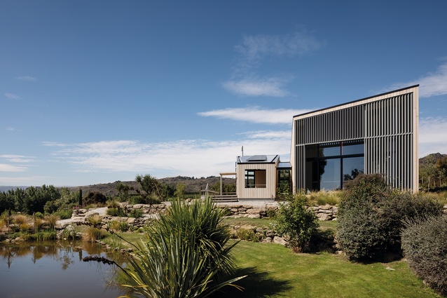
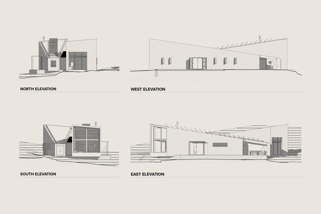
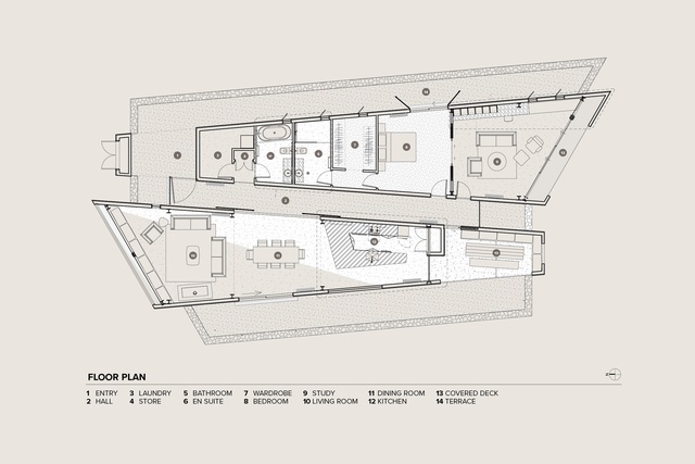
The new house consists of two large, long, angular, mono-pitched forms: twins, turned around on each other, adjunct to each other. In form and in plan, each is a mirror image of the other.
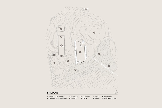
“I’ve taken a slice of shed and diced it once more to result in two wedge volumes: one orientated and lifting towards the quiet, reflective pond and the other orientated and lifting towards the dynamic view,” says Naish. “They’re placed side by side, with a glass-roofed hallway between.”
Despite its simplicity, the building has a sense of presence. The shapes remind me of the Sedona Chapel in Arizona; like obelisks in the landscape, the strong, powerful forms are sited proudly on the rock plateau overlooking the surrounding lands.
It has a sense of sculpture whilst being domestically reminiscent of an Italian villa overseeing the land. Reinterpreted as a Central Otago building, the feeling, as you arrive, is the same as it would be in a formal villa but also playful.
Naish describes the design as being of two simple parts – one is public space and the other private. “So, two rooms really: a public ‘room’ for entertaining friends, and a family and private ‘room’ for sleeping and relaxing. Each of these ‘rooms’ is a wedge.”
Space is hard to describe and even harder to photograph successfully. Space is about feeling and this house has a great feeling – it makes you breathe, stop, rest, relax.
There is a series of plays in place: narrow versus wide, low versus high volumes, and the play of light. The sense is of small-scale, intimate and low-key alongside large, tall, proud spaces. It is not just the wedge form that is important but the way these forms create depth and playfulness in the interiors, cleverly adding liveliness and evoking a reaction.

Each of the volumes forms a wedge in both section and plan. From the low end of the wedge, it is narrower, rising to the high end where it is wider, giving a sense of expanding from protection and shelter to vulnerability and uplift. The contrast of the low volume with the tall exaggerates and accentuates the height of the tall space, emphasised by the high, narrow windows to the side of the living area. Naish has also bravely created lower-than-normal spaces, partially enclosed, each of which has a real sense of shelter, protection and comfort, providing contrast to the more
lofty spaces.
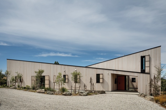
The wedges are symmetrical but one is flipped. The first wedge you encounter is the private ‘room’ and it starts with entry connected with the car courtyard. This is a small, intimate, sheltered, welcoming exterior space, carved out of the low end of the first wedge. It is the beginning. The entry is defined by a red door: happy and inviting, ‘come find me’. Beyond the entry, you step into the light-filled hallway, which acts as a spine connecting the two wedges.
Running along the private wedge, from narrow to wider, are laundry, bathroom and en suite, stepping along to the wardrobe and then the main bedroom, which opens out to the study and the north view and light. The study can be largely connected or completely closed off.
A clever niche hides away in the wardrobe: a sleeping nook at the back for a grandchild to come and stay. A fun, secret space for a child but, practically, it can also be used as a place to sit and put your shoes on and does away with the need for more bedrooms.
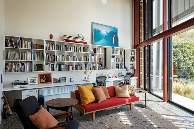
In this north-facing study space, it is about the natural light and the way it is controlled. The partial arrangement of exterior timber louvres, some moveable, behind the fully glazed window provides for a light-filtered space. The resultant soft light creates a warm and airy space – a happy place.
On the exterior, the end of this wedge is slatted, allowing a gentle breeze through onto the north study deck, also filtering the light. The play of shadows and light on the surfaces, both inside and out, is reminiscent of sitting under a tree, the shadows and light expressing the time of day.
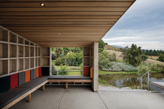
In contrast, the public ‘room’ has its low end at the north of the building and contains the outside sitting space, again carved out of the volume of the wedge. It creates a sense of shade and shelter on the sunny north end. While one might expect it to open fully to the north, it opens to the east, connecting to a linear deck where you can perch and overlook the land rolling down and into the distance. To the north, an opening frames the close, immediate view of the pond while controlling the intensity of the northern sun. A bench seat provides the sitting for the dining table, yet to be designed. The texture to the interior is expressed in the gridded structure of the timber-framed building, a nod to the pared-back, unlined sheds of the area. The exterior is clad using slats, gapped slightly to allow a gentle breeze through for cooling or to break up the stronger winds. Infill square panels of coloured cushions sit within the frame, providing support but, also, a playful addition of colour.
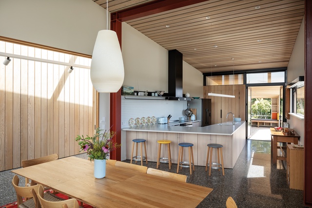
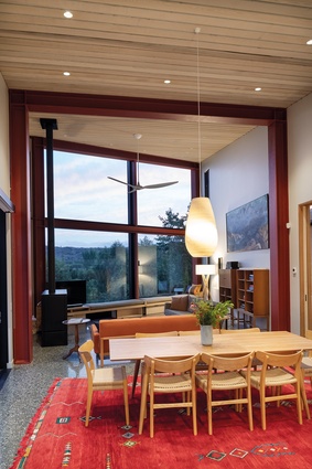
From this space, you step through to the kitchen, modest and functional with an open connection to dining, following the volume as it grows spatially through to the living at the end. The plan becomes wider as it does taller, your eye pulled to the large window at the end of the living area, drawing you in and up to it, to see the rugged mountains in the distance. Towering up to overlook the view, this move makes the spaces dynamic, transitioning through the space to where you are open and unprotected. A simple ledge forms a window seat that spans the full-width of this window. It allows you to sit in the view.
The space cantilevers out over the land and you have the feeling of sitting in space, as if dangling over the end of a rock, looking at the view. Simple but powerful. From the outside, you can see this window from the driveway. It is like a statue overlooking the land, surveying those who arrive.
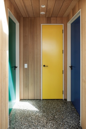
The playful nature of the house design continues in the interior, introduced through the use of a different colour to define each door, not soft or subdued but strong, vibrant and lively. The interiors are pared back, practical in their cabinetry infills, not cluttered – just as the window seat is simply a ledge for sitting. A bookcase in the study forms a library as well as a place for objects and there is plenty of wall space for art.
A rhythm of red-steel frames steps up through the living space, the structure exposed as in the old sheds. Naish says the colour references the old structural bridges of Central Otago in Ophir and Clyde. The ceiling timber again references the slatted timber structures of the region, while also providing acoustic treatment.
Outside, the ends of the wedges relate to the differing landscapes. The private room extends out and connects a garden to the immediate north via the study deck. Enclosed by the hill and plantings, this garden is a series of terraced rock walls; the rocks were sourced from the surrounding area and frame a small, established pond. In contrast, the public room’s view to the south is connected by the large, picture-framed, glazed wall at the end of the living, to connect with the wider world beyond, the rugged rocky outcrops and mountains.
The landscaping is simple; Central Otago rock formations merge with Italian vegetation, mixing two worlds to form a new context. It is the owners’ nod to their love of both regions. A large vegetable garden, surrounded by stone, resides on the paddock below the house, abundant in its growth.
The soft, washed-out, yellow-brown tussock colour found in the barren landscapes of Central Otago is used on the exterior timber cedar cladding – to blend, not to act as an exclamation mark.
A series of timber shutters frames windows that are used as screens or to close the building down and give privacy and filtered light.
Naish has created a beautiful house using the Central Otago vernacular and played with it to form a simple-but-sculptural building of the land. The spaces are not complicated; they are simple in their articulation, which, in turn, has added to and enhanced the experience. This house is not an icon but one that feels as though it will age and weather in time, never losing its essence of being a house in which to live, enjoy and be happy.

