A perfect ten
On the advice of its lawyers, Wellington Waterfront takes a leap of faith on Taranaki Wharf. The result shows that when it comes to urban design, sometimes the little things can make a big difference.
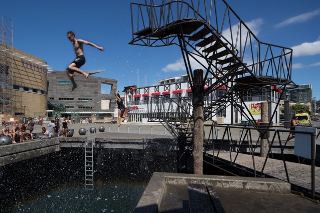
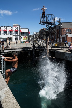
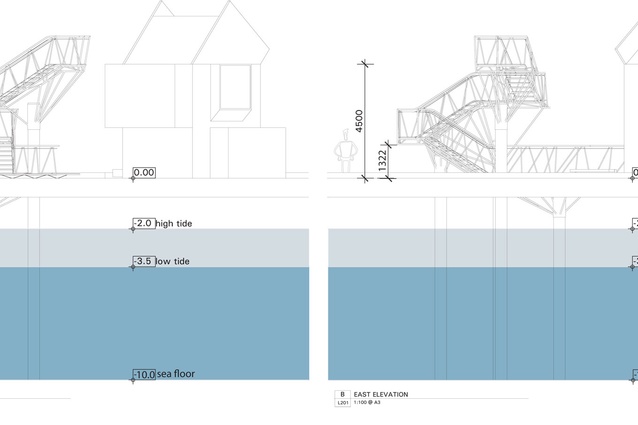
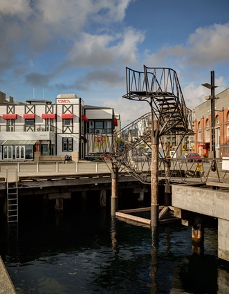
Yeeeessssss…!” That’s the sound of the Wellington waterfront reverberating across this unending summer. The source of this excitement is old news in the capital – the Taranaki Wharf jump platform opened just before Christmas. Those “down with the kids” have been on and around this great piece of urban design all summer long. At this key pivot point in the city where the main “vertical” street in Te Aro (Taranaki Street) meets the horizontal wharf edge, crowds gather on all sides of an existing “cut” in the wharf to watch the general public jump – from five and eight metres – into the sea below.
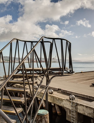
If approaching from a distance, and not knowing of the aperture, it appears as if people are throwing themselves from an Escher-esque staircase to the asphalt below – while surrounded by a chanting and cheering crowd. But sea spray – not blood – erupts among the crowd as the jumpers pass through the ground and hit the water. The result is theatrical, and crowds gather for a spectacle of twists, turns, bombs and the occasional belly flop. All leave with a grin (and perhaps droplets of sea water) on their face.
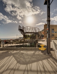
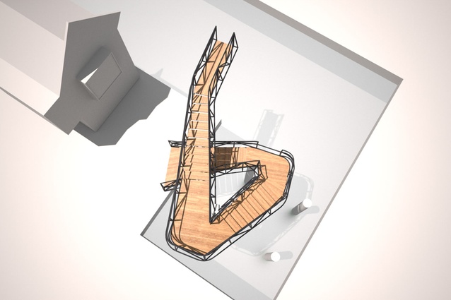
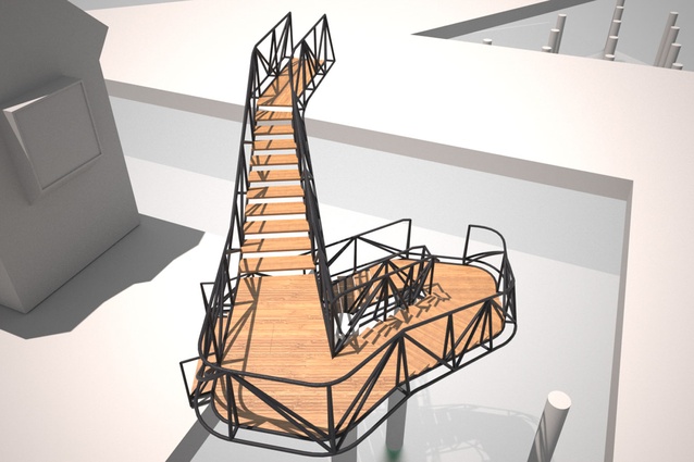
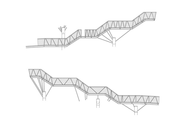
The prop for this drama is a piece of urban furniture designed by Wraight + Associates – a twisting and turning staircase springing from the wharf that appears to lead nowhere. It is a great piece of architecture, well considered, well placed and robustly detailed. On its own and without a gate, with seemingly non-compliant ballustrading, it is to health and safety pedants a no doubt unsettling sight. But climb to the top and the proposition is more staggering – jumping through the earth to water rhythmically beating against the wharf piles below. Those familiar with the tragic fence that encloses the nearby Te Papa pool will ask, “How the hell did this get here?”
As architect and professor Jeremy Till has noted, “architecture depends”, and this architecture traces its dependence from everyday actions, an enlightened client – and damn good lawyers.
People have been jumping into the cut for a long time. Prior to the platform’s construction, souls with the necessary bravado would climb up and leap from the roof of what once was the Linkspan building (it has since been adapted for the Wellington Free Ambulance) adjacent to the cut. The building had contained the machinery for raising and lowering a long-gone vehicle ramp; it’s now used as a layover for ambulance staff between their callouts to Courtney Place. The building was originally designed by Roger Walker (in 1968-69) and as such has an expressed form, pitched roof, articulated gutters and projecting windows – all of which enable a very easy climb to a height of about eight metres above a low tide. Needless to say this presented the landlord, Wellington Waterfront, with a dilemma: what were their liabilities regarding this activity? What were their obligations if something went wrong?
Legal advice was sought, and the lawyers advised that Wellington Waterfront offer an alternative. Wellington Waterfront, to their considerable credit, agreed, and they commissioned landscape architect Martin Bryant of Wraight + Associates to design a jump platform.
As yet, regulations have not been written to govern “pencil”, “bomb” or “flying squirrel” jumps, so the first challenge for Bryant and his team was determining the design criteria. Applying FINA (the world governing body for aquatic disciplines) diving regulations for a 7.5m plummet did not work – over shooting and side-safety zones clashed with the wharf edge. But the platform is specifically not for diving; it is for jumping and the majority of participants were not likely to be internationally competitive divers.
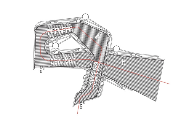
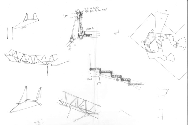
That said, it was to competitive divers that Bryant turned. He engaged the Wellington High Performance Aquatics Team to test how far they could reasonably jump. Using the 7.5m platform at Kilbirnie swimming pool, team members were asked to try and jump as far as they could from a standing, one and two pace start. The conclusion was that from a standing or single pace jump the edge of the wharf should not be reachable, but with two steps or more it would. This lead to the incorporation of a chicane detail at the platform’s top level, which prevents a two step approach to the edge. In comparison, the lower level has no chicane and a running jump can be made.
This “jumping template” data, then, determined possible positions around the cut – a careful balance between the jumping template, existing wharf elements/structures, urban view-shafts and the relationship to the spectator.
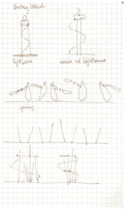
The final design appears to have been arrived at with consideration of international – particularly Danish – precedents. These precedents are split broadly between emphatic structures (think Calatrava), and theatrical plays on ascent, constriction, exposure and plummet. Wraight + Associates opted more for the second, carefully considering the ritual of jumping: the ascent – a spiraling journey where the prospective jumper takes in the 360° view; before the reveal – emerging at the top from behind the final flight of steps to face the water on axis.
For the crowd below, it’s a parade of bodies that slowly ascend and “take a turn” on the way to their big event. Witnessing their journey adds anticipation: “Will she jump from the lower one? Taking a look… nope she’s going to the top…”; “I think his knees are shaking… yep, he’s going back down”; “gosh, he’s a whole lot of lovin’ – stand back everyone, if he bombs he’ll be making a big splash.”
In Wellington, almost everyone now has a story about the platform and an event that they saw there: jean-clad midnight jumpers quoting Shakespeare before each plunge; kids lining the wharf edge and jumping in while strafing “fighter pilot” runs; or tourists leading the gathered crowd in Scandinavian chants to encourage their young kids to step off.
Previously, jumping from the Wellington Free building was quasi-illegal, and the act of watching made one a witness, not a spectator. The new platform enables public spectacle and legal risk taking. The crowd is no longer struggling with their complicity; they are now engaged with, and encouraging of, the activity. The crowd vicariously enjoys others more willing to strut their stuff – if only because “they don’t have the time” or “didn’t bring bring a towel”.
The result, in short, is fabulous. Sure, there are detail aspects someone else might have done differently. I have wondered if the colour should be more emphatic, if it is too demure against the brash and bright paint of the Wellington Free and Circa Theatre buildings. Perhaps the gussets to the wharf piles beneath might have been a little less, shall we say, agricultural? And I want the top platform to be a fraction higher. To my eye, the gutter of the Wellington Free building might still be the greater height to jump from? But this is just quibbling; it’s like the diving judges who give a “9” because, apparently, nothing is perfect. Bollocks to that, the urbanism of this design is a perfect 10.
In the past year of tragic “blueprints”, soporific “placemaking” discussions and a never-ending, dense discussion on Auckland growth, this little gem of a project offers hope for local urbanism. At the next Urban Design Awards this project should be considered – and it should win. Not for the merits of its “figure-ground” or its “active edges”, or whatever else it was that the Urban Design Awards were assessed against, but for its urbane qualities and the consideration beyond built form which are of much more interest. The council’s lawyers should be awarded for the urbanism that their legal opinion enabled; Wraight + Associates should be rewarded for the conveyancing of the design into built form; and Wellington Waterfront should be commended for having the cojones to do it. I’d like to nominate them all. Any seconders?
Disclosure: Jon Rennie is employed by an architecture firm who has an ongoing working relationship with Wraight + Associates, particularly on the Wellington Waterfront. However, at the time of writing this piece, Rennie had not worked with Wraight + Associates.

