A nostalgic angle: Acute House
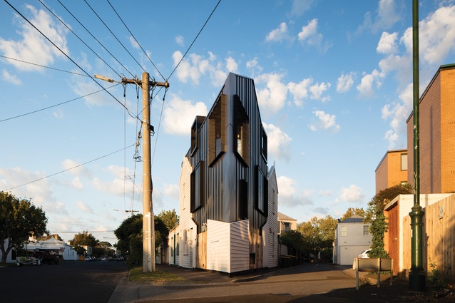
Wrapped in cladding salvaged from the small Victorian cottage that was originally on the site, this compact but generous home by OOF! Architecture sits within a modest envelope and presents a cordial face to the street.
Retrophilia runs rife in Australia’s inner-city suburbs. Perhaps it’s nostalgia for the fast-disappearing rundown cottages amid the gentrification and urban renewal, or maybe it’s just the inherent charm of the warped weatherboards and flaking paling fences, but these little suburban ruins often tug at the heartstrings of their owners and neighbours alike.
When Fooi-Ling Khoo of OOF! Architecture was presented with one such ruin – a falling-down Victorian cottage in the inner-Melbourne suburb of Albert Park – she and her clients agreed they wanted to keep it and rework it into a new house.

The astonishingly small, forty-eight-square-metre triangular site, wedged between a wide suburban street to the south and a narrow alleyway to the north, originally held a two-storey weatherboard cottage with a lean-to, a small yard and an outside toilet in the pointy corner. “Because we all loved the textures and the crazy decrepitude of the house, we decided to keep as much of it as we could,” Fooi-Ling says.
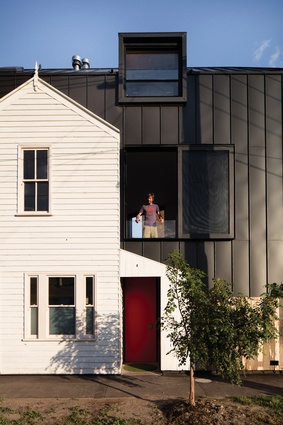
But unfortunately, the original structures were unsalvageable. In fact, the outside toilet was “leaning so far over the footpath it was classified as a public hazard,” Fooi-Ling says. So in preserving the old house, all the cladding was carefully removed, a new house was built in its place and the original cladding was then reinstated on the skin of the new as a pasted graphic. Rather than the old transitioning into the new, as is the design of many houses with a heritage requirement, this house is a case of the old literally embracing the new.

“In some ways [we’ve done] the reverse of what normally happens with heritage projects,” Fooi-Ling says. “Typically … you keep the frame underneath, remove the cladding and put new cladding on, [in which case] the house doesn’t look anything like it did before, because everything you can actually see has been replaced.
“Given the original house was structurally so far gone and that we wanted to retain as much of the original fabric as possible, what we did was keep all the cladding, and everything underneath has been replaced.”

Incredibly, the new house – on the interface between the street and laneway – packs about 140 square metres of liveable space onto the site. It is by no means palatial, but it affords the owners, a couple with a young child and a dog, a compact but generous home within a modest envelope that presents a cordial face to the street.
Derivative of the old, the new home has the same gabled form, but it is oriented perpendicular to the original and extruded along the length of the street, “like a loaf,” as Fooi-Ling describes, “and sliced off by the laneway.”
This has resulted in a form that, curiously, seems to present a bigger frontage to the narrow laneway than it does to the much wider street. But in context, the form actually responds to the scale of its neighbour, a three-storey apartment block that lines the laneway to the north. Meanwhile, the southern side is more modestly scaled, in deference to the classic single-storey Victorian homes that line the opposite side of the wide street.
Internally, the house is a demonstration of efficient planning through the use of vertical circulation and half levels. On the entry level, two rooms – the office and a kid’s bedroom – are concealed behind a joinery wall fixed with coat hooks. The bathroom is in the half-basement and directly above (half a level up from the entry) is a powder room, which coincidentally is in the same location as the former outside toilet. “It’s like a dedication to the old loo,” Fooi-Ling says. “The client told me that this is his favourite room, because when you sit in here, you can see the whole house. It’s a bit like the control station. You can see who’s in the kitchen, who’s coming through the door, what the kids are doing.”
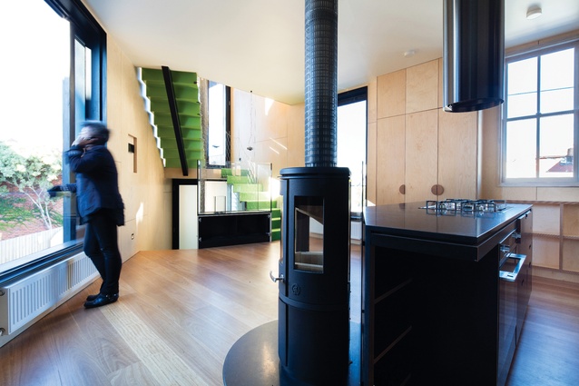
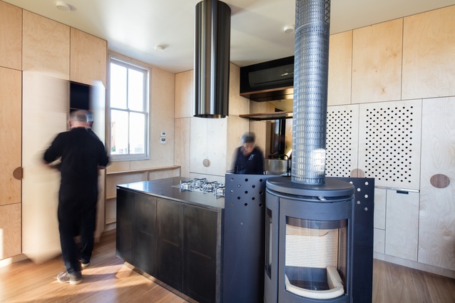
Half a level up again is the living-kitchen-dining area. Because of the limited space, every corner has been colonized for a useful purpose. “Space mining” is a term the architect uses when describing her approach to designing the house. Even the dog has his own shelf, “because all the corridor areas are required all the time, [so] there’s no corner to put a dog bowl.”
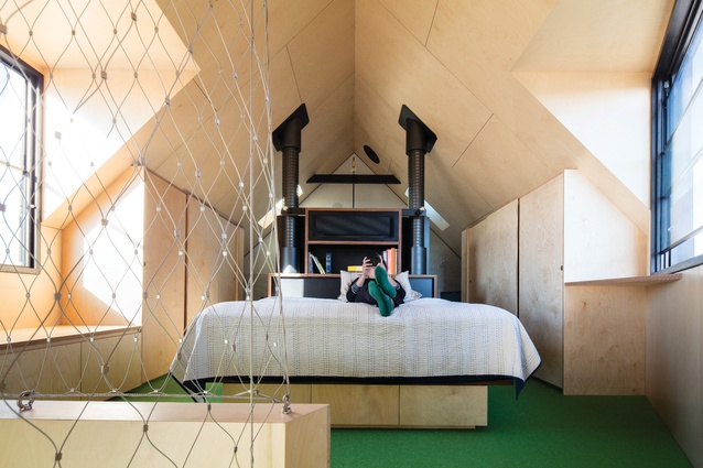
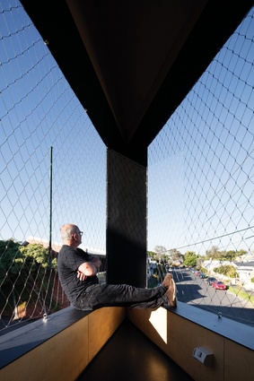
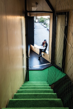
On the balcony, at the narrow ship’s-bow corner of the building, the parapet walls of the level below are used as benches where the occupants can sit and lean against the mesh barrier like a hammock. At the top-most level is the main bedroom and ensuite, where the shower and the window in the bedroom are cleverly aligned to be on axis with the Eureka Tower.
“In order to maximize the potential of the site in terms of living space, we basically got rid of all corridors and most doors,” Fooi-Ling explains. The staircase that runs through the house also brings in light, “so no matter where you are, there’s always light coming up and down that space. No matter where you are, you can always look to a bigger space,” giving the illusion of having more space than there is.
The Acute House received an award in the Architectural Design category at the 2016 Victorian Premier’s Design Awards and was the winner of the Residential – Alterations category at the 2016 Architeam Awards.

