A gentle rhythm: Mount Albert renovation
The reimagining of this home in Auckland's Mount Albert champions balance, tactility and the gentle power of detail.
Second chances. Danica Paki and Samuel McConnell believe in them. One year after they missed out on the house they’d scaled mountains for, it came on the market again. This time, they were ready. They did not hesitate.
Most people run for fitness but Paki and McConnell would regularly tackle the 135-metre climb of Ōwairaka, after the long haul from their first renovated home (an ex-Statie in Waterview), as an exercise in discovering the area. “We became obsessed with this part of Mount Albert: the lovely views, the personalities, the mix of cultures,” says Paki.
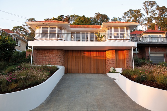
The house they secured second time around is elevated well away from the street, with its back to the maunga and its face to the north. Built in 1948, it has a red-brick base, stucco upper level and art deco features that are its winning hand. It was built by the parents of the old lady who had lived here all her life. She had Croatian roots and her name was also Danica.
Some would say it was fated that Paki’s future be linked to that of her namesake’s past. The couple, in their early 30s, couldn’t wait to turn the house, with its anachronistic aesthetic of apricot carpets, blue vanities and a kitchen from the ’70s, into their own.
When they asked their friend, architect Raukura Turei, for help, she initially put the brakes on. “The house was a beautiful mash-up of deco and Queen Anne styles,” says Turei. “I encouraged Danica and Sam to discover the parts they loved over four seasons before they jumped too heavily into the moves.”
A year later, the renovation plan was set. Although the house was not protected, Turei had a scheme that retained most of envelope and was respectful of its heritage. There was much to cherish as sacrosanct – the sash windows and faceted bays, the mataī floors – but also plenty to riff off. In contemporising the old girl, Turei slid modern moves seamlessly alongside the existing architecture then explored the details with rigour.
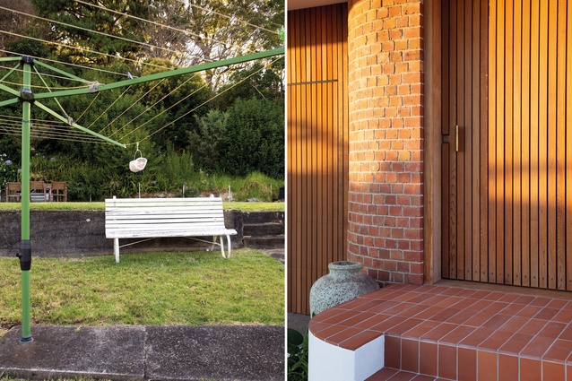
What was once an awkward narrow drive has been transformed into an approach the elegant proportions deserve. A wide swathe of exposed concrete bordered by rounded, white plaster-rendered walls pays homage to the symmetry of the design and the double door of the new garage is clad in slender cedar battens that meld with the warm tones of the brick lower level.

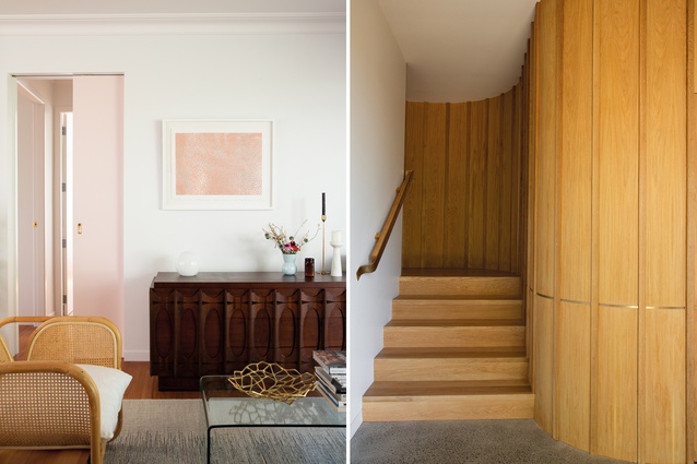
The main entry, formerly up a set of side steps, was moved to the front. Fluid lines beyond the cedar door are an aperitif to a recurring motif – the curve. Sinuous walls in the gallery-style hall are panelled in American oak and lead the eye to the stairwell. A Tom Dixon bronze vessel is totem-like in the space and all is calm – a pause in the journey. “The entry has a gentle rhythm that draws you inside and provides a deliberate change in light conditions from those of the exterior,” says Turei.
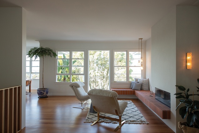
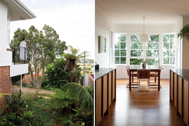
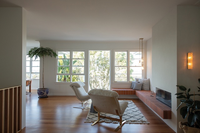
Follow the brass handrail up to the living zone where the feel is open yet intimate and the light seems to be in soft focus. Typical of the time, this three-bedroomed dwelling was designed with every room an isolated entity so walls and a wood-burner were removed to create view shafts through the body of the home. They connect the tousled back garden to the front deck where the vista across suburbia to the Auckland skyline is a serious selling point.
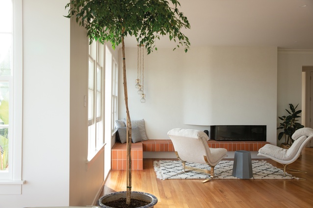
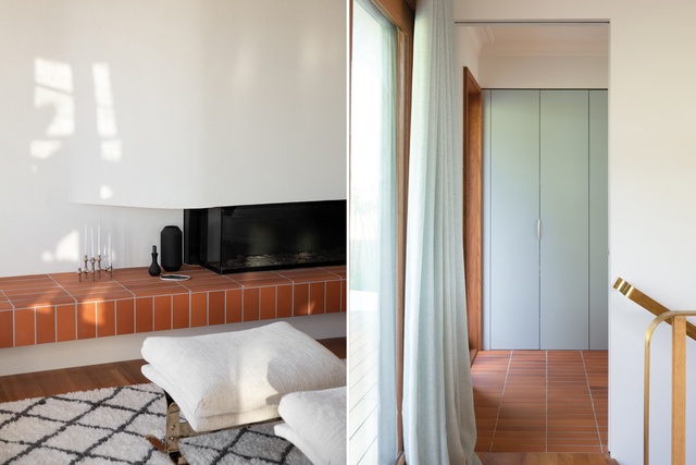
Turei was conscious of opening up the living space while still creating moments of intimacy and the focal point of a new sculptural fireplace was a key factor. Her design for this is mid-century in mood with an organic hearth and a terracotta-tile bench seat that runs to beneath the living-room window. “The bench seat was the one thing I really weighed in on; otherwise, I left everything else to Rau and Danica,” says McConnell. A trio of glass pineapple pendants was repurposed to round out the area.
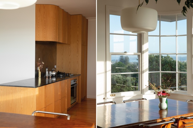
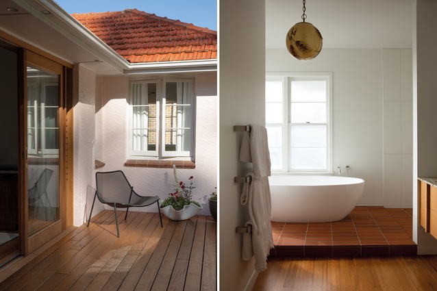
In the upgraded kitchen, there are those curves again – American oak cabinetry evocative of the home’s ’40s’ roots has robust handles that are substantial to the grasp while soft-closing drawers are eminently modern. The bathroom, too, has its synergies of old and new – the free-standing bath in prime position for a snapshot of the Sky Tower and Rangitoto, and the brown swirl of the new marble vanity top taking its cue from a frosted globe decorated with husks of corn, which was part of the original home.
While Turei mapped out the restructure choosing materials that were redolent of an era, craft-based, true and honest – “it was important to have a cohesive language that drew on the best of the existing palette” – Paki was using her on-line detective work to source furniture and fittings to honour the integrity of the renovation. She kept a mood board and avoided the brash or shiny. “The house could afford to have touches of luxe but that needed to be kept in balance,” says Paki. She also channelled her namesake, imagining what a contemporary version of a swaggy, mature woman would love.
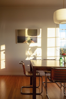
Danica the Original (known as Danna) would undoubtedly have approved of her choices – one-offs, old and new, with an upmarket vintage vibe, that define the separate living zones and defy the clinical. “Danica manages to choose pieces that don’t shout out at you; her style has swag but is effortless and classic,” says McConnell.
In the gardens, landscape designer Xanthe White provided a plan that was compatible with the architecture. Then McConnell, his father-in-law and Paki started planting out the front with a breezy mix of natives and perennials. “It felt good to be hands-on with a part of the renovation,” says McConell.
Eleven months later, and with stage two of the process put on hold, the couple intends to savour the special moments of domesticity: gin and tonic on the deck with an aspect that stretches from the western fringes of the Waitemata – and pans across the city limits to the cones of Rangitoto and Maungawhau; the luxury of an en suite that feels like a romantic hideaway; a kitchen that looks out at the ocean; even the patina of brass detailing that is shaping up just as planned.
Turei too feels the privilege of creative connection with clients that are her first since she set up as a sole practitioner. “I jumped at the chance to do something highly crafted and of my own hand after working for Stevens Lawson Architects for several years. It was an added bonus that Danica and Sam were totally on board with my design vision and our tastes were aligned,” she says.
Out back, where the stucco swirls are painted in the palest tinge of pink, grassed terraces step up the hillside. There’s an imposing sense of jungly lushness but it’s quiet and still. A rotary clothes line in the middle of the lawn awaits the next stage in history. What goes around comes around.
This article first appeared in Urbis magazine.


