A decade of transformative architecture 2008–2017
The past decade of architecture and urban design in New Zealand may well be a period which could be considered as the most transformational our small country has seen yet. Architecture New Zealand magazine invited the NZIA editorial board to nominate and vote on what they consider to be the decade's most ‘transformativeʼ projects.
More than 50 projects were nominated, and 10 designs led the voting, listed below in no particular order. Obviously, voting is subjective, so we have included a poll (wholly unscientific, we know) at the bottom of the article to enable everyone to have their say on which project should be considered the period's most transformative.
Auckland Art Gallery Toi o Tāmaki
2011
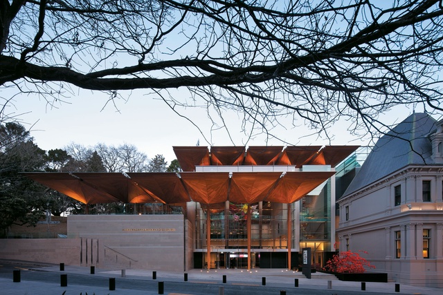
The list of awards received by the Auckland Art Gallery since its 2011 redevelopment is multitudinous and most notably includes the prestigious World Building of the Year Award in 2013. However, while gratifying, winning awards was never the intention of architect Richard Francis-Jones, whose firm Sydney-based FJMT (Francis-Jones Morehen Thorp) worked on the project in partnership with Archimedia and Auckland City Council.
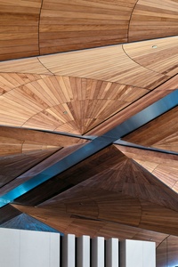
“We set out to make a building that could embody the identity of its place and the culture in which itʼs set,” he says. “In Auckland, the site was very powerful because the colonial heritage building juxtaposes the natural landscape of Albert Park. You also have the evolving bicultural character of Auckland and New Zealand really developing into a settlement of colonial culture – a rich, diverse and inclusive community, which is admired around the world.”
In the six years since opening, the gallery has received 3,118,520 visitors – more visits than in the 15 years prior to redevelopment. The design truly engages with the public, both celebrating the heritage features of the original building and providing a light and airy atrium and an atmosphere that is lively rather than serious and quiet,
According to gallery director Rhana Devenport: “The redevelopment expanded the exhibition spaces by 50 per cent and the liminal spaces by 80 per cent, providing generous zones for experiencing the most visible and expansive collection of New Zealand art in the world.
More crucially though, the architectural spaces have provided a gracious and explorative home for art and people; the exhibition spaces are fluid and adaptable, and the terraces offer tremendous potential for art making and creative encounter that has still only barely been realised through artist commissions and performative events.”
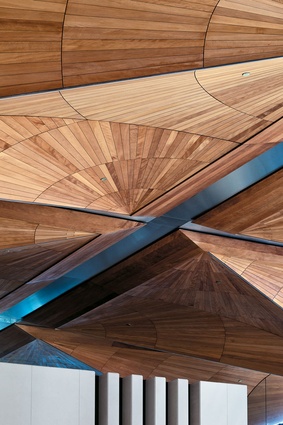
Len Lye Centre
2013

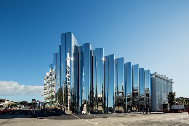
In 2016, Lonely Planet named Taranaki as one of the best regions to visit in 2017 and names the Len Lye Centre in New Plymouth as one of two unmissable experiences, calling it Taranakiʼs answer to New Yorkʼs Guggenheim.
The Len Lye Foundationʼs John Matthews can attest to the popularity of the building. “There has been a symbiotic effect between the Len Lye and the Govett-Brewster Gallery. The Govett used to get 60,000-80,000 visitors; now, combined with the Len Lye, we are getting 160,000-170,000 through. It has put New Plymouth on the map and has transformed the whole town.” Designed by Patterson Associates, the buildingʼs dynamic reflective façade has given it an obvious point of difference – and one that has inspired lots of selfies.
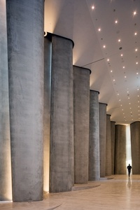
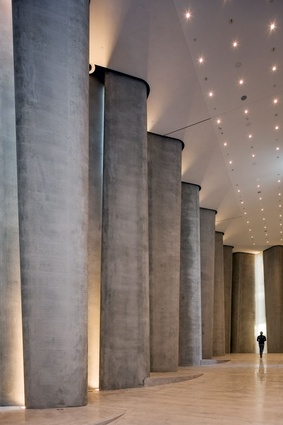
Inside, it features a unique 9m-high large works gallery dedicated to sculpture, a theatre, café and early learning centre. “Patterson was great in that, for the reality of cost, he would rework things. The project didnʼt cost the community a cracker,” says Matthews.
The centre has now become the poster child for Taranaki. “It has engaged with and heightened the sense of community,” explains architect Andrew Patterson, “and I think the Bilbao effect that itʼs created is beneficial to the whole country.”
The centre is located just off the cityʼs main street, a once-deserted area that has physically moved the centre of town towards it. Retail and hospitality has arisen around it, with the restored White Hart Hotel, a brand new hotel and a hub of boutiques and cafés changing the face of the street.
The summer after the centre was built, an EFTPOS receipt study showed a 44 per cent increase in sales, the highest ever recorded. And it has upped the status of the gallery within the international art world: “I believe the director of the Govett-Brewster Gallery can now pick up the phone to any fellow director around the world with a card to trade,” adds Patterson.
Bishop Selwyn Chapel
2016
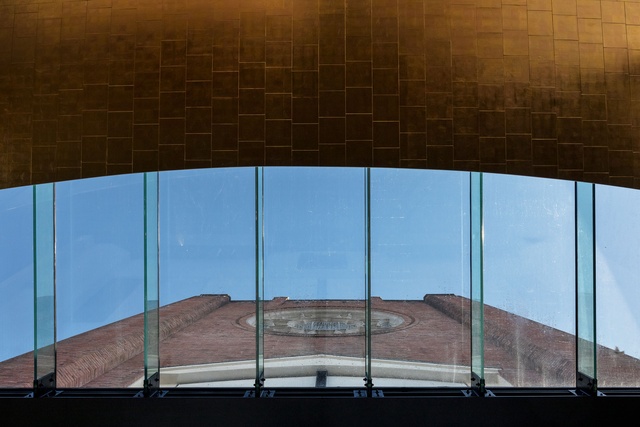
The Bishop Selwyn Chapel signals a greater sense of inclusion, transparency and openness among church buildings in New Zealand, as well as being a stunning piece of architecture. Fearon Hay Architectsʼ design presents an open public face that juxtaposes the inward-facing aesthetic of the original brick structures that surround it.
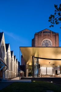
For the Dean of the cathedral, the Very Reverend Anne Mills, the building has transformed the way her congregation worships as a faith community and their focus as well. “The glass expanse looks out onto Godʼs creation and onto the city and the world in which we live and reminds us that is where our mission is,” she says. “So our words and our actions inside the building need to transform who we are and what we do outside the building. Weʼre not just a holy huddle but we gather to be strengthened and sent out into the world. That has been very transformative for us.”
An unexpected effect of the architecture of the new building is its popularity for non-religious events and ceremonies. The chapel is booked out well in advance for everything from gala dinners to awards evenings, movie showings and exhibitions.
“It was very important that the space had flexibility and was not simply about a static configuration of worship,” says architect Tim Hay. “The space also commands a level of respect from passers-by when an event is taking place.”
For Jeff Fearon, this project was an opportunity to create a space where people are held in a state of quietude. “Churches are places where you have to sit and stay still,” he says. “The eyes wander, and the mind is allowed to take it in. Instead of creating a container that is all about an internal focus, the design grabs layers outside the perimeter so you gain a spatial awareness into the distance.” The chapel won an Auckland NZIA Public Architecture Award in 2017 and was shortlisted for the 2017 World Architecture Awards in the category of Religion.
Transitional (Cardboard) Cathedral
2013
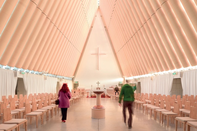
In 2012, lonely planet named Christchurch as one of the top ten cities to travel to, citing the Transitional Cathedral as one of the reasons the city is such an exciting place.
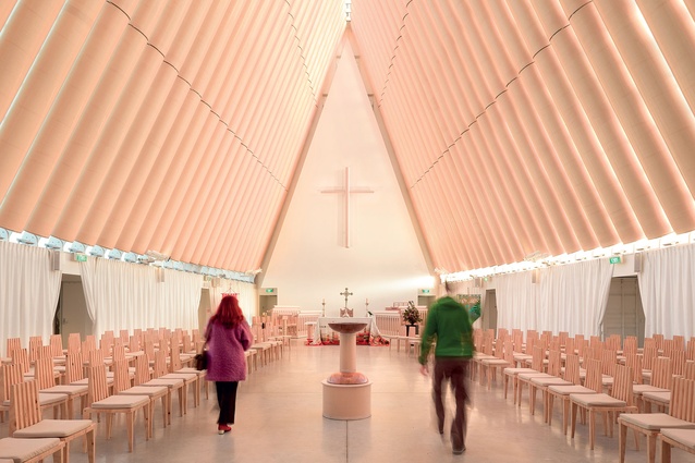
Located several blocks from where the original, damaged cathedral sits, the Transitional, or Cardboard, Cathedral was intended as a temporary structure for religious use and to house wider community events, but its scope has widened to include tourism. This is due in part to its star architect (Shigeru Ban, who worked alongside Warren and Mahoney) and also to its aesthetics, says Warren and Mahoneyʼs Peter Marshall.
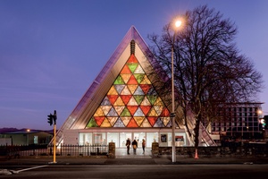
“It is a very engaging building as a space. The size and shape of it has been part of its success, which is why people respond so well to it, especially from an acoustic point of view and also in terms of the lighting. You could argue that itʼs not a Christchurch building and deliberately so. The last thing the client wanted was something that mimicked or replicated the original,” he says.
For the Very Reverend Lawrence Kimberly, Dean of Christchurch, the building has been highly successful, with about 300,000 visitors per year. “We think of it as an important place of encounter – to draw visitors, pilgrims and people searching for meaning. People come in a huge variety, and they are really moved by the building. The simplicity and the light draws people to sense something of a divine reality there.”
The building has also inadvertantly paid tribute to those who were killed in the CTV building in the 2011 earthquakes, many of whom were Japanese students. The site is adjacent to where the felled building stood, and the cathedral is often visited by Japanese residents, especially on the anniversary of the earthquakes. With its tent-like form, the building suggests flexibility and transition. “It is iconic in its own right,” says the Dean. “Itʼs a sign of hope and resilience of community.”
Ironbank
2009

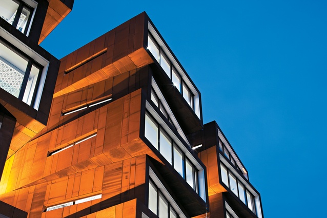
Ironbank has received a huge amount of international media coverage, mainly because it has helped to transform the medium-sized office building typology. The architects, RTA Studio, sought to integrate the building into its finely scaled historical neighbourhood around Karangahape Road by fragmenting the building form to break down its potentially large mass. Five unevenly stacked Corten steel towers, most clearly visible from Cross Street but also from Newton gully and the motorway, make it a visually arresting building. “We get the feeling it is becoming a landmark,” muses architect Richard Naish.
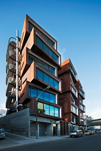
Cladding and form aside, the building has also been a commercial success, explains Marco Creemers of Samson Corporation, developers of Ironbank. “We wanted an iconic landmark building but we also like to build long-term assets that keep giving back, not only as an investment but to the location and the community as well. Ironbank was a slow generator in the beginning but now it is 100 per cent occupied. It creates its own community, and that is the secret to success in commercial development: great architecture.”
Ironbank most notably won a highly commended award at the World Architecture Festival. It also received three NZIA awards in 2009 and was the first building to be awarded a 5-Green-Star rating from the New Zealand Green Building Council.
Naish explains that the building aims to provide a socially sustainable office environment, evident in its retainment of tenants who also love the healthy, naturally ventilated spaces. The towers are connected by a number of bridges, lifts and stairways which “connect everything and foster interaction, a sense of belonging and passive observation, so if youʼre working late at night and you look across, there are other people in the offices across the way”.
Zavos Corner
2016

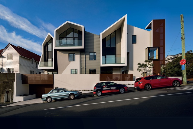
The list of awards received by Parsonson Architects for the multi-unit apartment development, dubbed Zavos Corner, is lengthy: Civic Trust Award 2015, Home of the Year Award 2016, NZIA Wellington Award 2016, two NZIA New Zealand Awards, and winner of the NZIA Sir Ian Athfield Award 2016.
“Zavos Corner is quite relevant at the moment with all this conversation about densifying cities,” says Gerald Parsonson. “We have a lack of housing, and there are arguments for and against densification. Itʼs an example of density done well – itʼs a 560m2 site that had one villa on it and now there are eight apartments.”
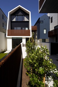
Zavos Corner delivers this level of density without compromising on liveability. Attention has been given to sun and spatial comfort. Each apartment has two focuses rather than a singular outlook, making them light and airy. The parking is underground so each apartment has a useable terrace.
“We did not cut corners,” says owner and developer Angelos Argus. “It may have cost us more but it was worth the investment. It fits with the area and gives us something we can be proud of in a location that has been owned by my family for many years. It acts as a memorial to my wifeʼs parents, who had been the owners of the property for a long time.”
The design received some opposition due to the heritage of the area but, once built, it is well-liked by residents. “One thing we pushed for was the clocktower on the corner,” says Parsonson. “It gives back to the community, and they say they like seeing the temperature and the time.”
The building is 100 per cent tenanted with a number of apartments taken up by Weta Workshop for overseas contractors and staff. When completed, planners from Wellington City Council toured the building as an example of good multi-unit design, and it is seen as a benchmark for such developments across New Zealand.
Wynyard Quarter
2012
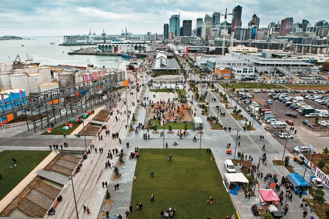
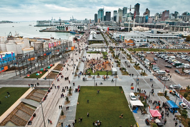
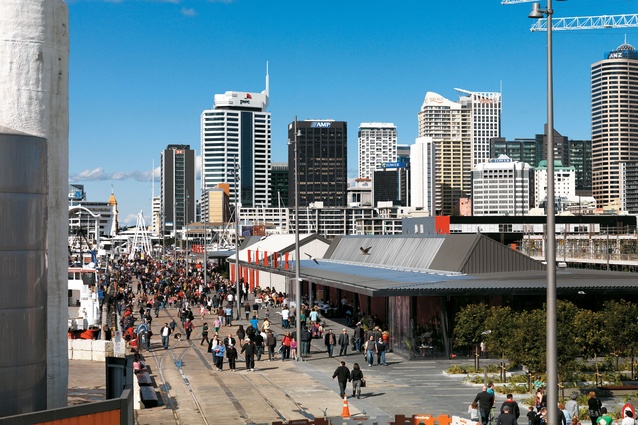
An official count in June 2017 on the Te Wero bridge, which accesses Wynyard Quarter from the Viaduct Basin, showed 1.9 million pedestrian visitors in the past year, up from 1.3 million in the previous year. The precinct includes North Wharf, Silo Park and the streets from Fanshawe Street to the industrial area beyond Silo Park. “What you see down there is a collective vision from all users, stakeholders and the community about what a successful place could be on the waterfront in a city environment,” explains Rod Marler of Panuku Development.

“There are places for people to work and live, for recreation, family, promenading and just enjoying the environment. One of the most successful things has been integrating the historical elements that tell the story of its former use, overlaid with contemporary things about how life is today.”
The precinct is a long-term project, with the latest progressions taking the form of new walkways and also new buildings and tenants taking position, such as GridAKL, which is spearheading the view of the precinct as an innovation centre.
The first residential tenants of Wynyard Quarter will be moving in this year, meaning that it will become a home as well as a place to eat, work and play. Staff at the visitorʼs kiosk near North Wharf tell of a wide variety of users, including a rise in the number of tourists using the precinct, especially when cruise ships are in town.
“It is a part of Auckland that has changed by addition and evolution not by obliteration,” says Patrick Clifford of Architectus, which worked on the urban design framework for the area. “Itʼs important that it has been already going for a long time – 15 or so years since the planning phases – and it has been a real testament to the fact that a lot of people have really cared about it and made contributions. From that point of view, it has been a good model for how these kinds of projects can proceed.”
North Wharf
2011

“North Wharf was created basically from nothing, which is an unusual starting point in the central city,” says architect Jeff Fearon of Fearon Hay.
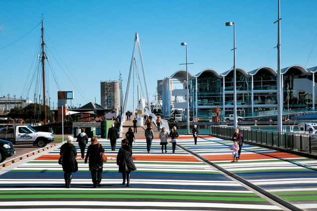
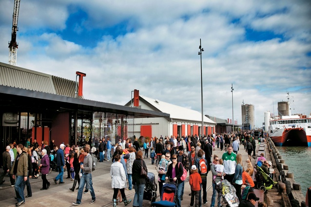
The architecture firm designed the North Wharf buildings and worked alongside a design team for the North Wharf promenade, Jellicoe Street and Silo Park, which included landscape designers Wraight and Associates and Melbourne firm Taylor Cullity Lethlean. The starting point was an industrial no-manʼs land, but the result is a lively promenade, a food and beverage destination, a cycle route through to the city, a place to be and a place to take people and show off the waterfront.

“Its success is due to the fact that it has been programmed,” says Megan Wraight. “It was fast-tracked initially in time for the Rugby World Cup, and it is progressing from there. It couples fantastic design with a diversity of spaces, capturing the imagination of the people and also of event promoters – the activity programme is out of the box; there is always something interesting happening.”
The promenade was expanded and Jellicoe Street narrowed from the original plans to allow more space for waterfront activities and pedestrians. An unusual streetscape was created through an ecological collection of tree species, says Wraight. “This includes pūriri, pōhutukawa, nīkau – coastal forest species that would have touched that edge of the waterfront. Instead of a tree every 10m, we have an incredibly densely vegetated street.”
The buildings call on the history of the area, referencing shipping warehouses. “Itʼs hard to see where the work has happened underneath it,” explains Fearon. “Really, the sheltered rooms are hugely flexible, open structures that allow for tenants to adapt and manipulate the spaces. As the place was unknown to the wider public, it needed an identity. We literally put the name in lights. Sometimes the simplest things are the most successful.”
Waitomo Glowworm Caves Visitor Centre
2010
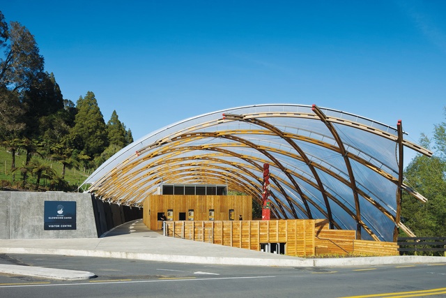
Since the opening of the Waitomo Glowworm Caves Visitor Centre in 2011, the Waitomo area has seen fantastic growth, receiving more than 600,000 visitors per year. “This is not just due to an increase in tourism in the country in general,” says Grant Webster of Tourism Holdings Limited (THL), current owners of the building. “Our market share of visitor arrivals has grown substantially in the past six years, and the building is now a critical element to this. It has a very practical transformative element in that it created space and facilities and a customer experience that is far and above what we had before or what we ever imagined we would have.”

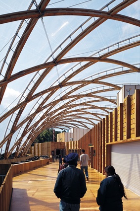
The centre was designed by Architecture Workshop, led by architect Chris Kelly. Pathways into and out of the caves begin and end at the Visitor Centre with its wide woven roof, with the departure pathway higher up the sloping site. The varying levels and pathways organise the flow of people in an efficient and gentle manner. The visitors are provided with sheltered areas to rest and meet, as well as the usual facilities, like toilets and ticketing areas, plus a theatre, café and deck.
“The building ensured the Waitomo area was in a good position when the tourism surge came,” says Kelly. “We established a clear idea early on, and the client took a risk with it and got an iconic structure – the idea of an inverted sky shell to complement the beauty of the environment and the caves.”
The project was a collaborative effort that involved the architects working closely with structural engineers as well as with iwi and THL. The design connects to the essence of Waitomo, suggests Webster. “The building is environmentally friendly and well-positioned within the landscape; itʼs a stunning building aesthetically and flows well for users. We had the caves with an entrance, now we have the caves with this incredible building that people photograph and remember just as much as the glowworm caves themselves.”
Botanic Gardens Visitor Centre
2014
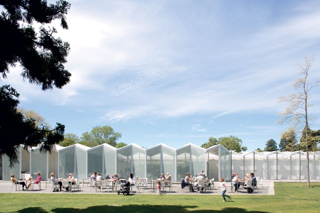
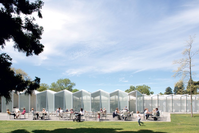
The visitor centre at the Christchurch Botanic Gardens was visited by 400,000 people in the 2016/17 season. This is an astounding increase on the previous building, which at last count had 40,000 visitors per year. The gardens themselves see over 1.1 million visitors per year, making it one of New Zealandʼs most popular tourist attractions.
Patterson Associates won a competition for the design of the centre, notably positioning the building in a completely different area of the gardens from that stated on the brief. The result is that visitors now venture further into the 21ha gardens, says Jeremy Hawker, previous operations manager of the gardens for the Christchurch City Council.

“The new building changed the gardens, which were described in our research as ‘another old auntieʼ, to somewhere that is young and hip. It is persisting in changing the character of the destination and of Christchurch in general to a more contemporary place to visit.”
Andrew Mitchell of Pattersons Associates says there was a feeling of nervousness when the building was revealed to the city, as it was council money spent on something other than infrastructure, post-earthquakes. “But the city totally embraced it, and it became a sanctuary when there was so much unbuilt, vacant space around. People love going there as a break away from dust and rubble.
The building is new, and the gardens are intact; itʼs somewhere new to go. It is also aspirational in terms of the way the city is evolving,” he says. The building has provided a much-needed function venue for the city. It is widely used for weddings and events and is also hired out by international corporations for private functions. With research rooms and workshop spaces, the centre extends the gardens ability to undertake research, conservation and education activities and to demonstrate themes of the beauty, variety and complexity of the plant world.
Britomart Precinct
2012
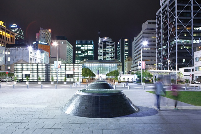
According to britomart Group, pedestrian numbers in the precinct have seen a 21 per cent average growth year-on-year, or 260 per cent growth over the last five years. Not simply an upgrade, the development has taken what was once a derelict part of town and created a multi-facted destination for shopping, dining and for generally hanging out.
When the development of Britomart began, Auckland was undergoing a renaissance from a sleepy town to an international city, says a spokesperson from the Britomart Group. “We are proud to have played a part in that transformation by adding a district of 11 blocks and by giving back with the cherished public spaces we’ve helped create. We are excited about the City Rail Link development and all that it will bring, as well as the rapidly increasing population of inner-city dwellers and developments happening on the periphery of the precinct.”
A sense of connectivity has been created through the use of careful planting, lighting features and open spaces. “We have created what we set out to do, in terms of not pigeon-holing what we are and we have let our dynamic mix of tenants speak for itself. We have been pleasantly surprised at the level of demand that the precinct has attracted,” says the spokesperson.
Cheshire Architects played a large part in the planning of the development, and in the design of many of the restaurants and retail spaces. “Part of the success is due to the long-term owners, who are not building with an eye on this half-year’s balance sheet but see it as an inter-generational project,” says Pip Cheshire. “It has matched or exceeded our expectations. The developer needed and wanted a sustainable-development model and a connection from the older parts of town, such as High Street, to the waterfront.”
Links through buildings and lanes make the area perforated north to south and link it with the rest of the city.
***
We want to hear from you! Vote below for which project you think is most transformative. If you don’t agree with any of our picks, send us an email with your favourite and if we get enough votes we’ll update the article in the new year.


