30 years on: Wellington Central Library
The Wellington Central Library was designed by Athfield Architects in 1989. Architecture New Zealand published its review of the space in the March/April 1992 issue under the title "Library a talking point". In 2019, 30 years on, the building has once again become a topic for discussion about whether to tear down Ath's structure and start again or spend potentially more money to strengthen the exisiting, earthquake-prone building.
After receiving feedback from the city's residents, Wellington City Council voted earlier this month to save and upgrade the existing building. We pulled Tommy Honey's original review out from the archives to get a glimpse into an era when digitisation was starting to gain momentum and to hear some of Ath's own thoughts on the project.
Library a talking point
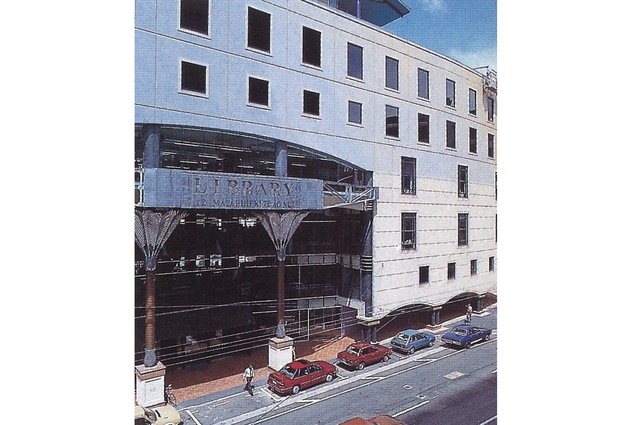
The citizens of Wellington are actively and passionately involved with the development of their Civic square. The new library – the most public of the buildings that surround the square – has attracted its share of praise and condemnation as public awareness of architecture and the city increases. Shortly before the building opened, two women could be heard across Victoria Street discussing at length the curve of the facade. They wanted to know why it curved, and only at one end; why it wasn’t square. They didn’t understand it, but they wanted to. Whether they liked it or not is irrelevant – they were standing still and looking up. And that is a rare and excellent thing.
Athfield Architects have contributed much to the debate. Already notorious for being unafraid of provoking reactions, they haven’t held back here. They were involved with the planning of the Civic Square from the beginning and were given the job of designing the new library. The existing library was full to bursting and a new space was long overdue. The new library is more than a set of shelves in a bigger space – it embraces a relatively new idea of the role of libraries in society.
The rapid advance of information technology has catalysed a new philosophy of libraries, with some operators overseas considering them to be information supermarkets dedicated to giving as much information as possible to as many people as possible. After a trip to the US to research libraries, Ian Athfield became very excited by this idea and used the opportunity to integrate it in the design process early on. But Athfield thinks the librarians may not have gone far enough: “They are the conveyors of information and there are many levels of information which they are not prepared to accept and understand.”
The advance of computers and modems means that in the future the movement of information will increase in importance. Athfield values libraries very highly. “They provide one of the few opportunities for people to stop and think and research and sort out a direction for themselves. They should challenge the people who enter them.” The design of the new library embodies this philosophy. There is an air of accessibility, and increased space means that far more of the library’s collection can be on display.
Lightness of being
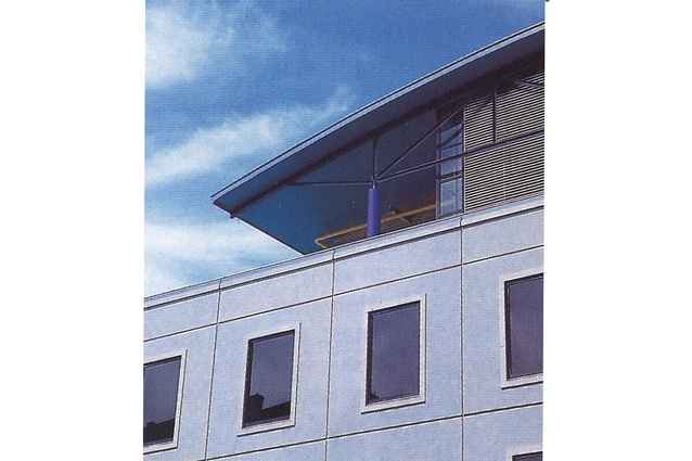
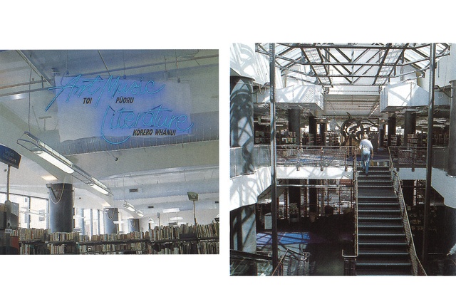
The building itself is a reversal of traditional expectations of what a library should be. Its essence lies in its lightness, in every sense of the word. It is not a serious building but it manages to be playful without being flippant; it breaks with the modernist tradition of carefully controlled indirect lighting with a curving three-storey glass wall to the east; and far from being a stolid monument, it chooses instead to emphasise its thinness, its ephemerality, with a light structure.
The fabric of the building has been reduced wherever possible to deny the weight commonly associated with libraries. Early designs had a suspended ceiling which was pulled out of the contract in favour of exposed services with light curved steel mesh floating above. The stairs are detailed in steel and the colour scheme of muted gun-metal with vibrant blue red and purple carpet reinforces the high-tech industrial aesthetic. But this attempt to lighten up may be too successful – the virtually total denial of things heavy, of gravitas, could be the building’s downfall.
In a world where speed-reading is replacing quiet contemplation, two questions arise: does architecture such as this assist this change in attitude? And does it matter? The answer may lie in the fact that the building has been full since the day it opened. Running along the wall of glass is a ribbon of seating where readers can, and do, stretch out with a good book and soak up a bit of sun. There is no denying this is a good place to be – it’s fun, invigorating and pleasant. But if your idea of study, of books and of reading doesn’t encompass fun or associate with pleasantness, maybe this building is not for you.

Difficult context
The new library has a difficult context in the city to work within and, for the most part, it does this well. It faces, on one side, the office blocks of Wellington and, on the other, the Civic Square. The library wanted a presence on Victoria Street and the city council was more concerned with a presence to the square. Because of security, libraries can have only one point of entry.
Early on, Athfield decided to compress the upper floors, giving the ground floor a high stud and allowing a mezzanine floor. There is public entry at mezzanine level from the Civic Square which connects through the library and down onto Victoria Street. There is no direct access from this internal street to the library and it bypasses the security problems.
Athfield explains: “It should provide a positive relationship to the Civic Square as a bookshop or a coffee-bar develops on the mezzanine floor. It gives you the ability to get close to the library without actually having to use it. I think one of the big problems about libraries is that they are seen by some people as a territory which is difficult to enter, either because they don’t enjoy books to any great extent or they feel that people who use libraries come from a different class from them.”
There are two colonnades to the building, each of a different character. Athfield was influenced partly by Maybeck’s campus at Stanford University in Palo Alto, California. He says: “I’ve always been interested in exploring the building and colonnade rather than the verandah. I find the verandah a very bad mechanism for tall buildings so the colonnade seemed a natural choice.” It is questionable whether this exploration has been fruitful.
The colonnade to the entry on Victoria Street tries to do too much – it wants to impress with the power of the solidity of its columns and also address a human scale for the people walking through. The result is clumsy with the stubby columns looking as if they were once much taller but had since subsided into the ground. It is a pity that the lightness that permeates the rest of the building was not used here – the detailing of this street edge under the colonnade seems almost banal and lacking the excitement of the rest of the building.

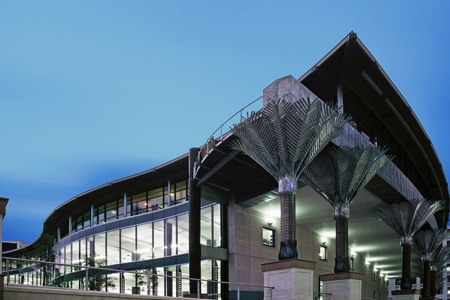
The more controversial colonnade of nikau palms around the corner on Harris Street has been attracting its fair share of attention, but for all the wrong reasons. Those that dislike the library, but have trouble articulating why, have seized on these columns as a waste of money and an unaffordable frivolity. The architects and the council have been quick to point out that the same columns clad in Oamaru stone would have cost $30,000 more. To which no one seems to have made the obvious reply that Oamaru stone columns would look incongruous beyond belief – the only reason that the colonnade almost works is because they are palms. They can depart from the building and safely stand alone. The question of money is a red herring.
The questions that need to be answered are why is it there in the first place, and does it work? It runs along the edge of a gradual ramp that curves up, allowing wheelchair access to the future plaza that will connect with the harbour front. It was to have continued beyond, between the Town Hall and the Michael Fowler Centre, although this may now not happen. The lonely colonnade serves as an uncomfortable reminder that the plaza is the most unresolved and ill-defined part of the Civic Square.
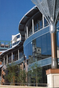
The success of the colonnade depends largely on the nature of the plaza. Considering the indecision that has plagued the plaza, things do not look hopeful. There is also something uncomfortable about the heights of the palms. As the ramp rises, the palms decrease in height until they emerge from supporting the building and stand alone where they suddenly take off again. The building acts as a datum forcing a stasimorphy under which the palms may grow no further. This is denied further out and the resulting ambiguity is unsettling.
Also unsatisfying is the interstitial space between the library and the council administration building, particularly the uneasy connection at third·floor level. It points to problems resulting from a number of different architects designing different buildings within the Civic Square – while the range of buildings is richer, the responsibility for how they sit together seems to have been somewhat neglected. Ian Athfield points out that an earlier scheme for a more active collision between the two buildings was watered down and eventually disappeared – a casualty of costing and an example of the difficulties of being employed by the developers and not having a direct relationship with the city.
The new library makes a valid and valuable contribution to the centre of Wellington. Athfield Architects has taken the risk to provide the city with a provocative building and the city is the better for it. We can only hope that the city council responds to this challenge and completes the Civic Square with as much daring.

