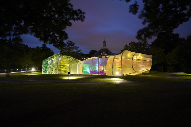
2015 Serpentine Pavilion polarises critics
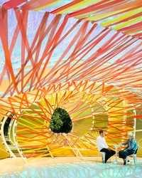
Trippy womb of candy coloured sweetness or shoddy, psychedelic police cordon? The 2015 Serpentine Pavilion by Spanish architects SelgasCano has opened with UK critics polarised as to its success, or lack thereof.
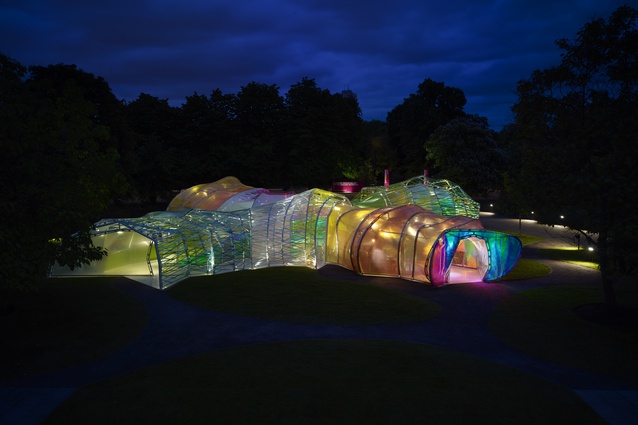
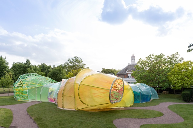
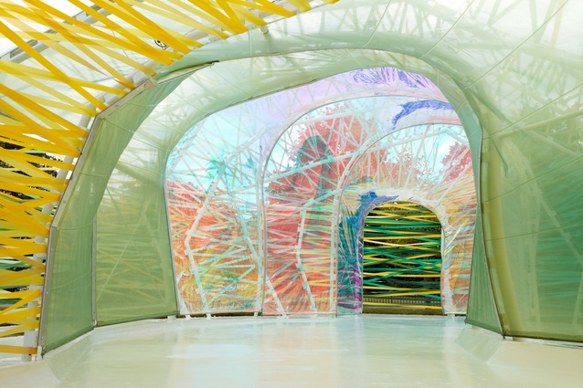
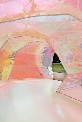
Made from layers of ETFE plastic stretched out across a writhing, wormlike skeleton of steel ribs, the structure is designed to be a day-glo celebration of its predecessors, launching as it does on the 15th anniversary of the Serpentine Pavilion program.
Many warmed to its merry intent, with both The Guardian’s Oliver Wainwright and Edwin Heathcote writing in the Financial Times finding it an enjoyable frolick.
As Wainwright writes, “Architectural purists might sniff at what looks like a kids’ funfair maze from the outside – until they’re sucked through the wormhole and swallowed inside Selgas Cano’s trippy womb.” He found it embodies an almost anti-architectural approach, which seems to consciously resist “the pressure to construct a manifesto in miniature.”
While struck by the structure’s apparently ad-hoc and slightly “bodgy” appearance, Heathcote likewise found it to be “a terrifically enjoyable blast of candy-coloured sweetness, a Pop Art kickback to a 1960s sensibility of disposability and playfulness.”

Detractor’s of SelgasCano’s psychedelic pupa, though, didn’t hold back in expressing their disdain. The Telegraph’s Ellis Woodman found its ropey ETFE cladding reminiscent of a “police cordon” and pointed to some obvious climatic failings, saying it recalls the “sweat-box conditions” of 2006’s plastic-clad Rem Koolhaas pavilion.
The sharpest jab, though, came from Robert Bevan, formerly of the Australian Financial Review. Writing in the London Evening Standard, Bevan called it “a shoddy end-result,” less “brilliant chrysalis” than “clown’s sleeve.” Ouch!

