Patina and texture: 102 The Mill
Designed by Carter Williamson Architects, the exposed structure of this former timber factory encourages consideration of not only the house’s final form, but also its individual parts.
As a writer I’m interested in words: their meanings, usage and origins. When I toured 102 The Mill with Shaun Carter of Carter Williamson Architects, the word “building” was used frequently as both a noun and a verb, “building” referring to a physical structure and the construction of something by putting parts or material together. This is because 102 The Mill is a former timber factory that Carter Williamson has transformed into a four-storey house. Its original structure and construction techniques are visible, contributing to its new residential form.
The project is part of a redevelopment of an industrial site in Balmain, Sydney, in which a sawmill, cottage and factory now accommodate four residences. The long, rectangular factory building has been divided into two homes: 102 The Mill, at the front, is a 430-square-metre house with generous and comfortable spaces, multiple outdoor areas and character derived from its existing structure and materials.
The house is organized logically: the eastern wall adjoins a factory, the western edge opens to a garden and the northern facade engages with the street. “This was an exercise in organizing the spaces to get light into the building,” Shaun explains.
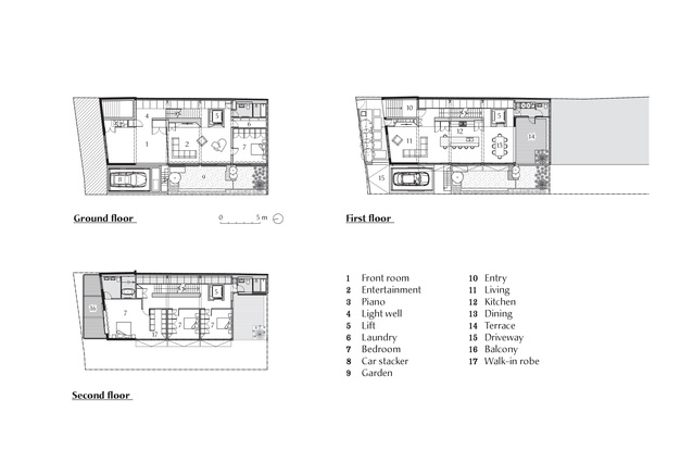
In section, the circulation zone with a staircase and void is arranged along the eastern side of the house, with the living and bedroom spaces configured to the western side, to receive light and ventilation. The open-plan kitchen, living and dining area is on the entry (middle) level, bedrooms are upstairs and a guest bedroom, entertainment area and workspace are downstairs.
Incorporating an outdoor space at every level was part of the design strategy to increase light and a sense of generosity: a front-yard entrance, a ground-floor garden, a living-area terrace, a main-bedroom balcony and a rooftop terrace with city views.
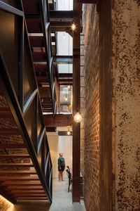
The house has a cavernous entryway lined with steel sheet cladding; its patina and texture contrast with the glossy black exterior tiles. A solid inlaid-timber door opens to the staircase and four-storey void alongside a recycled-brick wall that appears original, but isn’t. “The neighbouring factory was built before this one and they probably thought, let’s save money and not build that wall, so they borrowed from it. It’s such a Balmain thing,” says Shaun.
Consequently, the steel columns sat up to 700 millimetres off the adjoining factory wall. While the new wall is closer, there are still variations in the gaps between it and the columns, and the columns and beams differ in size. New steel insertions are painted grey to differentiate them from existing elements and a skylight brings light to the lower levels of the house.
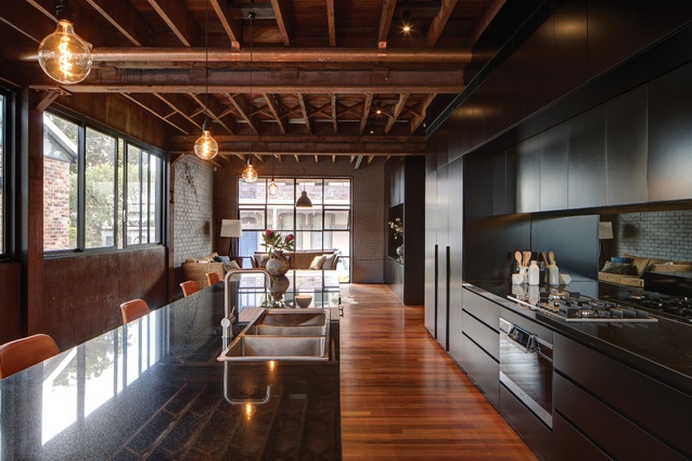
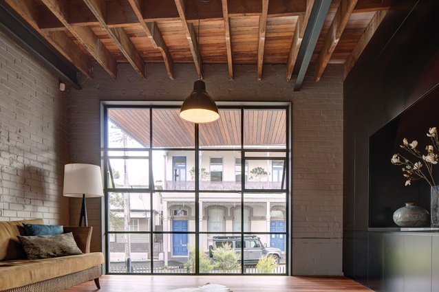
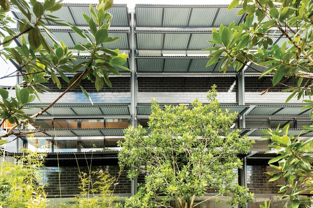
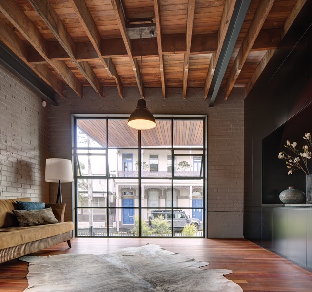
Another recycled-brick wall divides this circulation zone from the open-plan living, kitchen and dining area. In a nod to Balmain’s Victorian terrace houses, the lounge is at the front of the house, where large steel-framed windows allow for northern sun and engagement with the street. The kitchen, with a large island bench, has black cabinetry that recedes into the background, and the dining area opens to the rear terrace. Screens along the western facade block the harsh afternoon sun and reduce the heat load, and steel panelling on the walls contributes to the industrial character.
Fire tore through the lower levels of the building at some stage in its previous life, so the grey ironbark flooring in the living space is new. The floor above survived, however, and the ceiling exposes its original construction with herringbone bracing, hand-scrawled numbers on the underside of the floorboards and steel trusses – some with and some without haunches. “It’s that old Balmain way again, where they just found materials and built a factory out of them,” says Shaun. The scars of the former staircase are also evident on the painted brick wall.
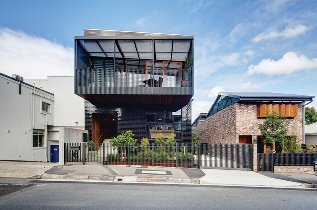
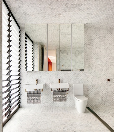
Upstairs, the corridor leads to three light and bright bedrooms. The main bedroom and ensuite at the front of the house open to an angled balcony that responds to the grand two-storey Victorian terrace across the road and fosters engagement with the street life of Balmain. Fan-shaped tiles in Carrara marble cover the bathroom floor, walls and ceiling, rising up to the skylight to create a more luxurious feel of “bathing rooms,” rather than simply bathrooms.
The ground floor is a versatile space that is suitable for a variety of uses, such as guest accommodation and/or a home office. While the open area has a light palette and a subterranean feel, from the base of the void its verticality is amplified by the expansive brick wall, steel columns and lofty skylight.
Indeed, standing up close to the exposed structure of 102 The Mill encourages you to consider the house in not only its final form but also its individual parts. As Shaun explains, “You engage more with this home as a building, as a physical structure. You get a sense of how the [parts come] together; you can see it, feel it and understand it.”
This article was first published on architectureau.com

